KS3 Histograms and Frequency Polygons Worksheets
All worksheets are created by the team of experienced teachers at Cazoom Maths.
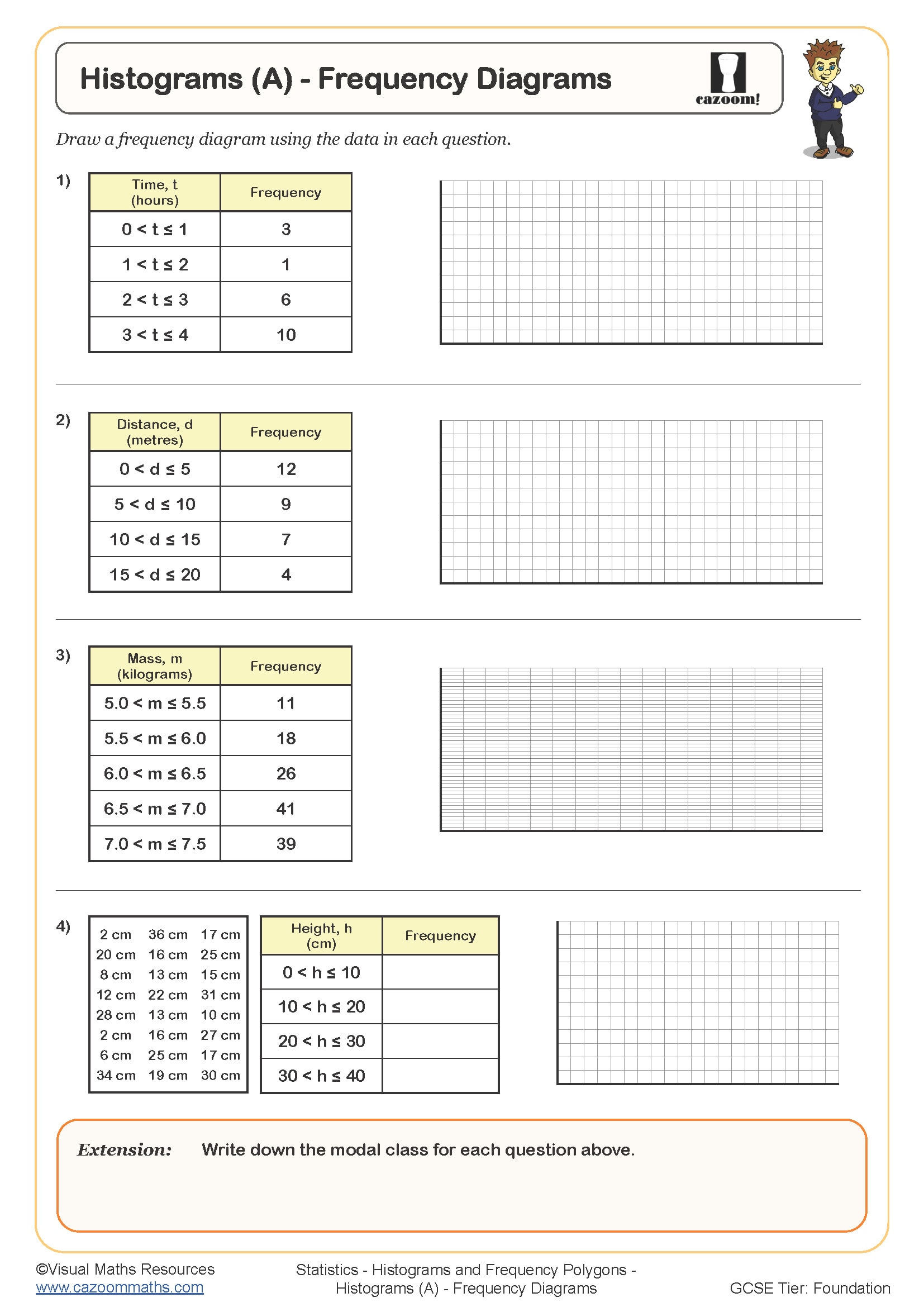
What is the difference between a histogram and a bar chart?
A histogram displays continuous grouped data with bars that touch, where the area of each bar represents frequency. Bar charts show discrete categories with gaps between bars, where the height alone shows frequency. In histograms with equal class widths, frequency density equals frequency divided by class width, and this distinction becomes critical when intervals vary.
Students lose marks in assessments when they draw gaps between histogram bars or label the horizontal axis with categories rather than a continuous scale. Many teachers find that asking students to shade different class intervals and calculate the areas helps reinforce why histograms differ fundamentally from bar charts. This understanding proves essential when students encounter unequal class widths at GCSE, where simply reading bar height leads to incorrect frequency values.
Which year groups study histograms and frequency polygons?
These worksheets cover Years 8 and 9 within Key Stage 3, where the National Curriculum expects students to construct and interpret statistical diagrams for grouped data. Year 8 typically introduces histograms with equal class widths and simple frequency polygons, building on prior work with bar charts and line graphs from earlier key stages.
By Year 9, the complexity increases to include unequal class intervals, requiring explicit calculation of frequency density. Students also compare multiple data sets using overlaid frequency polygons, developing skills in statistical reasoning that prepare them for GCSE Foundation and Higher tier questions. Teachers often notice that students who master frequency density in Year 9 show greater confidence when tackling cumulative frequency curves later.
How do you calculate frequency density for histograms?
Frequency density equals frequency divided by class width, giving the height needed for each bar so that area represents frequency accurately. Students must first determine class width by subtracting the lower boundary from the upper boundary, then divide the frequency for that interval by this width. The vertical axis on a histogram shows frequency density, whilst the horizontal axis displays the continuous variable being measured.
This calculation appears in real-world data analysis across healthcare, engineering and social sciences. Medical researchers use histograms to display patient age distributions in clinical trials, where unequal age bands require frequency density calculations to avoid misrepresenting sample sizes. Environmental scientists similarly employ histograms when analysing pollution measurements across varied time intervals, ensuring that data collected weekly and monthly can be compared fairly on the same diagram.
How can teachers use these histogram worksheets effectively?
The worksheets build from drawing histograms with given frequency density values to calculating frequency density from raw data, then interpreting completed diagrams. This scaffolded approach allows students to focus on one skill before combining techniques. Answer sheets show complete working, which helps teachers address misconceptions during marking and supports students checking their own solutions during independent practise.
Many teachers use these resources for targeted intervention with students who struggle to differentiate between statistical diagrams, or as revision before end-of-unit assessments. The worksheets work well for paired activities where students construct histograms from different data sets, then compare their frequency polygons to discuss distribution patterns. They also suit homework tasks following initial classroom teaching, giving students repeated practise with calculations that become automatic through repetition rather than memorisation.