Box Plots Worksheets
All worksheets are created by the team of experienced teachers at Cazoom Maths.
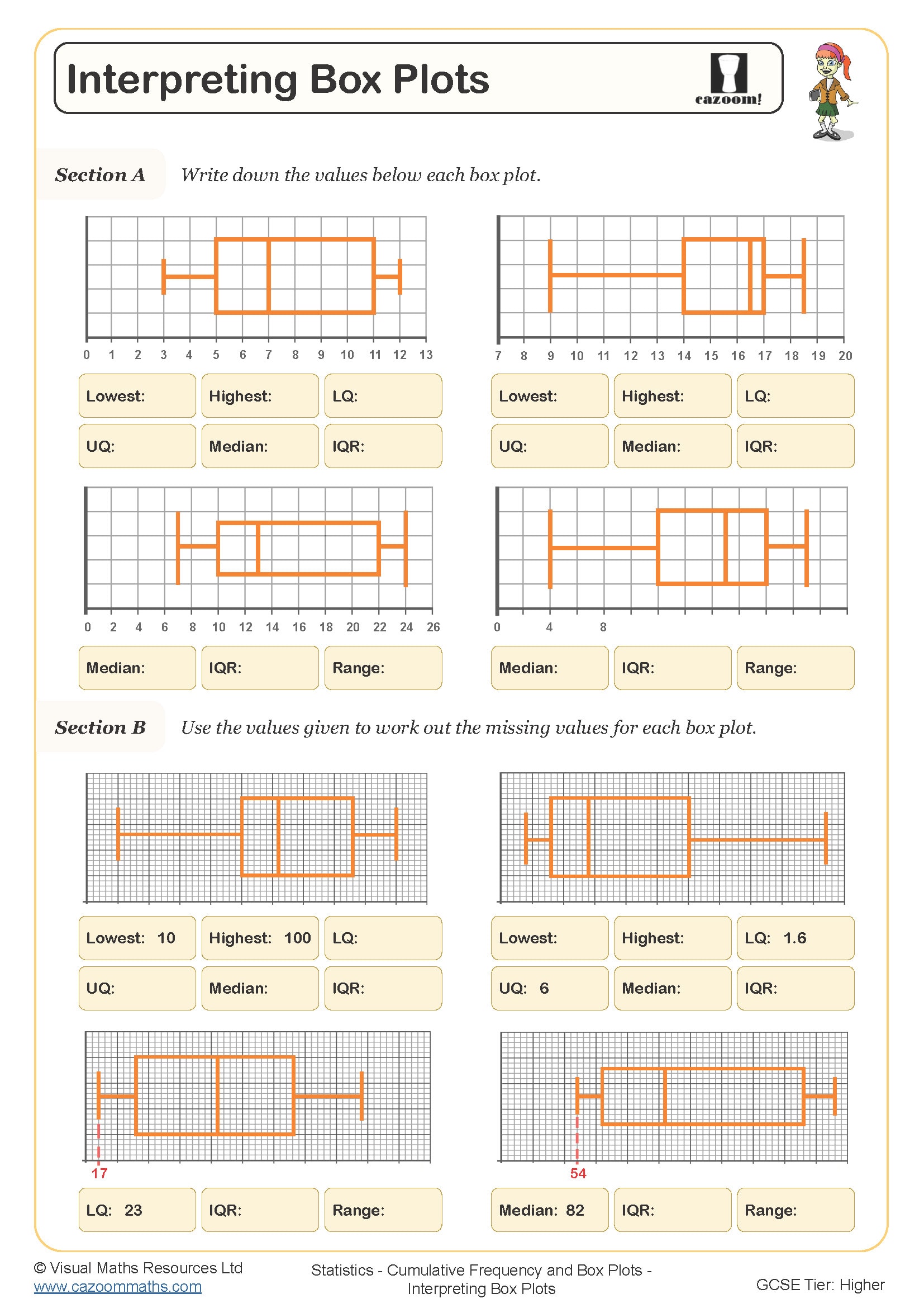
What are box plots in maths?
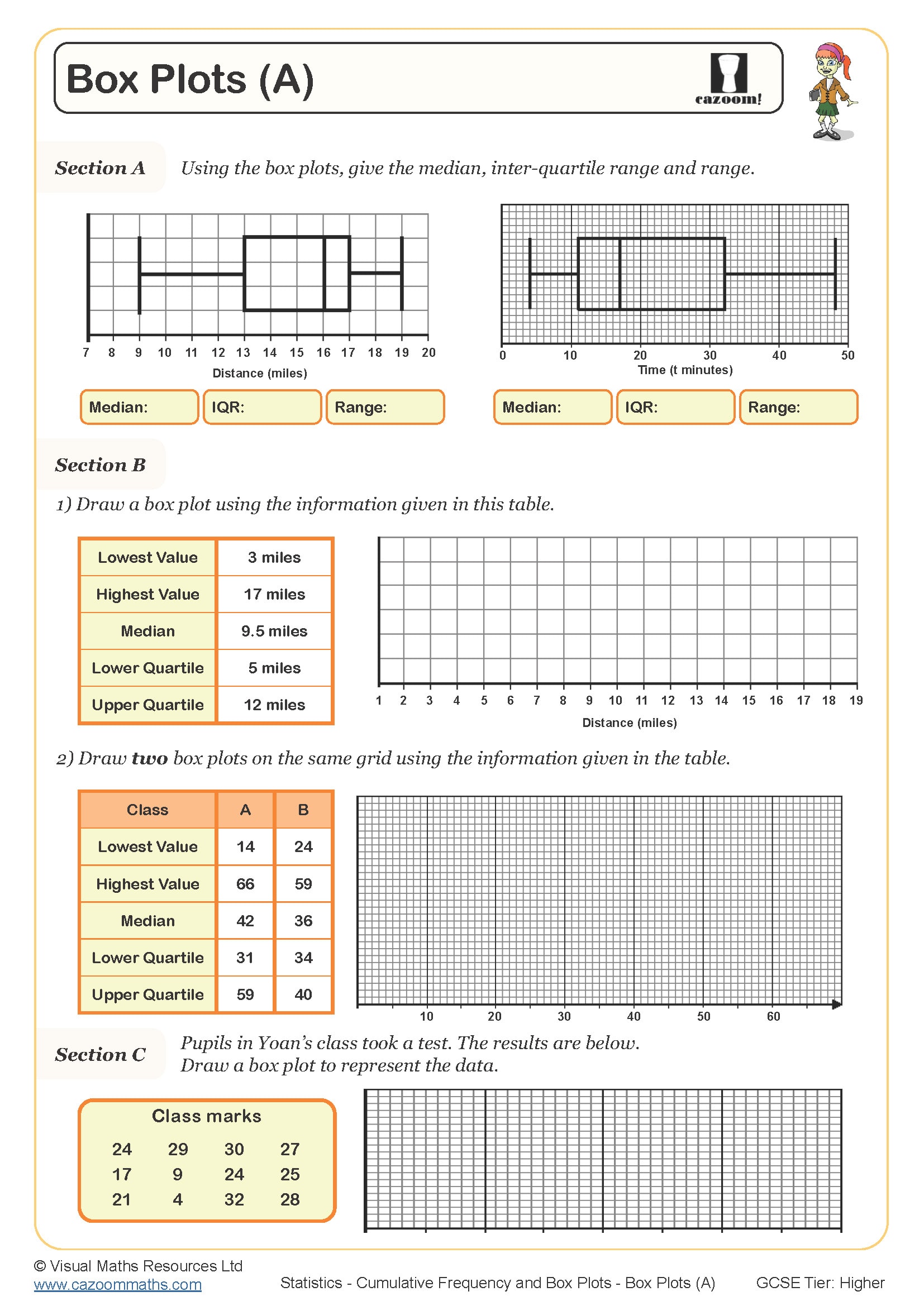
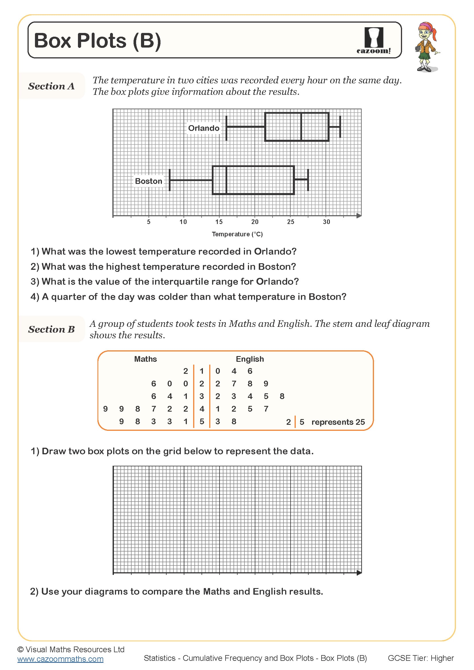
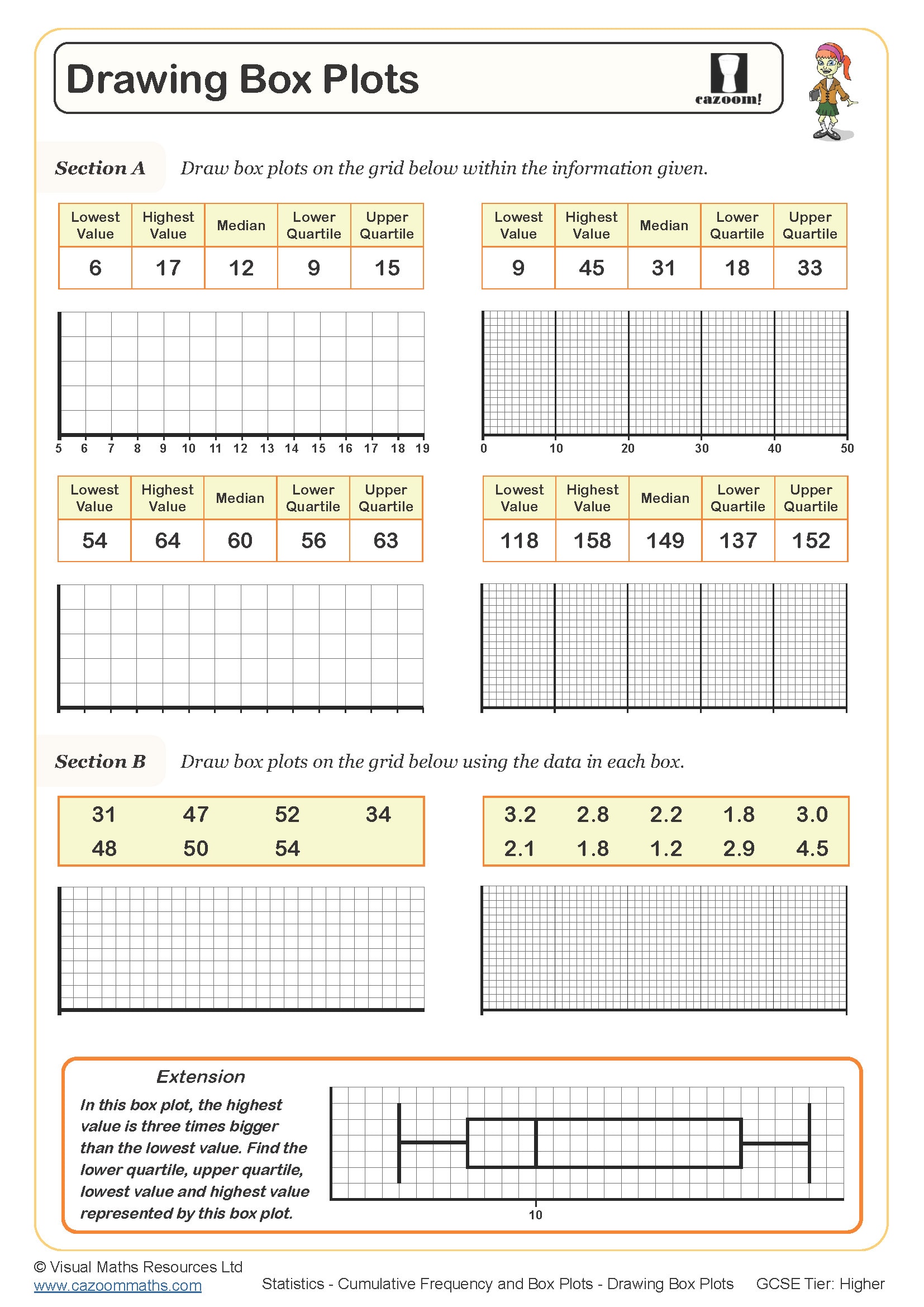
Box plots, also called box and whisker diagrams, provide a visual summary of a dataset using five key values: the minimum, lower quartile (Q1), median (Q2), upper quartile (Q3) and maximum. The 'box' spans from Q1 to Q3, showing the interquartile range where the middle half of the data sits, whilst the 'whiskers' extend to the minimum and maximum values. This representation appears in the National Curriculum for statistics from Year 9 onwards and features regularly in GCSE Foundation and Higher tier papers.
Teachers often notice students struggle to understand that the position of the median line within the box indicates skew – when it sits closer to Q1, the data is positively skewed, not evenly distributed. Exam mark schemes expect students to recognise this visual clue when comparing two distributions, yet many lose marks by simply stating which dataset has a higher median without commenting on spread or skew.
Which year groups learn about box plots?
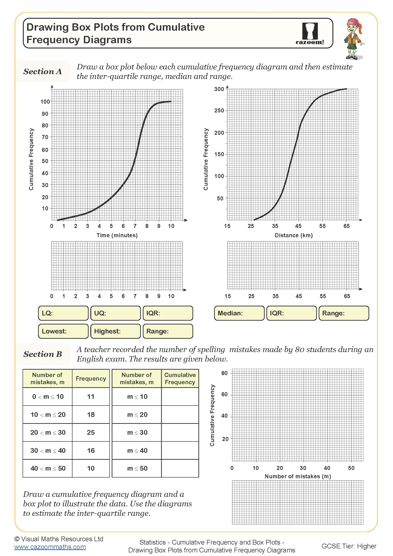
Box plots appear in the curriculum for Year 9, Year 10 and Year 11 students, spanning both KS3 and KS4. The topic typically introduces towards the end of KS3 as students develop their understanding of averages and range, then extends throughout KS4 where it becomes assessment material for GCSE. Foundation tier students must interpret box plots and understand quartiles, whilst Higher tier extends to constructing them from raw data and using cumulative frequency diagrams.
The progression across these year groups moves from reading values directly off given box plots to calculating quartiles from ordered datasets, then comparing two or more distributions. Year 11 students working at Higher tier also encounter outliers, learning to identify values that fall more than 1.5 times the interquartile range beyond the quartiles, which then appear as individual points rather than extending the whiskers.
How do you find quartiles for a box plot?
Finding quartiles requires ordering the dataset from smallest to largest, then locating the median position (the middle value or mean of the two middle values for even datasets). The lower quartile Q1 sits at the median of the lower half of data, whilst the upper quartile Q3 sits at the median of the upper half. When the dataset contains an odd number of values, teachers frequently notice students make errors by including or excluding the median value itself when splitting the data – the convention is to exclude it from both halves.
This statistical skill connects directly to quality control in manufacturing, where engineers use box plots to monitor production consistency. If the interquartile range suddenly widens, it signals increased variation in component dimensions, prompting investigation before defects occur. Weather forecasters similarly use box plots to compare rainfall distributions across regions or decades, helping communicate climate patterns to the public more effectively than lists of numbers alone.
How can these box plot worksheets help students?
The worksheets build skills systematically, starting with interpreting completed box plots before moving to constructing them from given quartile values, then calculating quartiles from raw data. This scaffolded approach allows students to grasp the visual representation before tackling the computational aspects. Answer sheets enable immediate feedback, which proves particularly valuable when students miscalculate quartile positions – they can identify exactly where their method diverged from the correct approach rather than simply knowing the final answer was wrong.
Many teachers use these worksheets during intervention sessions for students who find cumulative frequency graphs challenging, as box plots offer a more accessible route to understanding distribution and spread. They work well for homework consolidation after introducing the topic, or as revision materials before assessments since they condense several statistical concepts into one diagram. Paired work sessions where students construct box plots from different datasets then compare their distributions encourage mathematical discussion about variability and typical values.