Cumulative Frequency Worksheets
All worksheets are created by the team of experienced teachers at Cazoom Maths.
What makes a good cumulative frequency worksheet with answers pdf?
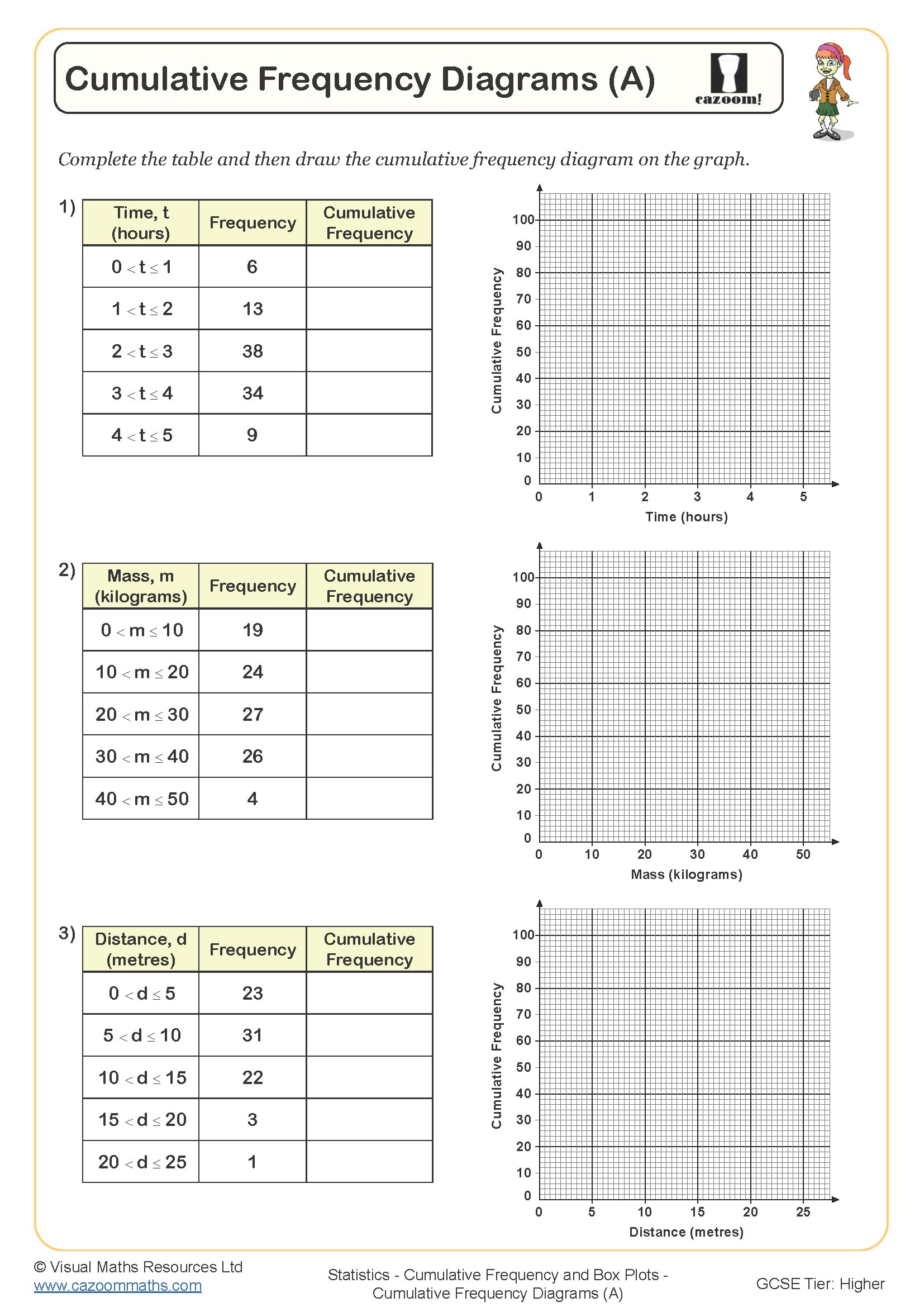
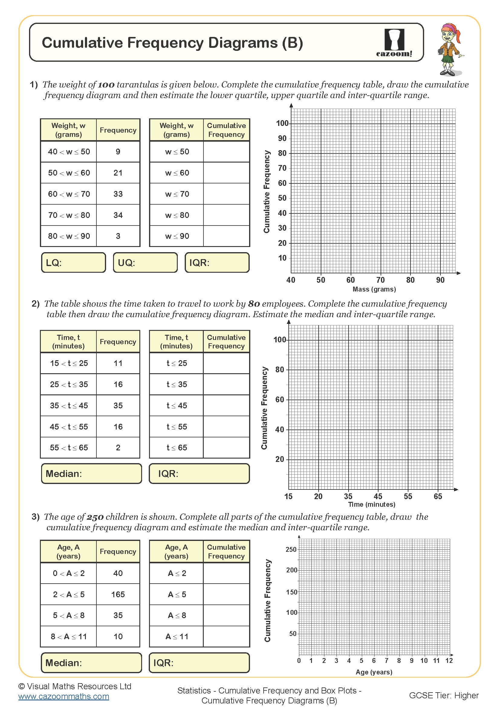
A quality cumulative frequency worksheet pdf should progress logically from basic frequency tables to complex statistical interpretations. The best resources begin with simple discrete data before advancing to grouped continuous data, ensuring students understand why upper class boundaries matter when plotting cumulative frequency curves. Answer sheets must show clear working methods, particularly for reading quartiles and calculating interquartile ranges from graphs.
Teachers notice that students often plot cumulative frequencies against the wrong x-values, using class midpoints instead of upper boundaries. Quality worksheets address this directly through guided examples and include questions that specifically test whether students can identify the correct plotting coordinates. The answer sheets should demonstrate the step-by-step process for constructing accurate cumulative frequency graphs and extracting statistical measures.
Which year groups typically study cumulative frequency?
Cumulative frequency appears primarily in Key Stage 4, typically introduced in Year 10 as part of the GCSE Statistics strand. Students encounter this topic after mastering basic frequency tables and histograms, as cumulative frequency builds directly on these foundational concepts. The National Curriculum requires students to construct and interpret cumulative frequency graphs, calculate quartiles, and understand measures of spread.
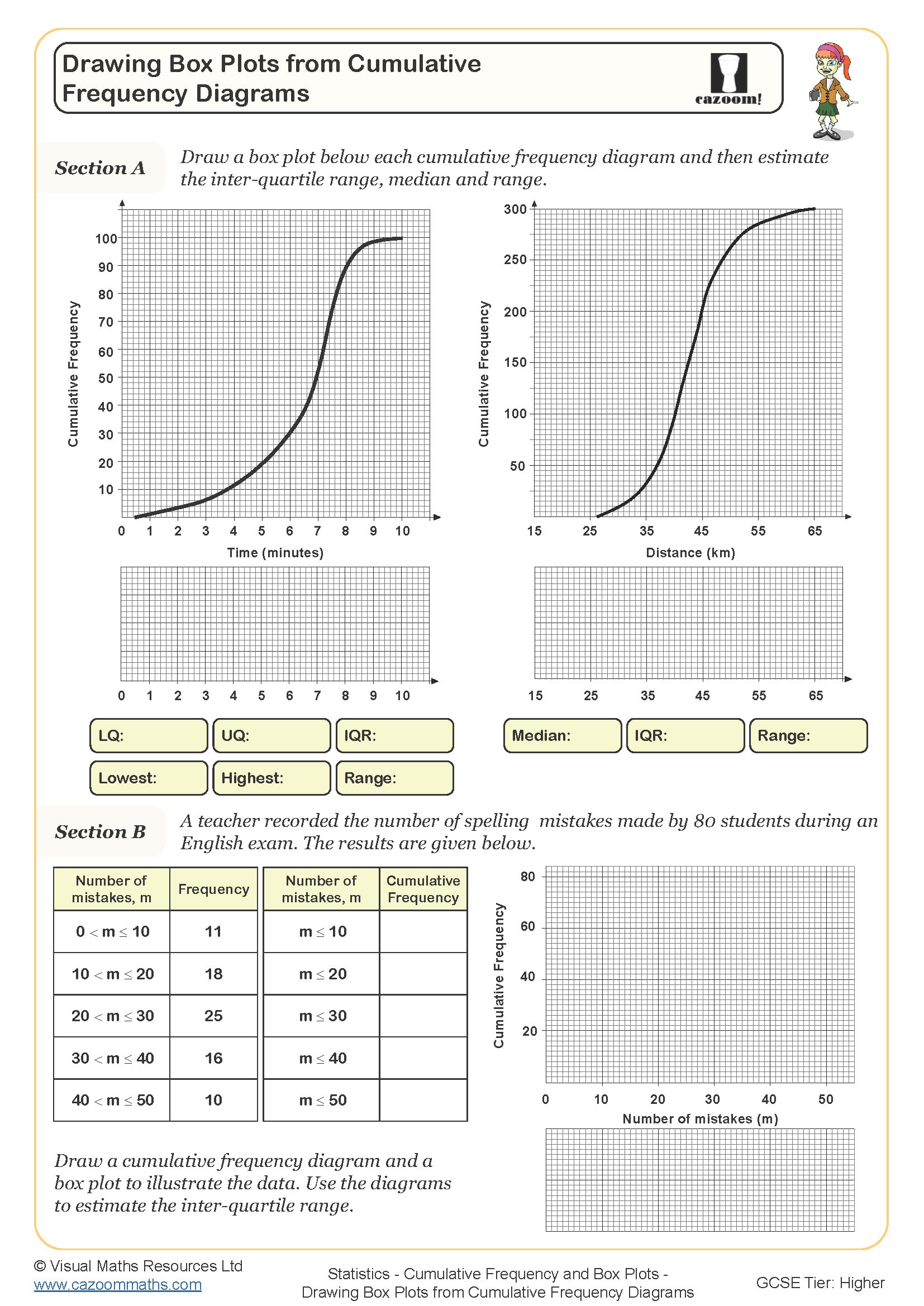
Year 11 teachers often revisit cumulative frequency during GCSE revision, particularly focusing on exam technique for reading values from curves accurately. Many students need additional practice identifying which statistical measures can be found from cumulative frequency graphs versus those requiring the original frequency table. Box plots frequently appear alongside cumulative frequency questions in examinations, so students must confidently extract quartiles from their constructed curves.
How do students construct cumulative frequency curves accurately?
Students must understand that cumulative frequency curves plot running totals against upper class boundaries, not class midpoints or lower boundaries. Teachers observe this as the most common plotting error, where students incorrectly use class centres from their frequency tables. The curve should start at zero and rise smoothly to the total frequency, creating an ogive shape that allows accurate reading of percentiles.
Drawing the curve requires careful attention to scale and smooth plotting through the coordinate points. Mathematics teachers notice that students often draw straight lines between points rather than a smooth curve, making quartile readings inaccurate. The curve should pass through or very close to each plotted point, enabling precise identification of the median, lower quartile, and upper quartile positions at 25%, 50%, and 75% of the total frequency respectively.
How can teachers use cumulative frequency worksheets most effectively in lessons?
Starting lessons with a brief recap of frequency tables helps students connect prior knowledge to cumulative frequency concepts. Teachers find success introducing the running total concept through simple discrete examples before progressing to grouped continuous data. Demonstrating why upper class boundaries matter for continuous data prevents the most common plotting errors that affect examination performance.
Using worksheets as scaffolded practice works well, with initial questions providing partially completed cumulative frequency tables for students to complete. Teachers often pair cumulative frequency questions with box plot construction, as GCSE papers frequently combine these topics. Regular mini-plenaries where students explain their plotting method to peers helps identify misconceptions early, particularly around coordinate identification and curve drawing techniques foundational for accurate statistical readings.