Cumulative Frequency and Box Plots Worksheets
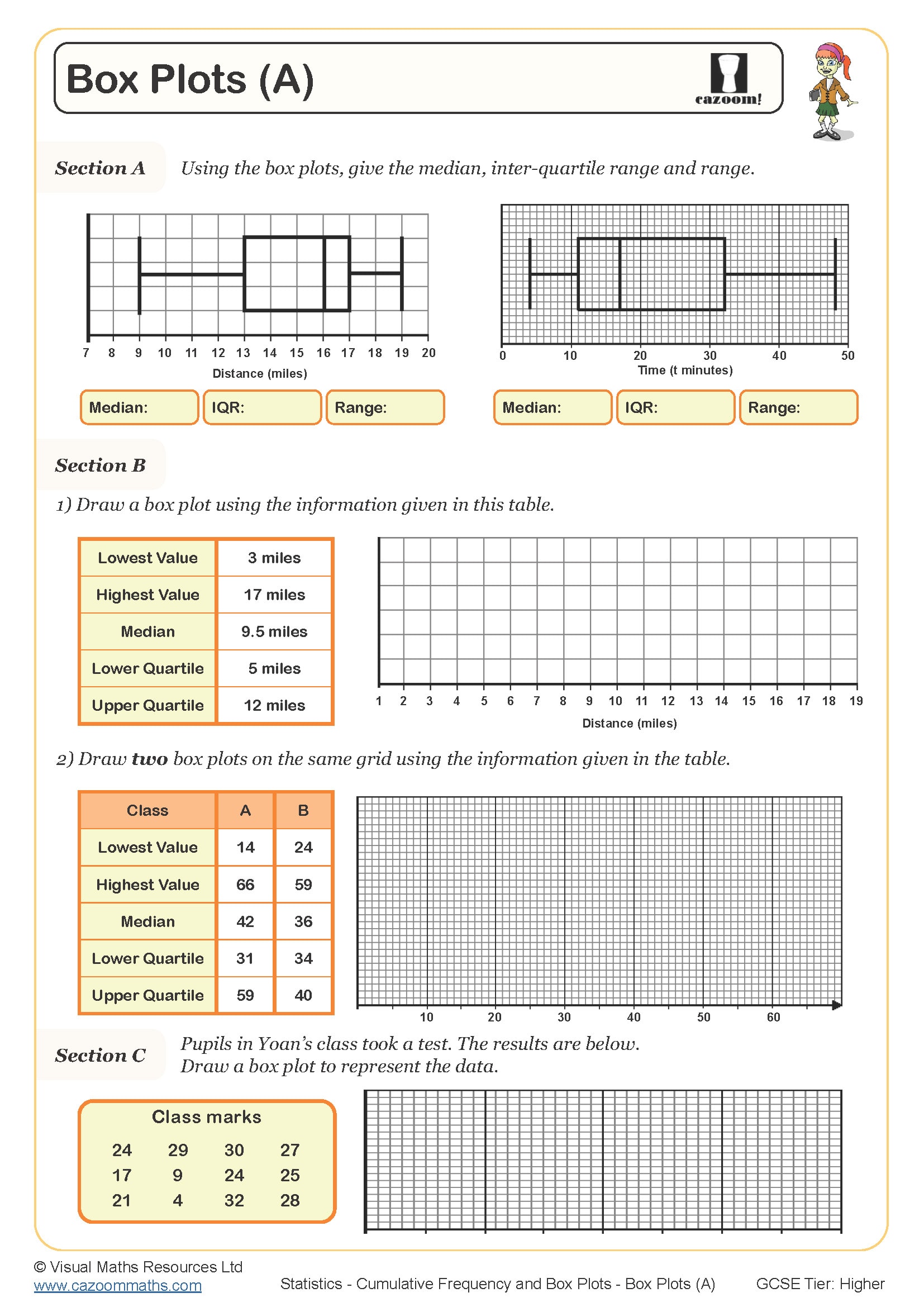
Box Plots (A)
Year groups: 9, 10
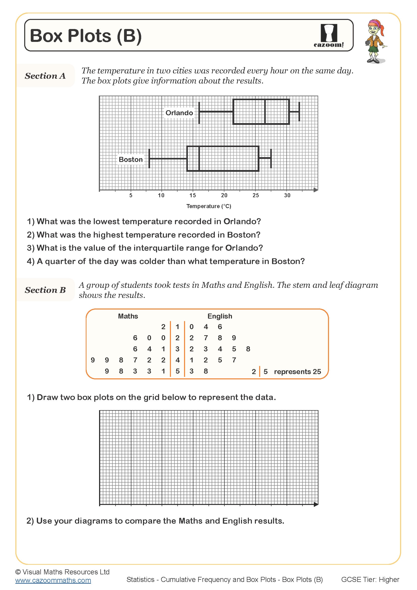
Box Plots (B)
Year groups: 9, 10
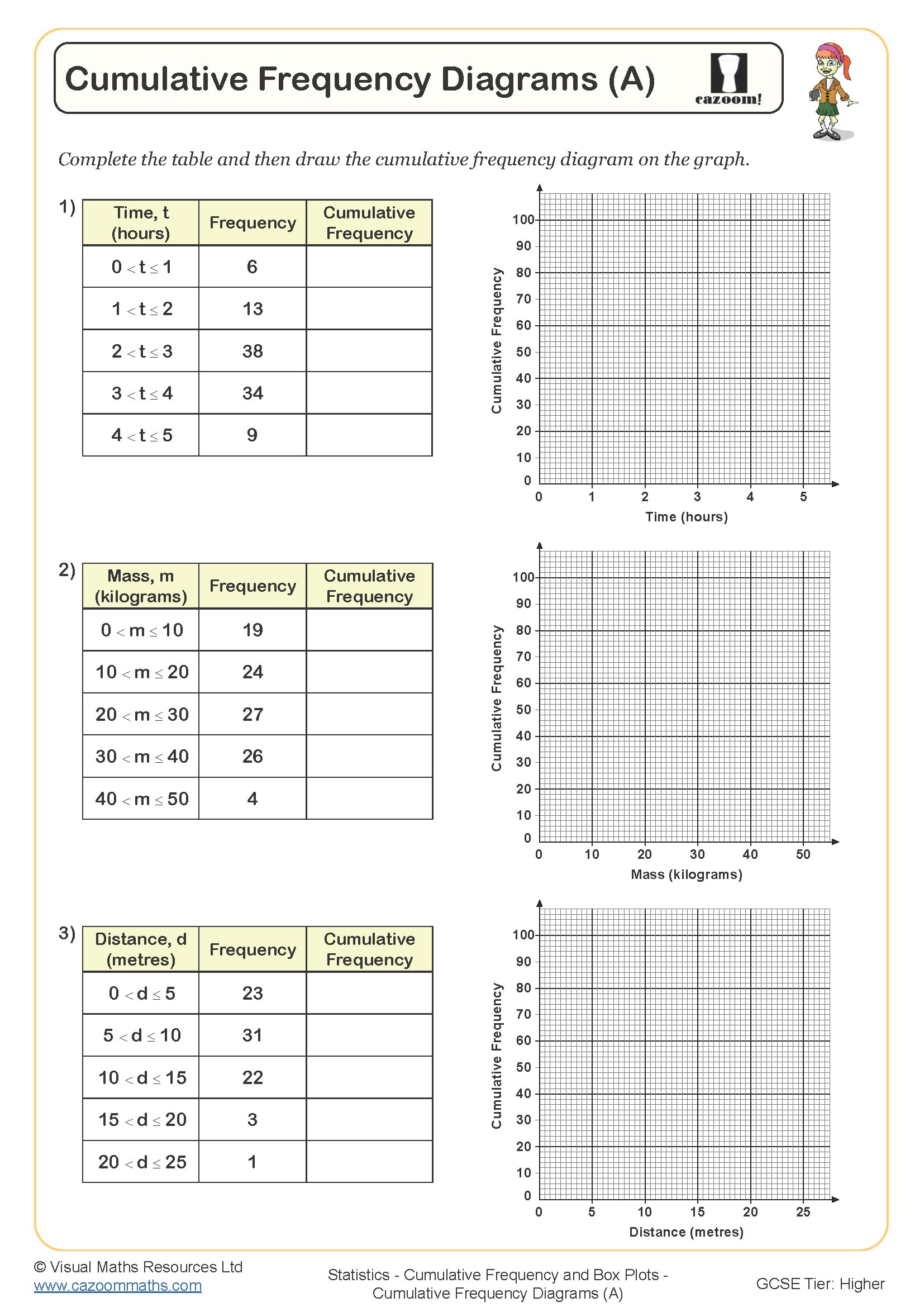
Cumulative Frequency Diagrams (A)
Year groups: 9, 10
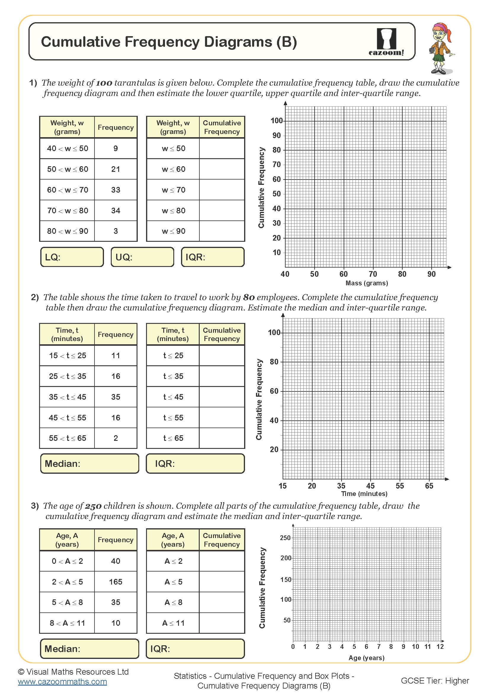
Cumulative Frequency Diagrams (B)
Year groups: 9, 10
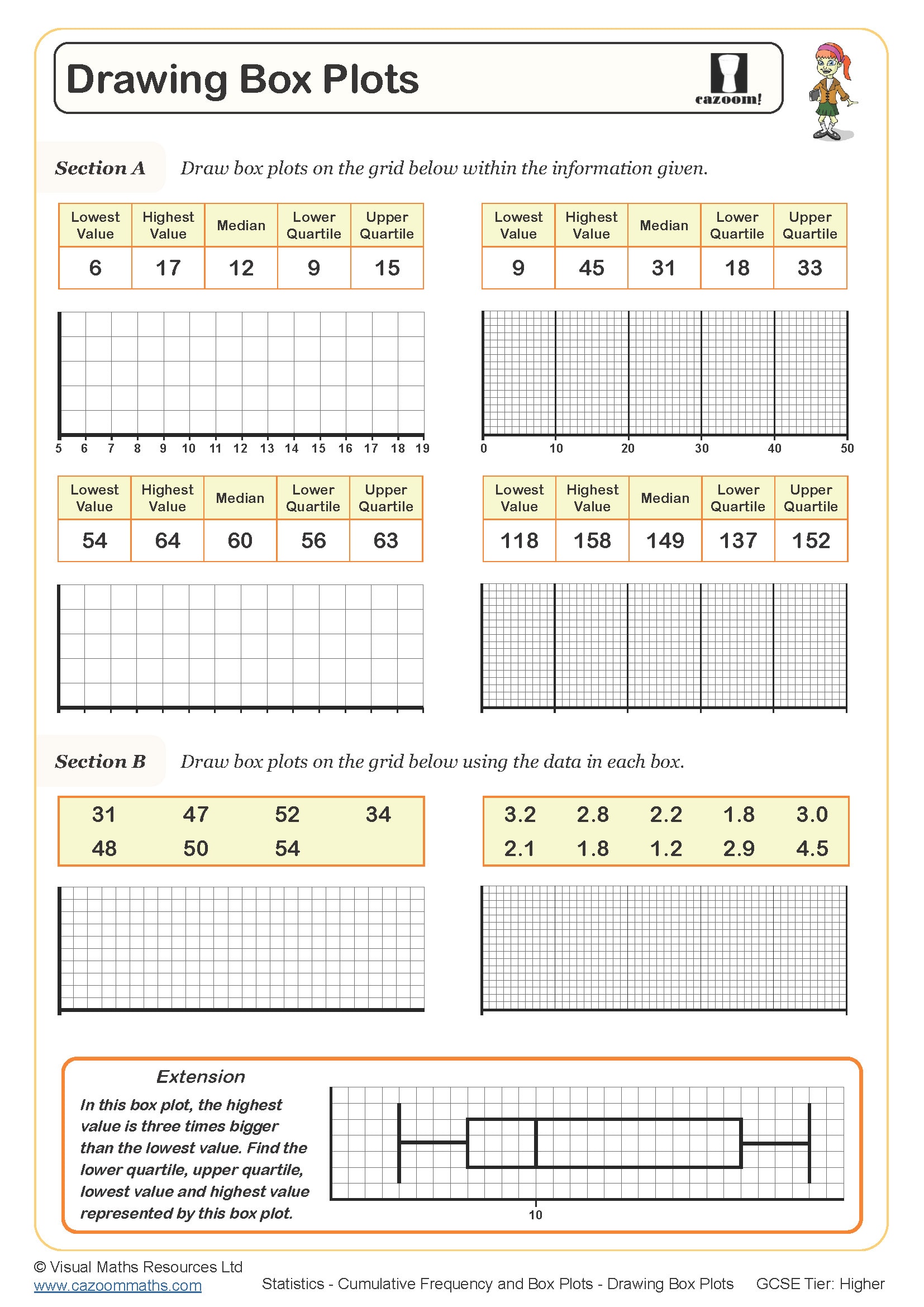
Drawing Box Plots
Year groups: 10, 11
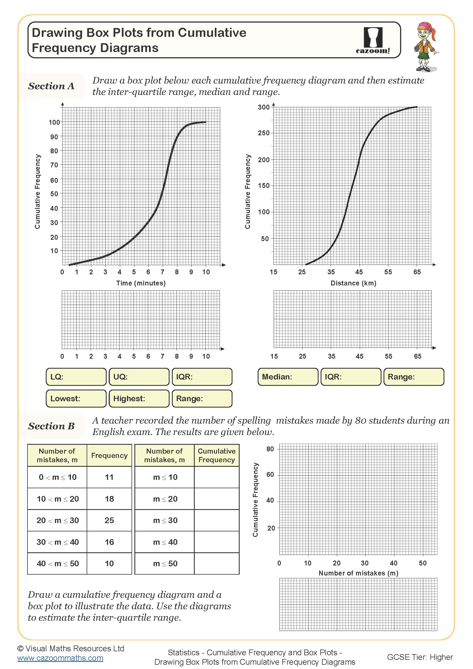
Drawing Box Plots from Cumulative Frequency Diagrams
Year groups: 10, 11
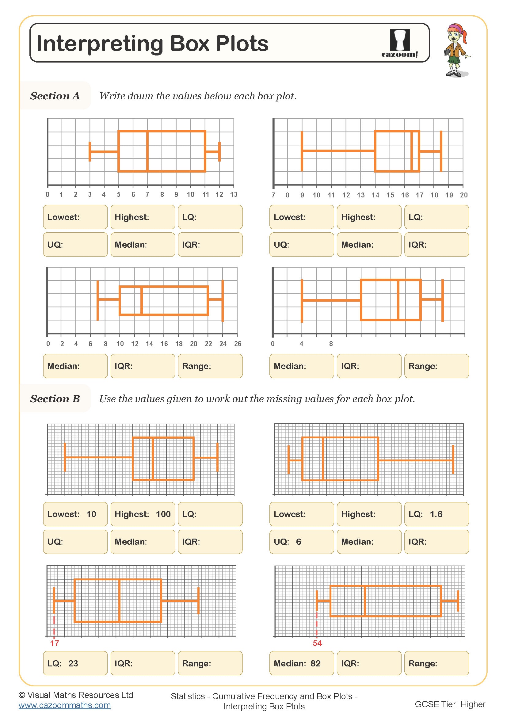
Interpreting Box Plots
Year groups: 10, 11
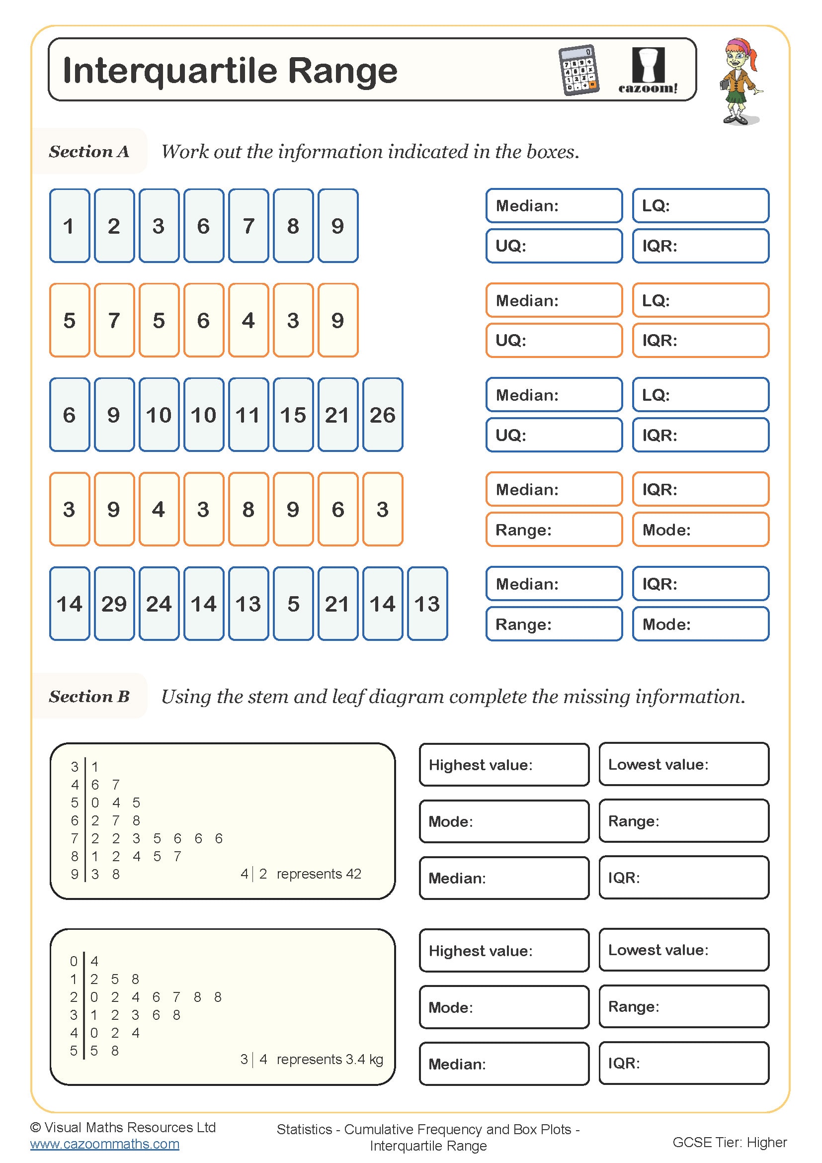
Interquartile Range
Year groups: 10, 11
All worksheets are created by the team of experienced teachers at Cazoom Maths.
Printable Worksheets for Cumulative Frequency and Box Plots with Answers
Download our printable PDF worksheets on cumulative frequency and box plots with answers to help pupils develop their skills in analysing data. Each of these worksheets includes clear instructions and worked examples. These clear instructions will help your pupils learn different related concepts like- Box Plots, Cumulative Frequency Diagrams, Drawing Box Plots from Cumulative Frequency Diagrams, Interquartile Range, and much more. Therefore, these worksheets are perfect for teachers, tutors, and parents who want to provide much-needed extra practice in key statistical techniques. Hence, with regular practising these statistical questions, your pupils will gain confidence in answering exam-style questions.
What Are Cumulative Frequency Graphs and Box Plots?
Cumulative frequency graphs is a process that shows how data builds up over time or across intervals. They help your children in KS3 and KS4 see patterns in grouped data and are useful for estimating medians and quartiles. On the other hand, Box plots show the spread of data using five key values: minimum, lower quartile, median, upper quartile, and maximum. Together, these two core statistical concepts are used to describe, compare, and analyse large sets of data. Hence, understanding how to draw and read them is an important part of GCSE statistics.
Why Learn Cumulative Frequency and Box Plots?
Learning to use cumulative frequency and box plots helps pupils make sense of data in a visual way. These methods are part of the GCSE curriculum and help students answer questions about averages, spread, and comparisons. They also support pupils in understanding variability and spotting patterns in real-world data. Our worksheets offer a wide range of practice questions to help learners get used to the techniques and build accuracy. Step-by-step layouts make the tasks easier to follow and ideal for revision or independent learning.
Real-Life Uses of Cumulative Frequency and Box Plots
These statistical tools are used in many real-life situations, such as comparing test results, analysing trends, or reviewing survey data. In careers like business, healthcare, and science, professionals use cumulative frequency and box plots to make decisions based on data. Teaching pupils how to interpret and create these graphs prepares them for both exam success and future applications. Our worksheets provide practical questions linked to real-world contexts so that pupils can see the value of what they’re learning and apply it with confidence.