Drawing Bar Charts Worksheets
All worksheets are created by the team of experienced teachers at Cazoom Maths.
What Are the Common Mistakes When Drawing Bar Charts?
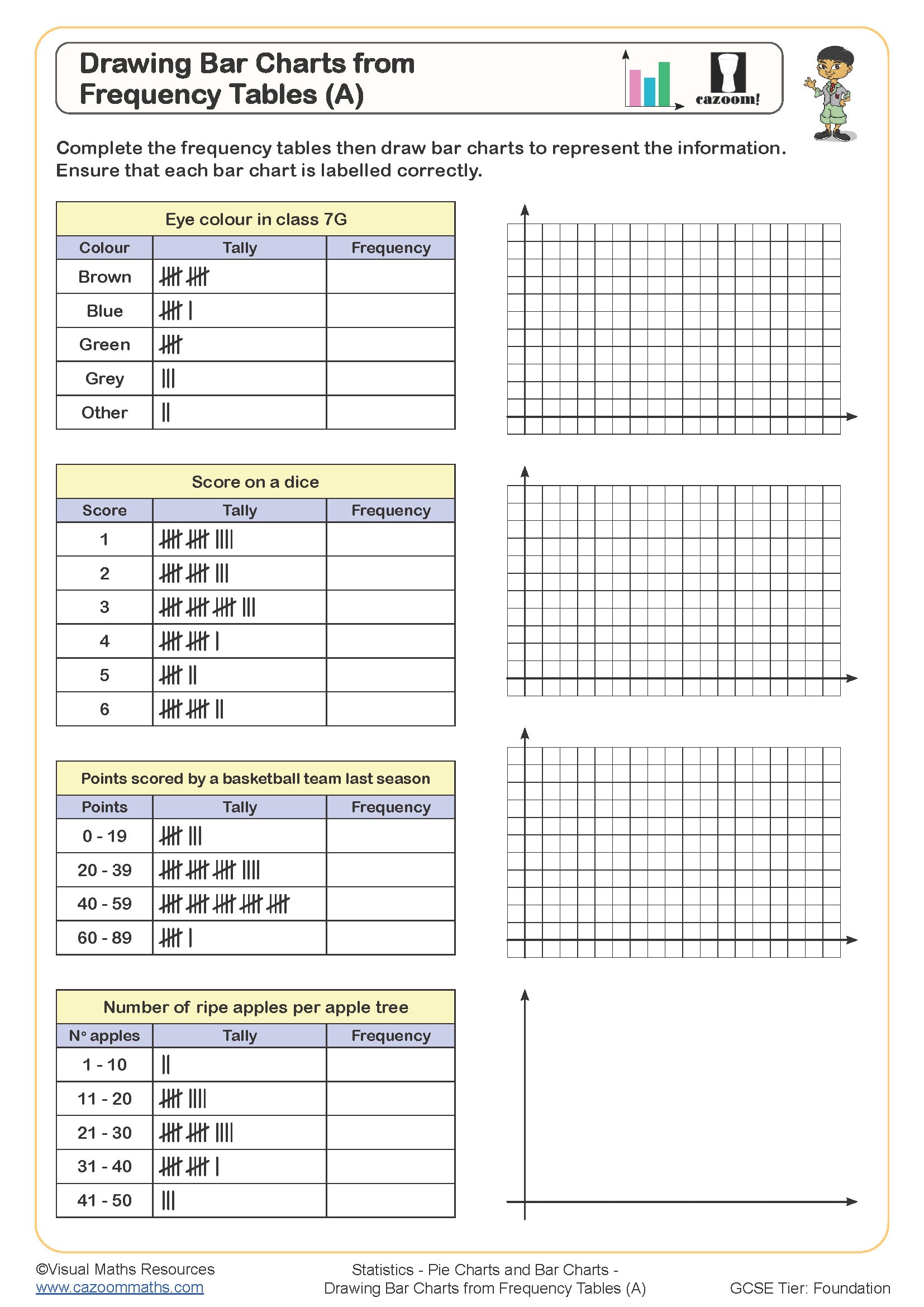
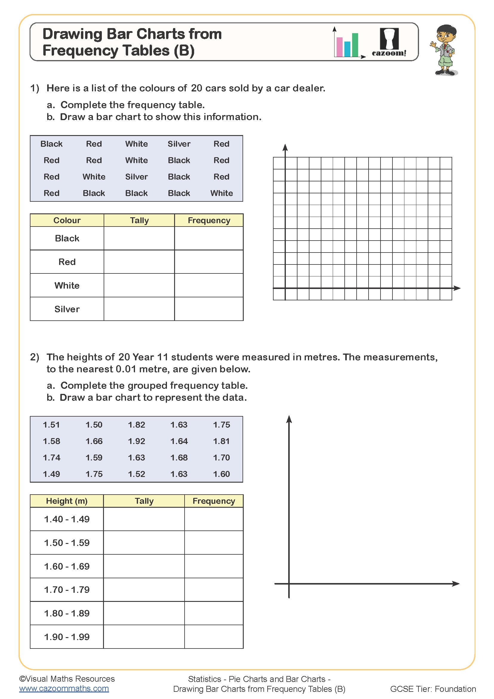
The most frequent errors occur with scale selection and axis labelling. Students often choose scales that don't accommodate their highest value, forcing them to restart, or they select awkward intervals like counting in threes or sevens that make plotting difficult. Many forget to label axes with both the category name and units of measurement, whilst others leave gaps between bars when these should touch for categorical data.
Another persistent issue is inconsistent bar width. Teachers regularly find that students start with wide bars then narrow them when space runs short, creating unprofessional charts that obscure the data comparison. Exam mark schemes explicitly penalise unlabelled axes and incorrect scales, so these foundational skills require careful attention during KS3 to prevent marks being dropped unnecessarily at GCSE.
Which Year Groups Learn Drawing Bar Charts?
These worksheets target Year 7 and Year 8 students within Key Stage 3, where constructing statistical diagrams becomes more sophisticated than primary approaches. At KS2, students work with simple bar charts using straightforward scales, but KS3 introduces more complex datasets requiring careful scale decisions and precise construction techniques that prepare students for GCSE statistics.
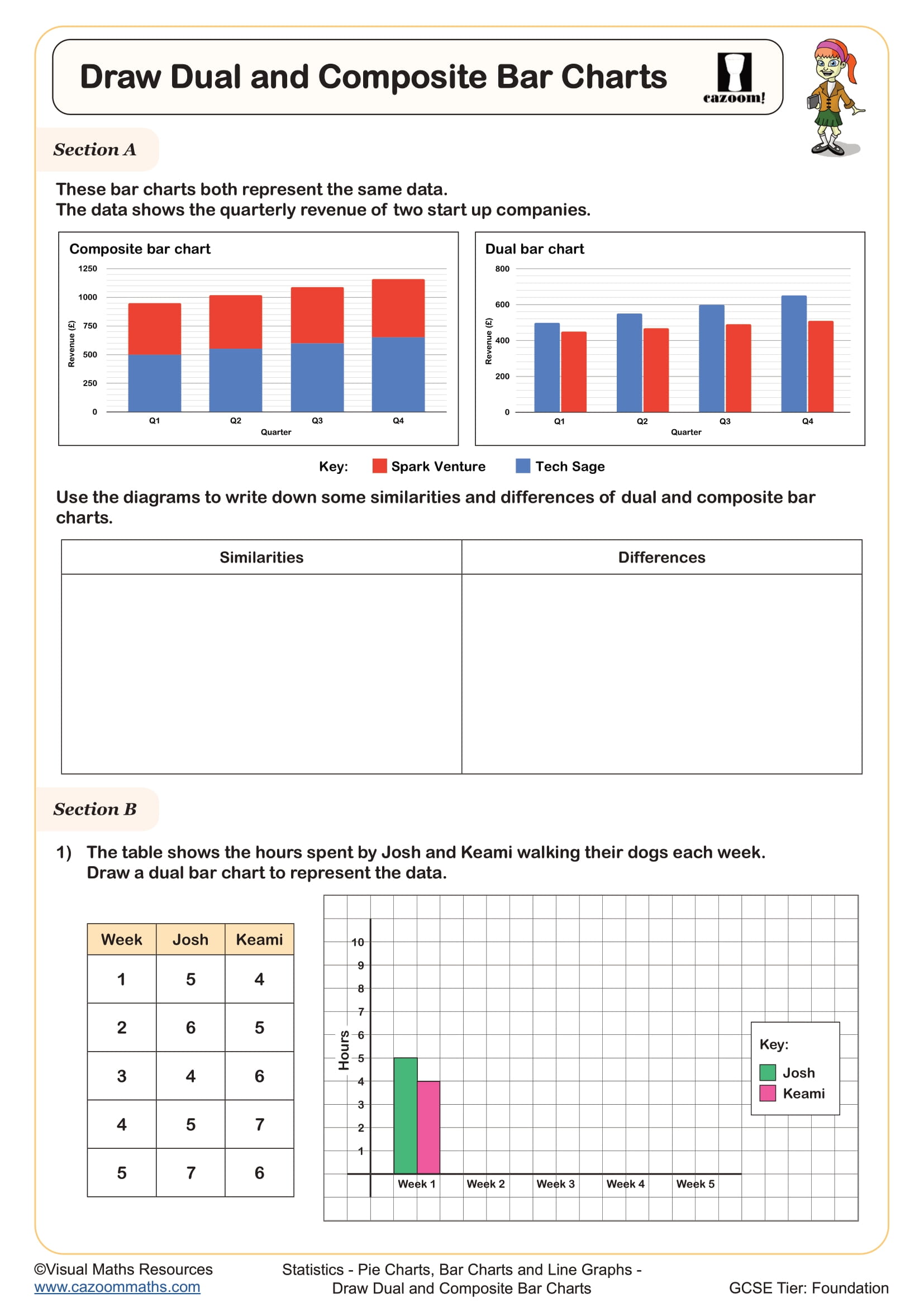
The progression across Year 7 and Year 8 involves increasingly challenging datasets with larger numbers, requiring scales that count in 10s, 50s, or 100s rather than simple unit intervals. Year 8 work often includes dual bar charts comparing two datasets side-by-side, and students begin distinguishing between bar charts for categorical data and histograms for continuous data, setting foundations for the frequency diagram work they'll encounter later in Year 9 and beyond.
How Do You Choose the Right Scale for a Bar Chart?
Selecting an appropriate scale requires identifying the highest value in the dataset, then choosing intervals that allow this maximum to fit comfortably on the available grid. The scale should count in convenient multiples (2, 5, 10, 20, 50, 100) that make plotting and reading values straightforward. Students must ensure equal spacing between intervals and that the scale starts at zero unless there's a specific mathematical reason to use a broken axis, which rarely applies at KS3 level.
This skill connects directly to scientific graphing across STEM subjects. In science practicals, students plot temperature changes, plant growth, or reaction rates using the same scale-selection principles. Geography students apply identical techniques when representing climate data or population statistics. Understanding how scale choice affects data interpretation helps students recognise when media graphs deliberately mislead by manipulating axes, developing critical thinking skills beyond the maths classroom.
How Do These Worksheets Help Students Improve?
The worksheets provide structured practice that breaks down bar chart construction into manageable steps, starting with simpler datasets and clear grid divisions before progressing to situations requiring independent scale decisions. Worked examples demonstrate the complete process from reading data tables through to labelling finished charts, whilst the variety of contexts maintains student engagement across multiple practice questions.
Many teachers use these resources for targeted intervention with students who struggled with initial classwork, as the answer sheets allow students to self-check and identify exactly where their construction went wrong. They work equally well as homework to reinforce classroom teaching or as starter activities to refresh skills before moving to more complex statistical diagrams. Some teachers find paired work effective, with one student constructing the chart whilst their partner checks against success criteria, promoting discussion about mathematical presentation standards before comparing with the provided answers.