Drawing Pie Charts Worksheets
All worksheets are created by the team of experienced teachers at Cazoom Maths.
What Should Students Include When Drawing Pie Charts?
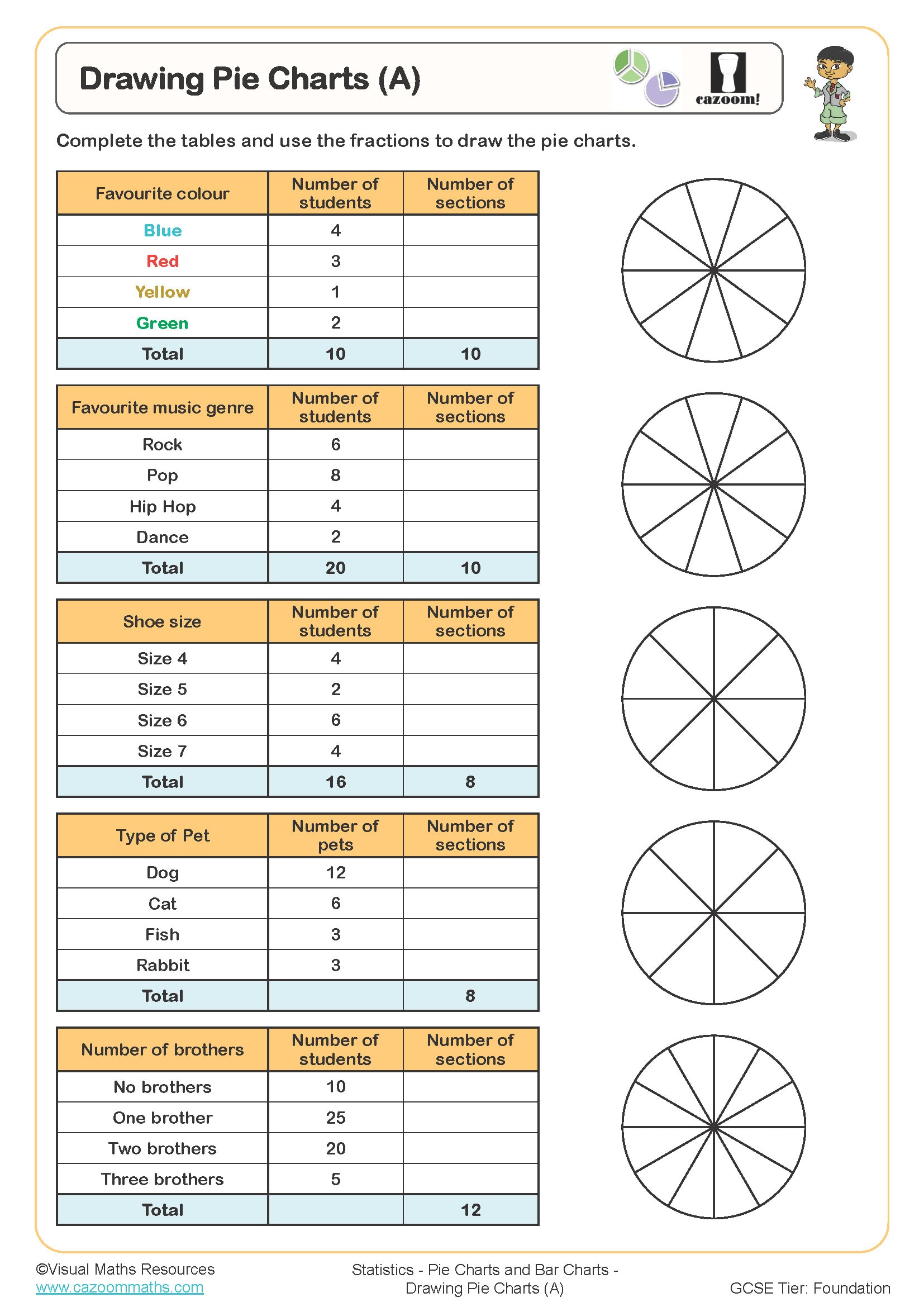
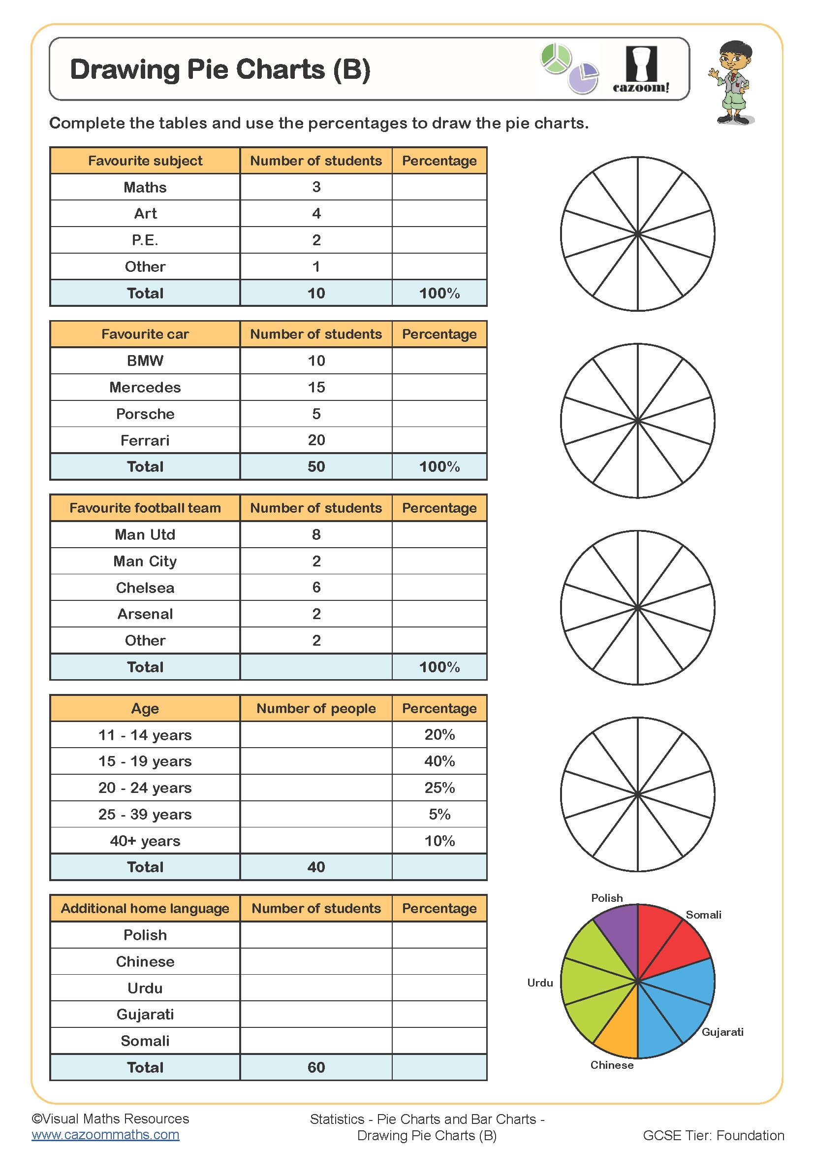
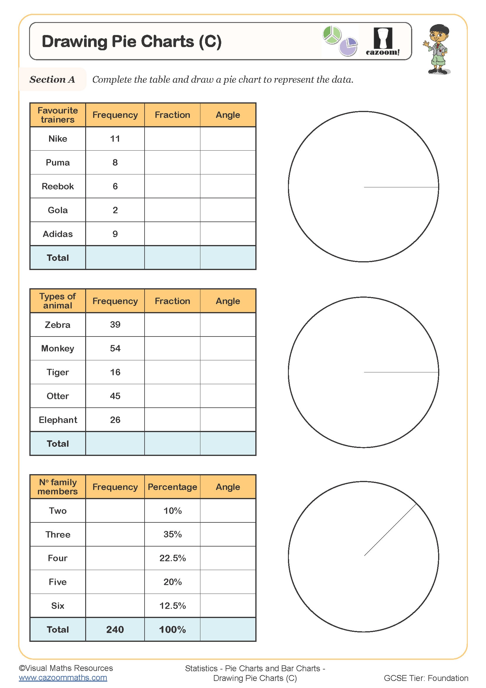
When drawing pie charts, students must include several essential components: a title describing what the chart represents, labels for each sector (either directly on the chart or in a key), and the data values or percentages. The pie chart should be drawn using a protractor to ensure accurate sector angles, with a compass used to create a neat circle. At KS3, students should also show their angle calculations clearly, demonstrating how they converted frequencies into degrees.
A common error teachers observe is students drawing sectors by eye rather than measuring angles precisely, leading to charts that don't accurately represent the data. Students also frequently forget to check their angles sum to 360 degrees before starting to draw. Exam mark schemes specifically award marks for showing the calculation method, not just the final chart, so encouraging students to record their working is essential for success in assessments.
Which Year Groups Learn to Draw Pie Charts?
Drawing pie charts is introduced at KS3, with these worksheets covering Year 7 and Year 8. At Year 7, students typically work with straightforward data sets where the total is a factor of 360, making angle calculations more manageable. They focus on understanding the proportional relationship between frequency and angle, practising the calculation process repeatedly until it becomes automatic.
By Year 8, the complexity increases as students tackle data sets with totals that don't divide neatly into 360, requiring them to work with decimal angles and round appropriately. Students also interpret and compare multiple pie charts, developing their analytical skills. This progression builds towards GCSE, where students must construct pie charts efficiently under time pressure and use them alongside other statistical diagrams to analyse real-world data sets.
How Do You Calculate Angles for Pie Chart Sectors?
To calculate angles for pie chart sectors, students must first find the total frequency by adding all values in the data set. Each sector angle is then calculated using the formula: (frequency ÷ total frequency) × 360°. For example, if 15 out of 60 people chose pizza, the angle would be (15 ÷ 60) × 360° = 90°. Students should calculate all angles before drawing and verify they sum to 360° to catch calculation errors early.
Pie charts appear frequently in data journalism and business contexts, particularly when presenting survey results or market share information. Companies use them in annual reports to show how resources are allocated across departments or how revenue breaks down by product category. Understanding pie charts helps students interpret the statistical graphics they encounter in news articles, scientific studies, and financial reports, developing their data literacy for informed citizenship and future STEM careers.
How Can Teachers Use These Drawing Pie Charts Worksheets?
The worksheets provide structured practice that builds from guided examples through to independent problem-solving. Early questions often include partially completed calculations or angle tables, scaffolding the process whilst students gain confidence with the method. Later questions require students to work through the entire process independently, preparing them for assessment conditions. The answer sheets show full working, allowing students to identify exactly where their method differs if they arrive at incorrect angles.
These resources work effectively for targeted intervention with small groups who need additional practice with proportional reasoning or protractor skills. Many teachers use them for homework following initial teaching, as the answer sheets enable students to self-assess and identify misconceptions before the next lesson. They're also valuable during revision periods, helping students refresh their understanding of pie chart construction alongside interpreting statistical diagrams. Paired work often proves beneficial, with one student calculating whilst the other checks the working step-by-step.