Frequency Polygons Worksheets
All worksheets are created by the team of experienced teachers at Cazoom Maths.
What are the key steps for drawing frequency polygons accurately?
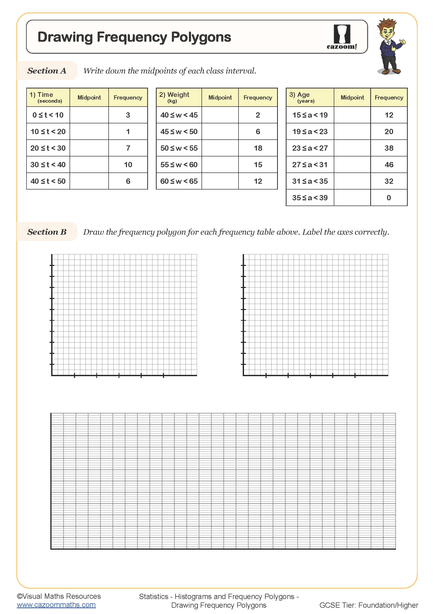
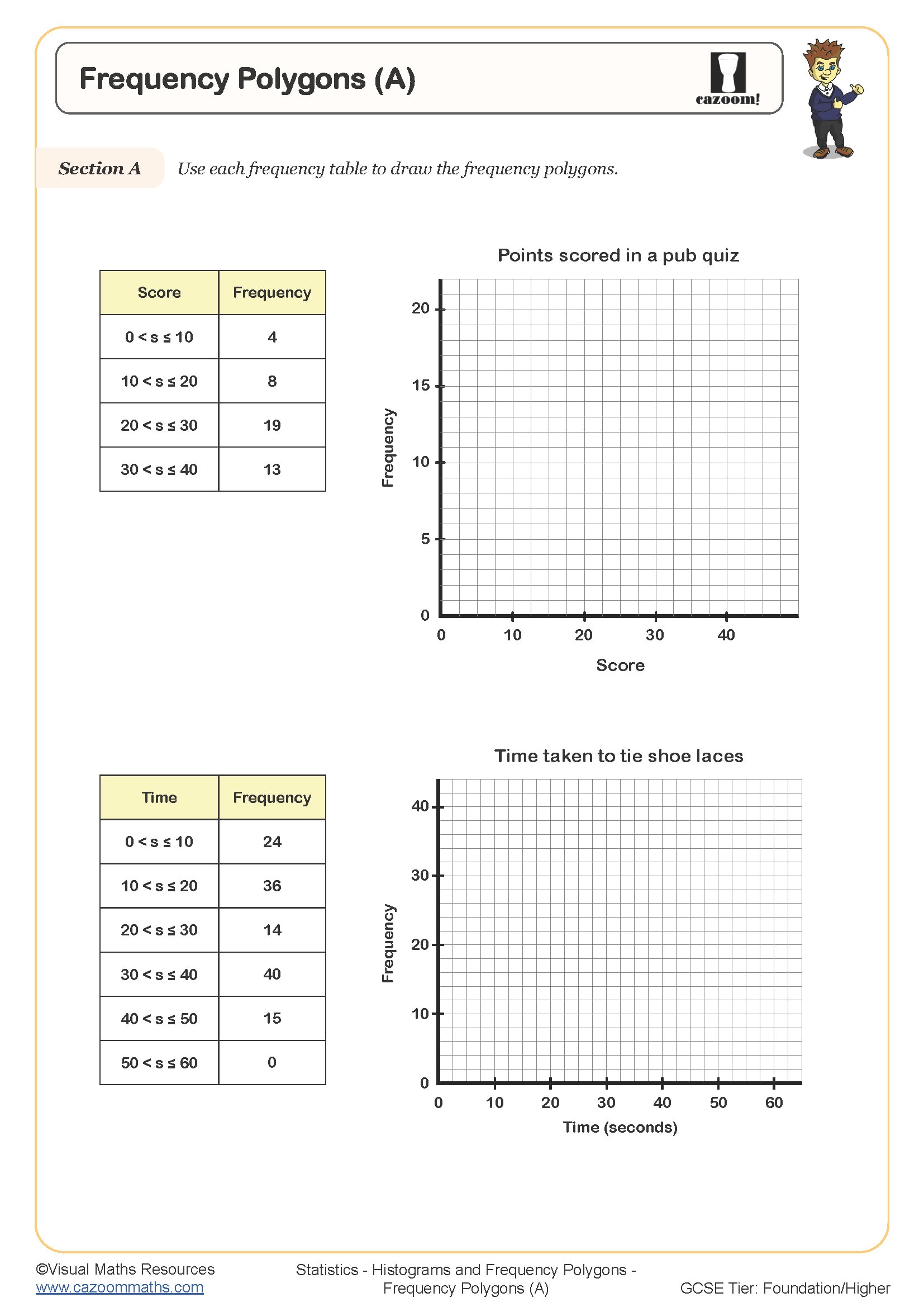
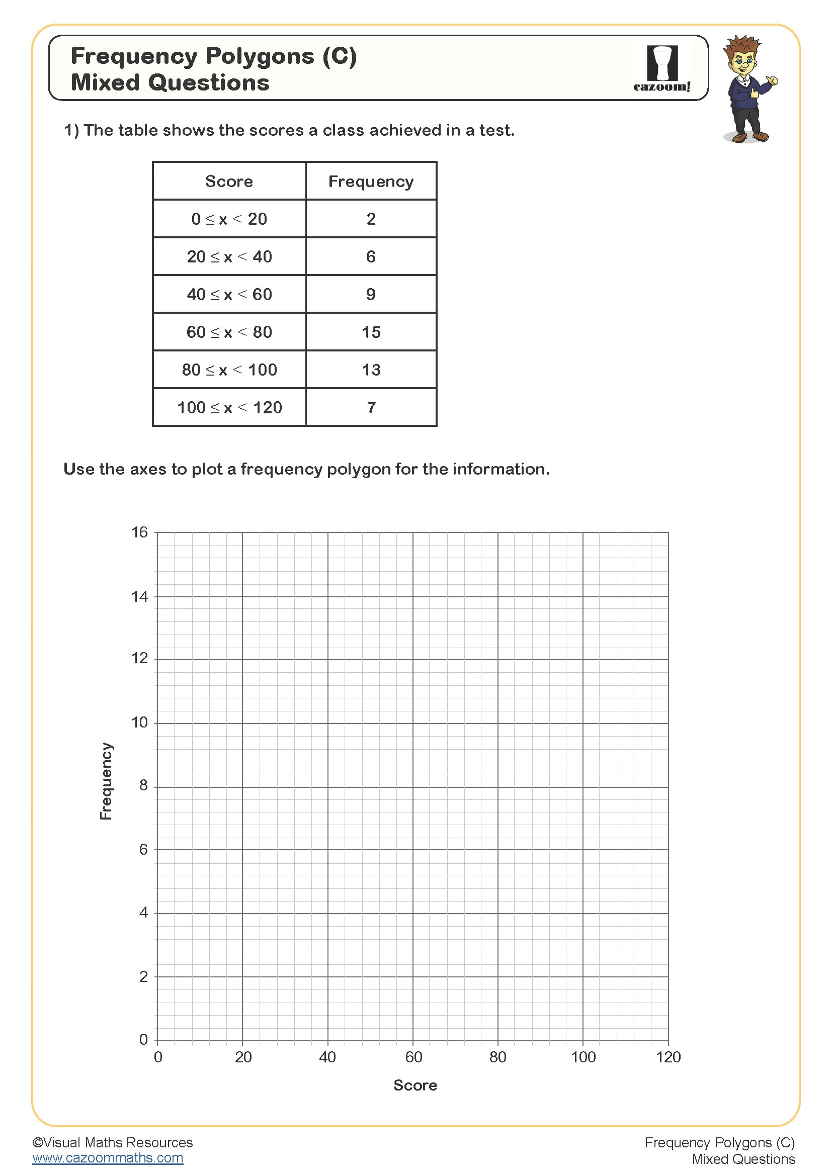
Drawing frequency polygons requires students to follow a systematic approach that builds on their understanding of grouped data. The process involves calculating midpoints for each class interval, plotting these midpoints against their frequencies, and connecting the points with straight lines whilst ensuring the polygon returns to the horizontal axis at zero frequency on both ends. Teachers often use the phrase 'midpoint against frequency' to help students remember the correct coordinates.
A common error occurs when students plot points at class boundaries rather than midpoints, particularly with intervals like 10-20 or 20-30 where the midpoint of 15 or 25 isn't immediately obvious. Students also frequently forget to complete the polygon by extending it to touch the axis before the first class and after the last class, leaving a floating line rather than a closed shape. Mark schemes consistently penalise missing endpoints, so explicit practise with these anchoring points proves valuable.
Which year groups study frequency polygons?
Frequency polygons appear in the KS3 statistics curriculum, typically introduced in Year 8 once students have mastered basic bar charts and frequency tables with grouped data. The National Curriculum expects students to construct and interpret frequency polygons as part of their broader understanding of statistical representations. This topic builds directly on Year 7 work with frequency tables and prepares students for GCSE statistics topics including cumulative frequency curves and histograms.
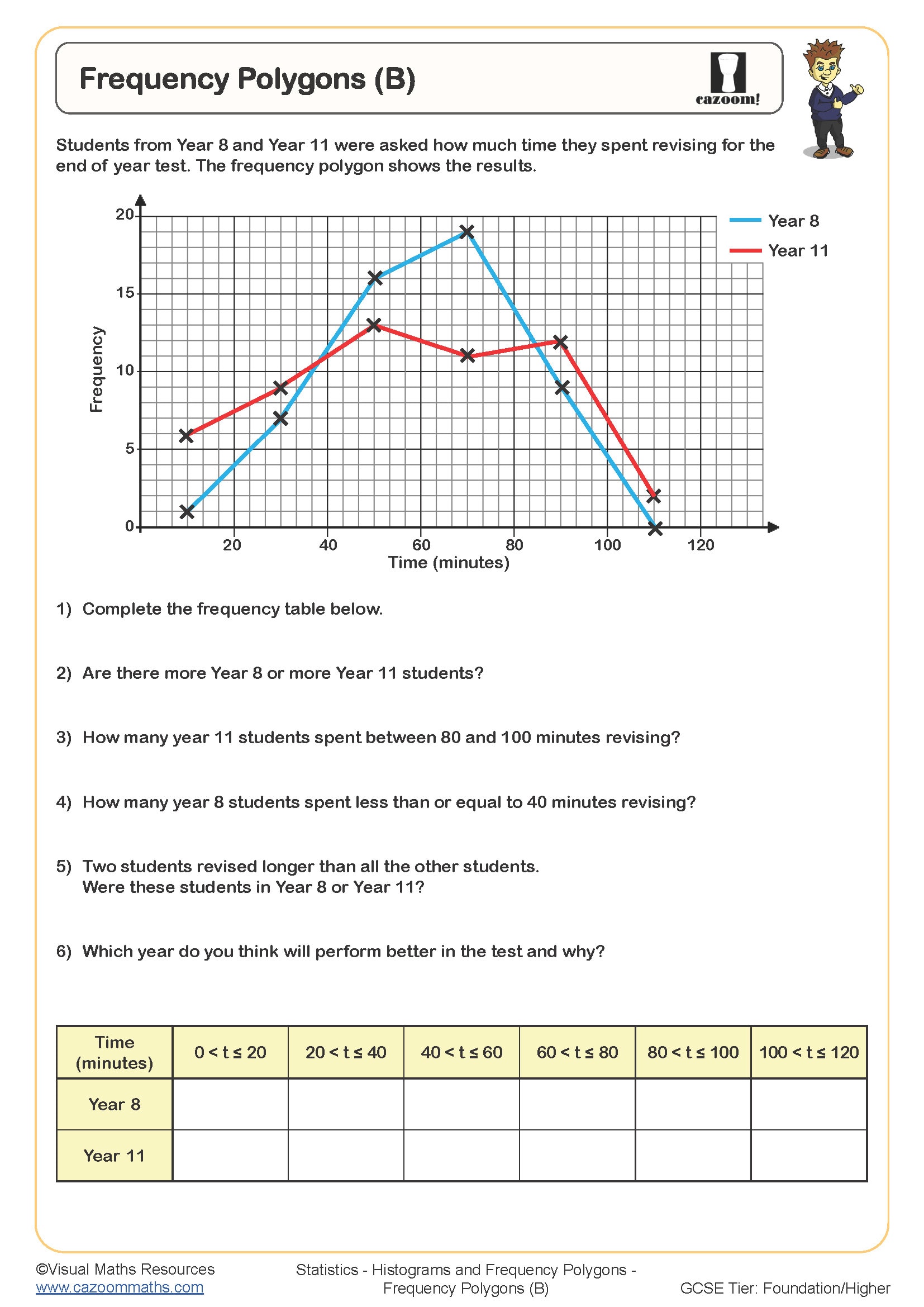
The progression from Year 8 to Year 9 involves increasing complexity in the data sets and class intervals. Year 8 students typically work with simple, equal-width class intervals and smaller data sets, whilst Year 9 worksheets introduce more challenging scenarios with unequal intervals, larger frequency values, and questions requiring comparison between two frequency polygons on the same axes. This layered approach ensures students develop both technical accuracy and interpretative skills before encountering similar graphs at GCSE.
Why is finding midpoints crucial for frequency polygons?
Midpoints represent the central value of each class interval and serve as the horizontal coordinate for plotting frequency polygons. For an interval like 30-40, the midpoint is 35, calculated by adding the boundaries and dividing by two. This positioning assumes data is evenly distributed within each class, allowing the polygon to represent the overall distribution shape effectively. Students must distinguish between class boundaries (the actual limits) and midpoints (the plotting position), as confusing these creates incorrectly shaped graphs.
This skill connects directly to applications in quality control and environmental monitoring, where continuous data like product weights or temperature readings are grouped into intervals. Manufacturing engineers use frequency polygons to visualise production consistency, plotting measurements against frequency to identify whether most products cluster near the target specification. Weather scientists similarly plot temperature ranges throughout a month, with the polygon's shape revealing patterns like bimodal distributions during seasonal transitions. Understanding midpoint calculations ensures these real-world representations accurately reflect the underlying data distributions.
How do these worksheets build confidence with frequency polygons?
The worksheets provide scaffolded questions that begin with completed frequency tables and clear class intervals, allowing students to focus purely on the graphical skills of calculating midpoints and plotting accurately. Early questions include grids with pre-marked scales, whilst later questions require students to choose appropriate scales themselves, developing their decision-making around graph construction. Worked examples demonstrate the complete process, including the crucial step of extending the polygon to meet the axis at both ends.
Teachers find these resources particularly effective for intervention sessions with students who struggle to organise their statistical work systematically. The answer sheets allow for self-assessment during independent practise or homework, helping students identify whether errors stem from midpoint calculations or plotting accuracy. Many teachers use the worksheets for paired work, where one student calculates midpoints whilst the other prepares axes, then they collaborate on plotting. This approach encourages mathematical discussion and helps students articulate the reasoning behind each step.