Frequency Polygons and Histograms Worksheets
All worksheets are created by the team of experienced teachers at Cazoom Maths.
Why do students need histogram and frequency polygon questions with answers pdf practice?
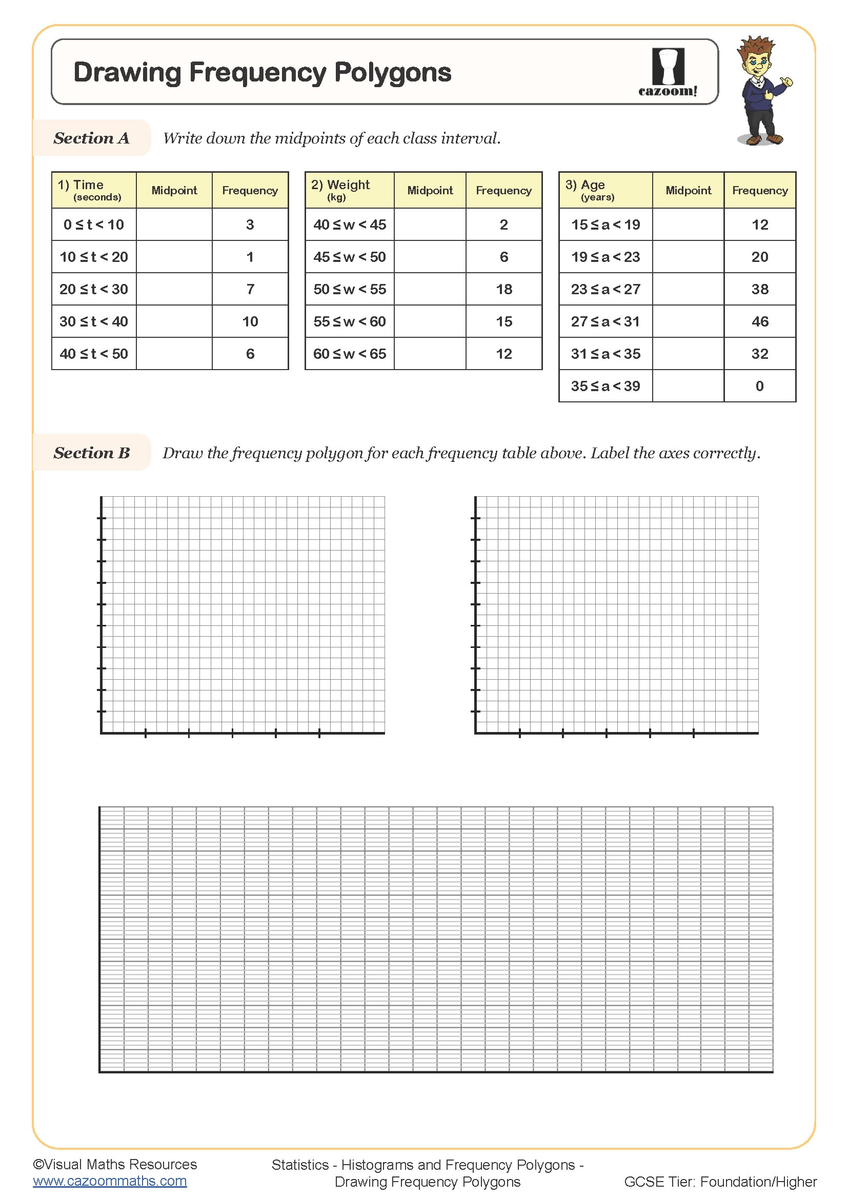
Teachers frequently notice that students find it challenging to move from discrete to continuous data representation, making structured practice important for building confidence with these statistical tools. The National Curriculum requires Key Stage 3 and 4 students to construct and interpret histograms with equal and unequal class intervals, whilst frequency polygons help them visualise data distributions more clearly.
Many mathematics teachers observe that students often confuse frequency and frequency density when working with unequal class widths. Having access to worked solutions allows pupils to check their understanding immediately and identify where calculations went wrong, particularly when determining appropriate scales for the vertical axis.
Which year groups should use these histogram worksheet resources?
These materials suit Key Stage 3 students from Year 8 onwards, with increasing complexity through to GCSE level. Teachers typically introduce basic histograms with equal class widths in Year 8, before progressing to unequal intervals and frequency density calculations in Years 9-11.
Experienced teachers notice that students benefit from revisiting these concepts multiple times with varied contexts. Year 11 students often need additional practice with histogram interpretation for their GCSE examinations, particularly questions involving estimating quartiles and comparing distributions between different datasets.
How do frequency polygons connect to histogram construction?
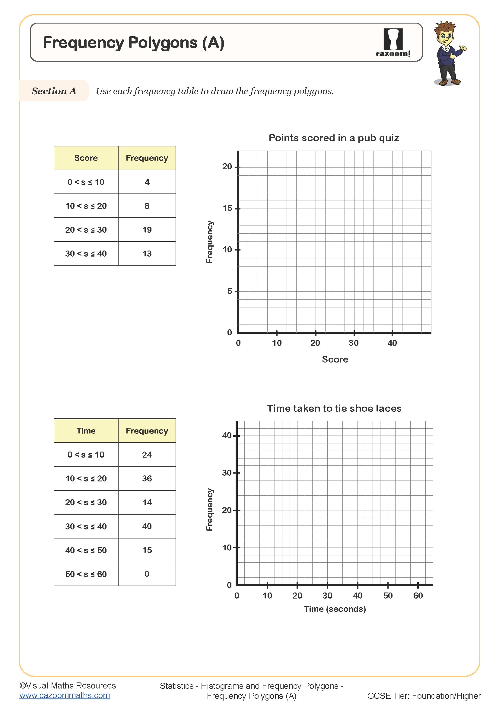
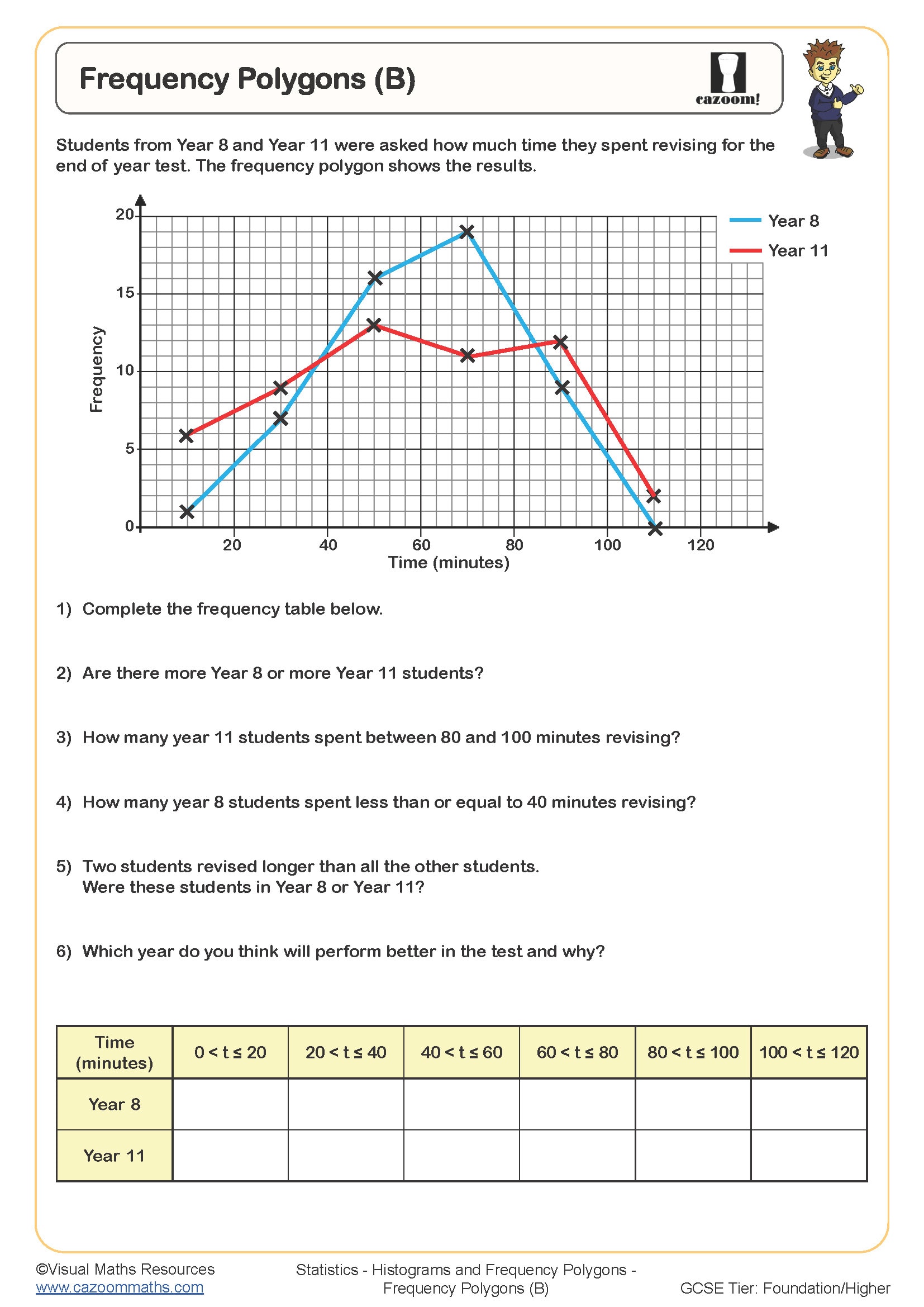
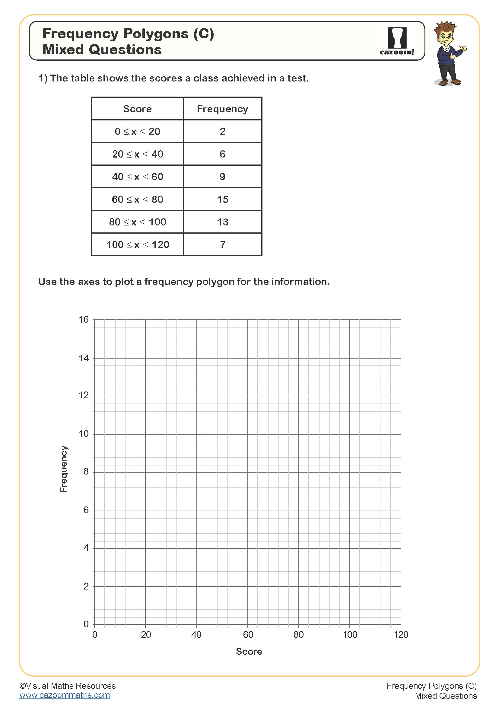
Teachers find that students grasp frequency polygons more easily when they understand the relationship to histograms, as both represent the same continuous data in different visual formats. Frequency polygons plot points at class midpoints and connect them with straight lines, making it easier to compare multiple datasets on the same axes.
Many mathematics teachers observe that students initially place points incorrectly on frequency polygon axes, often plotting at class boundaries rather than midpoints. This misconception becomes particularly problematic when students need to read values from polygons or estimate statistical measures like the median from the graphical representation.
What makes these histograms worksheet resources effective for classroom teaching?
Teachers appreciate having varied question types that progress logically from interpreting existing graphs to constructing their own representations from raw data. The worksheets include real-world contexts like rainfall measurements and test scores, helping students understand practical applications in geography, science, and business studies.
Experienced educators notice that students respond well to step-by-step construction exercises that break down the process into manageable stages. Questions on histogram analysis develop critical thinking skills as pupils learn to make valid comparisons between different distributions and draw appropriate conclusions from statistical evidence.