Histograms Worksheets
All worksheets are created by the team of experienced teachers at Cazoom Maths.
What's the difference between a histogram and a bar chart?
Histograms display continuous data with no gaps between bars, where the area of each bar represents frequency, whilst bar charts show discrete categories with gaps between bars and height alone shows frequency. In histograms, the horizontal axis shows a continuous scale (like heights or weights), whereas bar charts use distinct categories (like types of transport or favourite colours). This distinction appears throughout the National Curriculum from Year 8 onwards and forms a regular GCSE question.
Students commonly draw histograms with gaps between bars or fail to recognise that when class intervals vary in width, they must calculate frequency density rather than plot frequency directly. Mark schemes penalise incorrect axes labels heavily, particularly when students write 'frequency' on the vertical axis instead of 'frequency density' for unequal intervals. Teachers often use real datasets like reaction times or plant heights to reinforce why continuous data needs this specific representation.
Which year groups learn about histograms?
These worksheets cover Year 8, Year 9, Year 10, and Year 11, spanning both KS3 and KS4. Histograms first appear in the National Curriculum during KS3, where students interpret straightforward examples with equal class widths before progressing to more demanding frequency density calculations required for GCSE. The topic connects directly to other statistical concepts like grouped frequency tables and cumulative frequency, forming part of the data handling progression.
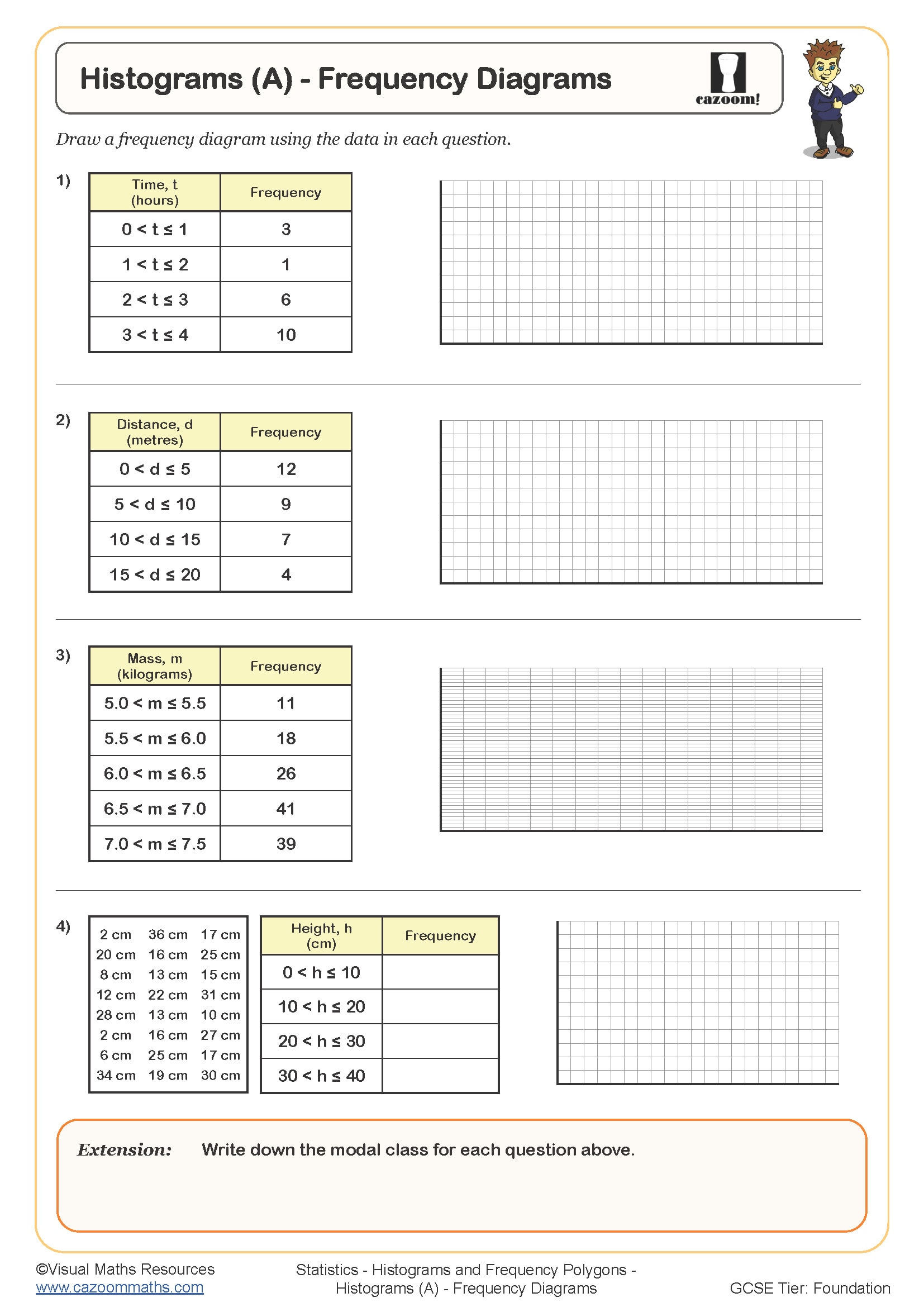
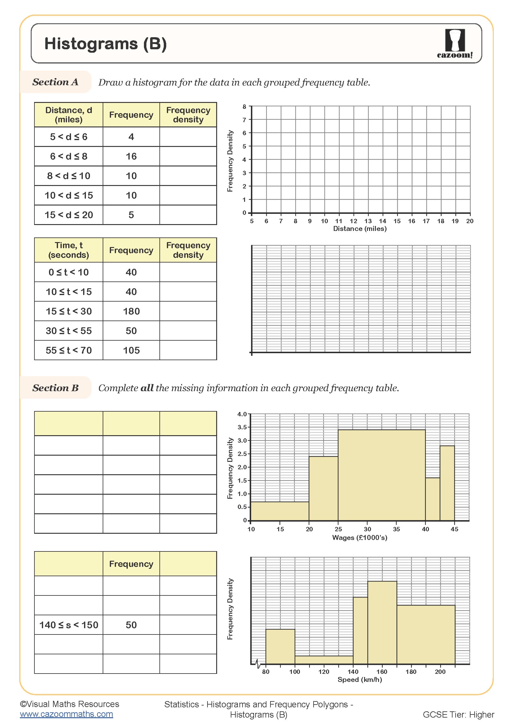
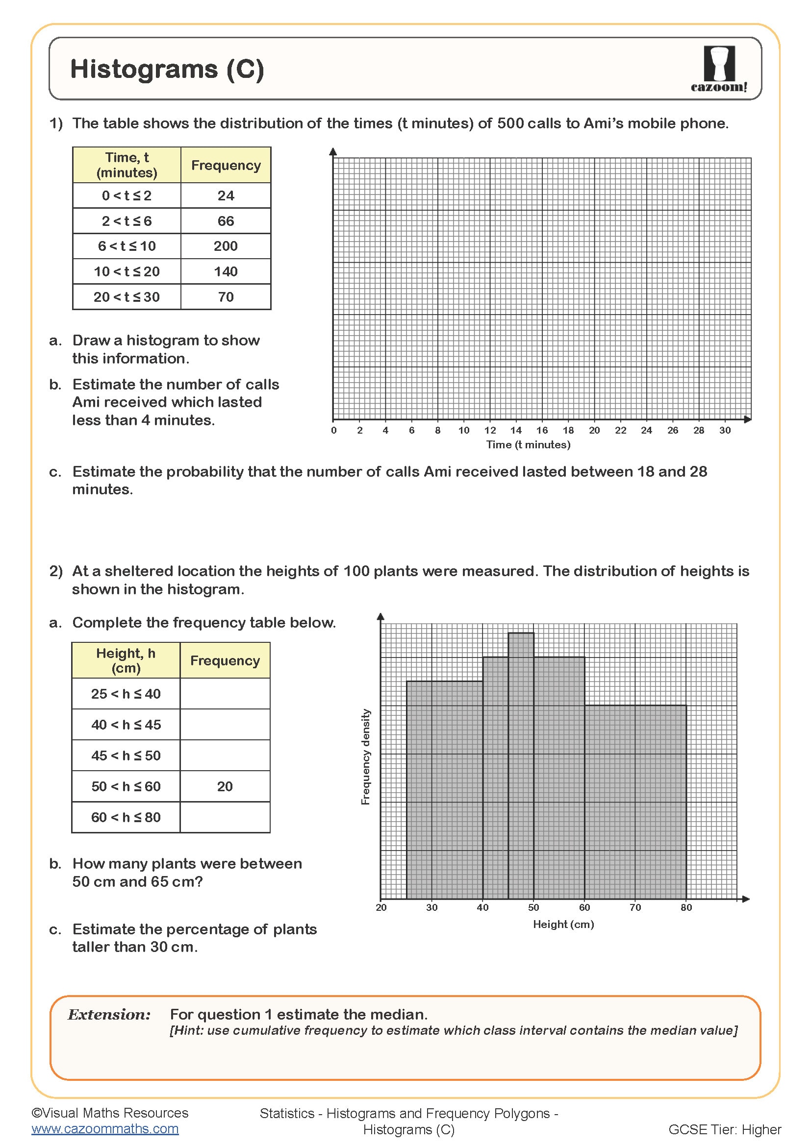
Year 8 and 9 students typically work with equal class intervals, focusing on reading values and understanding what the bars represent. By Year 10 and 11, questions involve unequal class widths where students must apply the frequency density formula (frequency ÷ class width) and reverse the process to find missing frequencies from histogram bars. Foundation tier keeps class widths manageable, whilst Higher tier introduces more complex scenarios with awkward numbers and inference questions.
How do you calculate frequency density for histograms?
Frequency density equals frequency divided by class width, which ensures the area of each bar accurately represents the frequency when class intervals differ. Students must first identify the class width by subtracting the lower boundary from the upper boundary, then divide the frequency by this value. This calculation becomes essential when histograms have unequal intervals, a feature that distinguishes Foundation from Higher tier GCSE questions. Exam mark schemes expect clear working, and students lose marks when they plot frequency directly without converting to frequency density.
This skill applies directly to data science and research contexts where real-world data rarely falls into convenient equal groups. Climate scientists use histograms with varying intervals when analysing temperature ranges over decades, whilst medical researchers examining patient age distributions might group young children in narrow bands but adults in broader decades. Understanding frequency density allows accurate comparison across these unequal groupings, making it more than just an abstract mathematical exercise.
How can teachers use these histogram worksheets effectively?
The worksheets build systematically from interpreting completed histograms to constructing them from grouped frequency tables, with answer sheets allowing students to check their understanding independently. Each question set scaffolds the learning, starting with straightforward reading exercises before progressing to calculations and drawing tasks. Teachers report that having worked solutions helps students identify exactly where errors occur, particularly with the frequency density formula or axis scaling.
Many teachers use these resources for targeted intervention with students who struggle to distinguish histograms from other graphs, assigning specific sections as starter activities before lessons. The worksheets work well for homework between taught sessions, giving students repeated exposure to the skills before assessments. They're also valuable during revision periods, where Year 11 students can focus specifically on histogram questions without working through entire statistics textbooks. Paired work proves effective, with students comparing their drawn histograms and discussing any differences in bar heights or axis labels.