Reading and Interpreting Pie Charts Worksheets
All worksheets are created by the team of experienced teachers at Cazoom Maths.
What makes an effective reading pie charts worksheet for KS3?
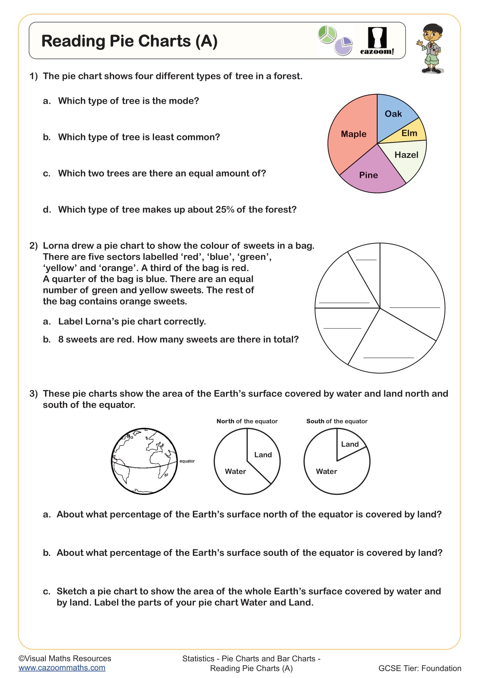
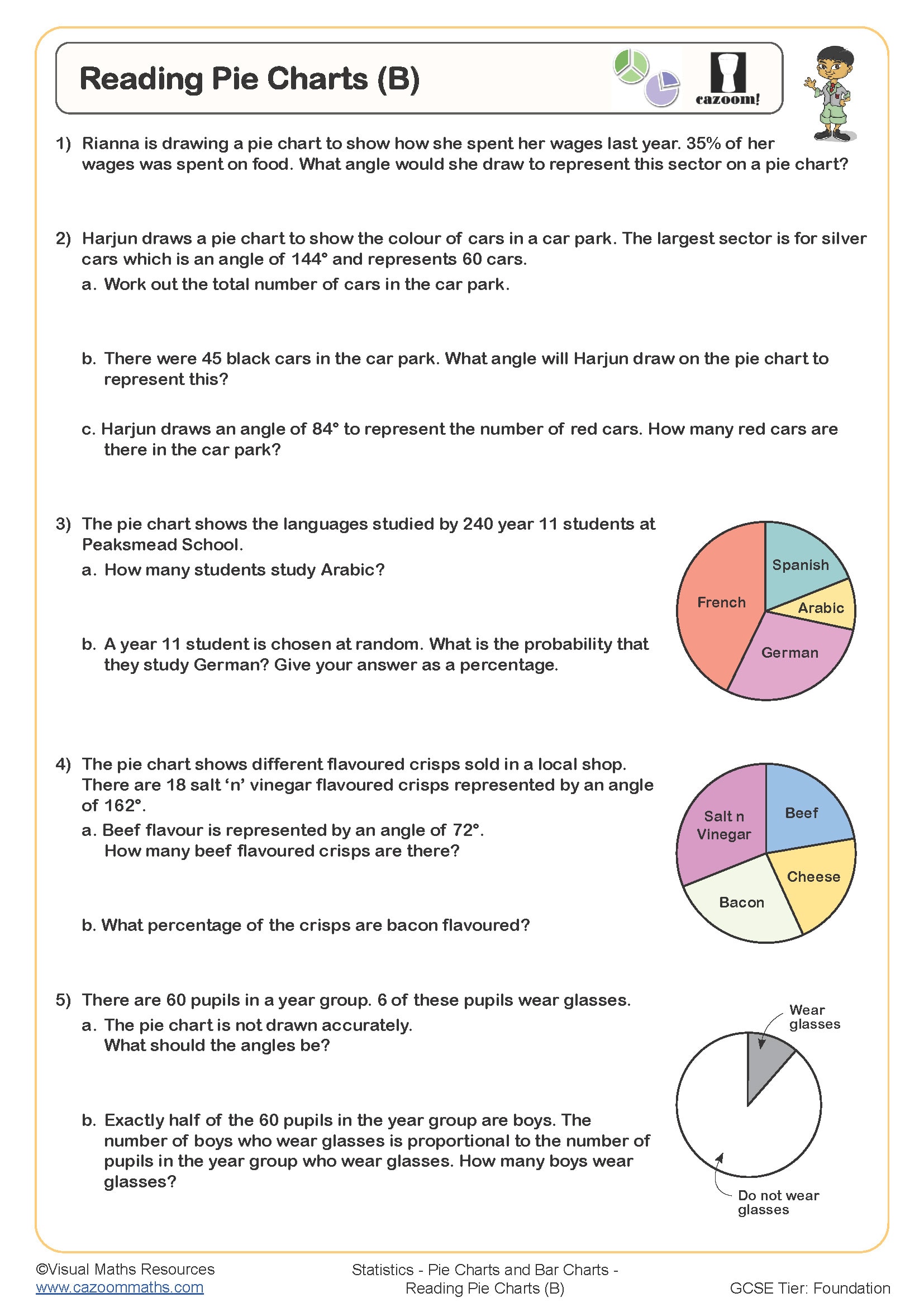
An effective interpreting pie charts worksheet focuses on the key skills outlined in the KS3 National Curriculum: reading data from sectors, calculating missing values, and understanding the relationship between angles and percentages. Quality worksheets progress from simple reading tasks to more complex interpretation questions that require students to make comparisons and draw conclusions.
Teachers find that the most successful pie chart interpretation worksheet resources include a variety of chart styles - some with percentages clearly labelled, others requiring angle calculations, and real-world contexts like budget breakdowns or survey results. This variety ensures students can tackle the different formats they'll encounter in GCSE assessments.
Which year groups should use interpreting pie charts questions?
Pie charts ks3 work typically begins in Year 7, where students learn basic reading skills and simple fraction-to-percentage conversions. By Year 8, students tackle more complex calculations involving angles and missing data, building towards the analytical skills needed for GCSE statistics.
Year 9 teachers often use interpreting pie charts as revision before moving to more advanced statistical concepts. The progression works well because students can apply their knowledge of fractions, percentages, and angles in a visual context that connects to real-world data representation they encounter in other subjects and everyday life.
How do you calculate missing values from pie chart sectors?
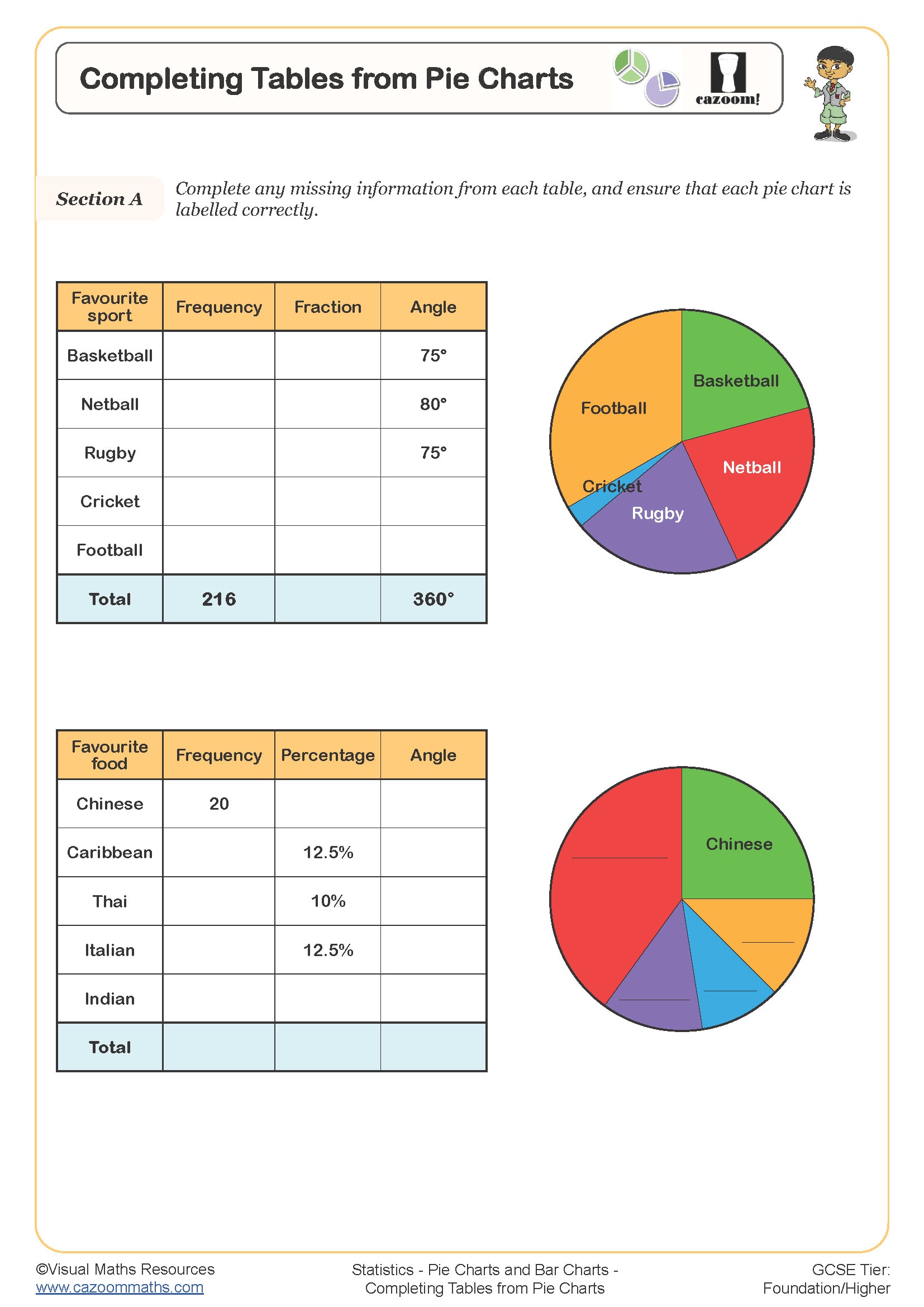
Missing value calculations require students to understand that the whole pie represents the total sample size, with each sector showing a proportion of this total. Teachers observe that students often struggle when given an angle measurement but need to find the actual number of people or items in that category.
The key teaching point involves helping students recognise the relationship: if 360° represents the total, then any sector angle divided by 360° gives the fraction of the whole. Multiplying this fraction by the total sample size reveals the missing value. Practice with this method builds confidence for the more complex statistical analysis required at GCSE level.
How should teachers use these pie chart worksheets in lessons?
These worksheets work most effectively when introduced after students have had hands-on experience creating simple pie charts themselves. Teachers find that starting with a brief recap of angle relationships helps students approach the interpretation tasks with confidence, particularly when charts require calculation rather than direct reading.
The answer sheets enable teachers to set these as independent practice or homework, with students checking their own work. Many teachers use selected questions as starter activities or assessment tasks, as the visual nature of pie charts makes them excellent for identifying gaps in students' understanding of proportional reasoning and data interpretation skills.