Scatter Graphs Worksheets
All worksheets are created by the team of experienced teachers at Cazoom Maths.
What makes a good scatter graphs worksheet for KS3 and KS4 students?
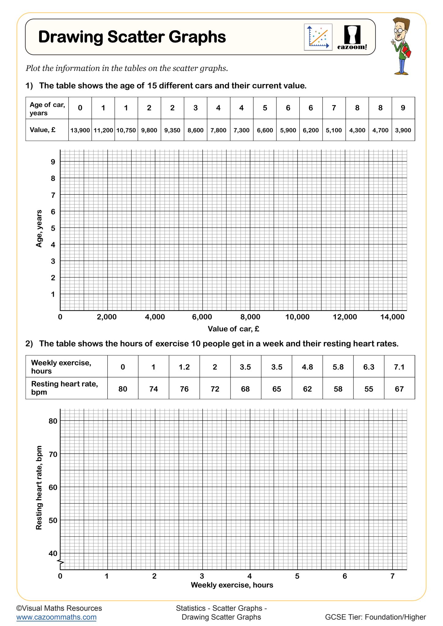
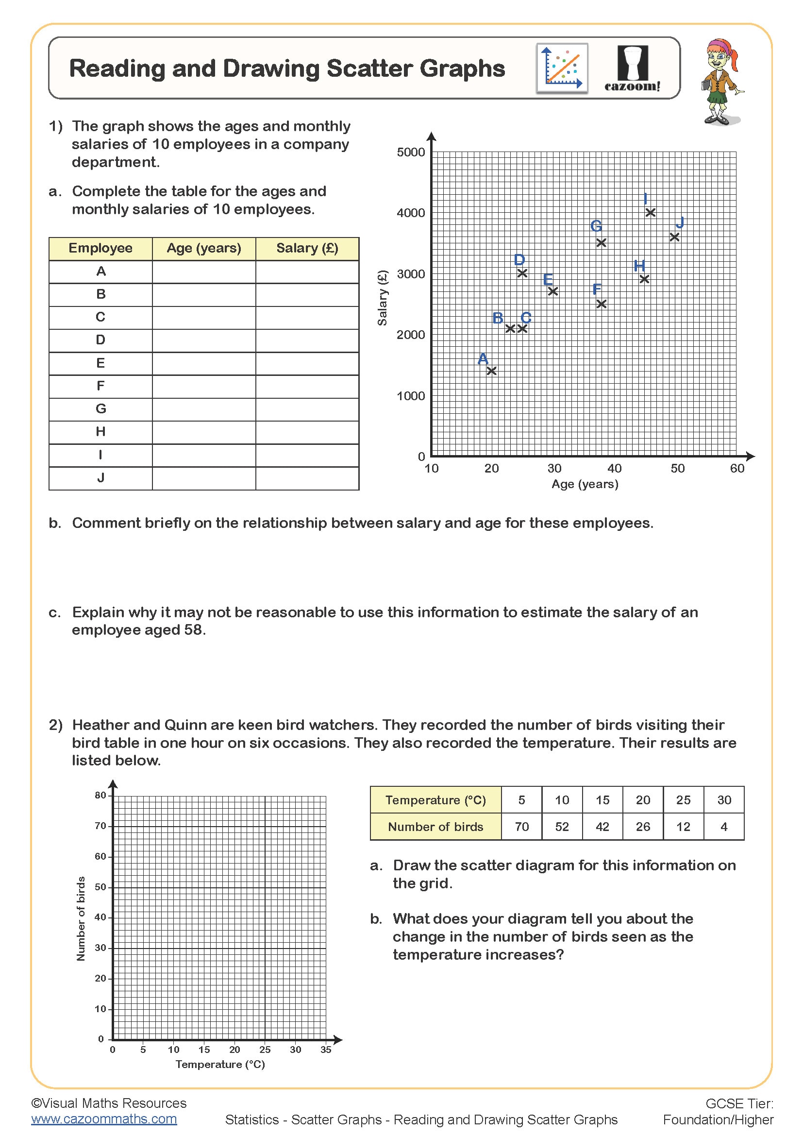
Effective scatter graphs worksheet resources should progress systematically from basic plotting skills to correlation analysis. Students need structured practice that begins with simple data sets and clear scaling before advancing to real-world contexts like height versus shoe size or revision time against test scores. The plotting scatter graphs worksheet activities should emphasise accurate axis labelling and appropriate scale selection.
Teachers frequently observe that students rush the plotting stage and create cramped graphs with poor scaling. Quality worksheets include explicit guidance on choosing suitable scales and provide grid templates where necessary. Answer sheets become particularly valuable for scatter graph work, as teachers can quickly identify whether plotting errors stem from calculation mistakes or poor graph construction techniques.
Which year groups typically study scatter graphs and correlation?
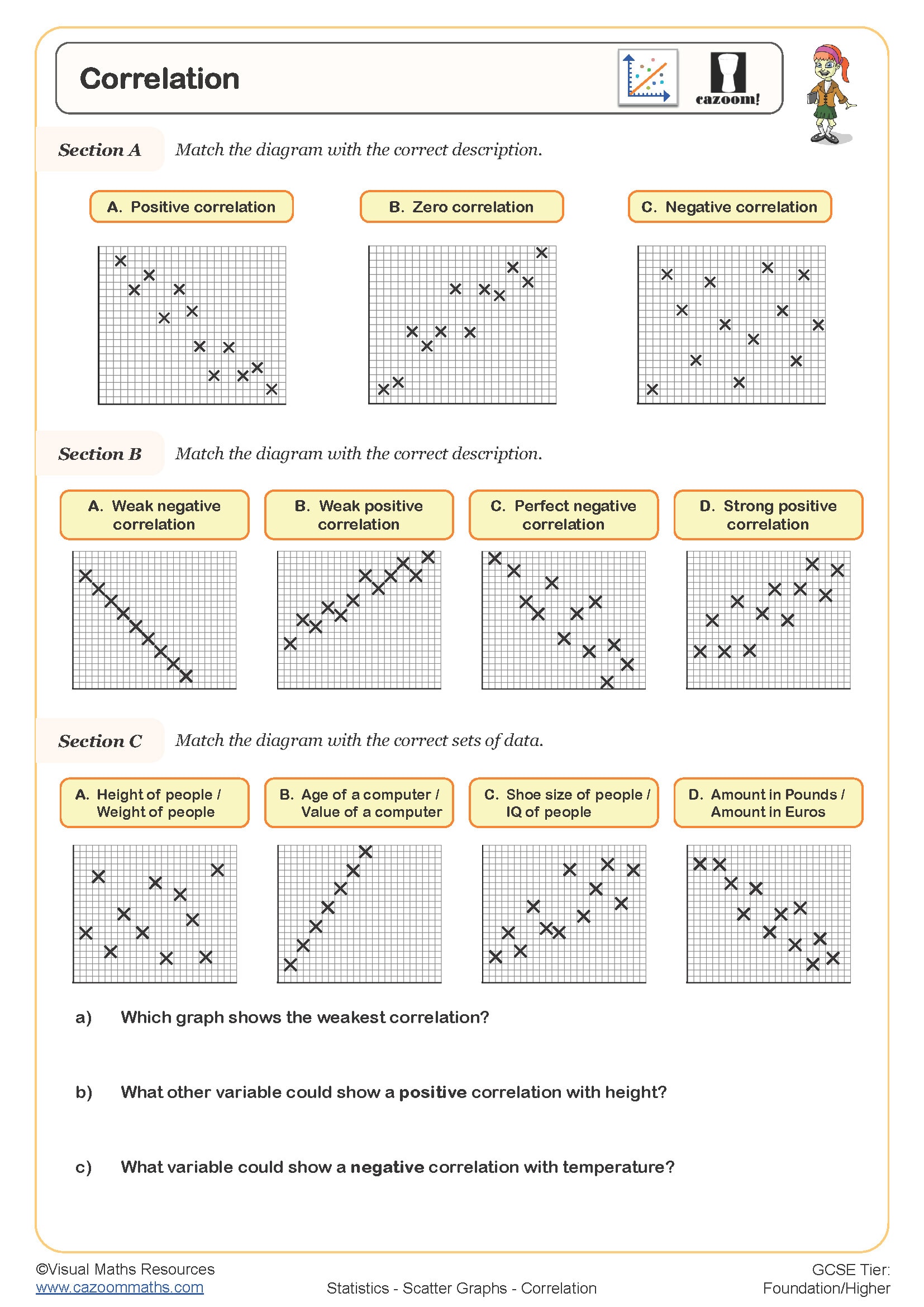
Scatter graphs appear prominently in the KS3 statistics curriculum, usually introduced in Year 8 when students have developed sufficient coordinate skills. The topic extends through KS4, where GCSE students encounter more sophisticated correlation analysis and line of best fit calculations. Foundation tier focuses on recognising correlation types, while Higher tier students work with correlation coefficients and making predictions.
Teachers notice a significant jump in complexity between KS3 scatter diagram interpretation and GCSE requirements. Students who confidently identify positive correlation in Year 8 often struggle with quantifying correlation strength or drawing accurate lines of best fit in Year 10. Regular practice with varied data sets helps bridge this gap and builds confidence with statistical reasoning.
How do students learn to draw lines of best fit effectively?
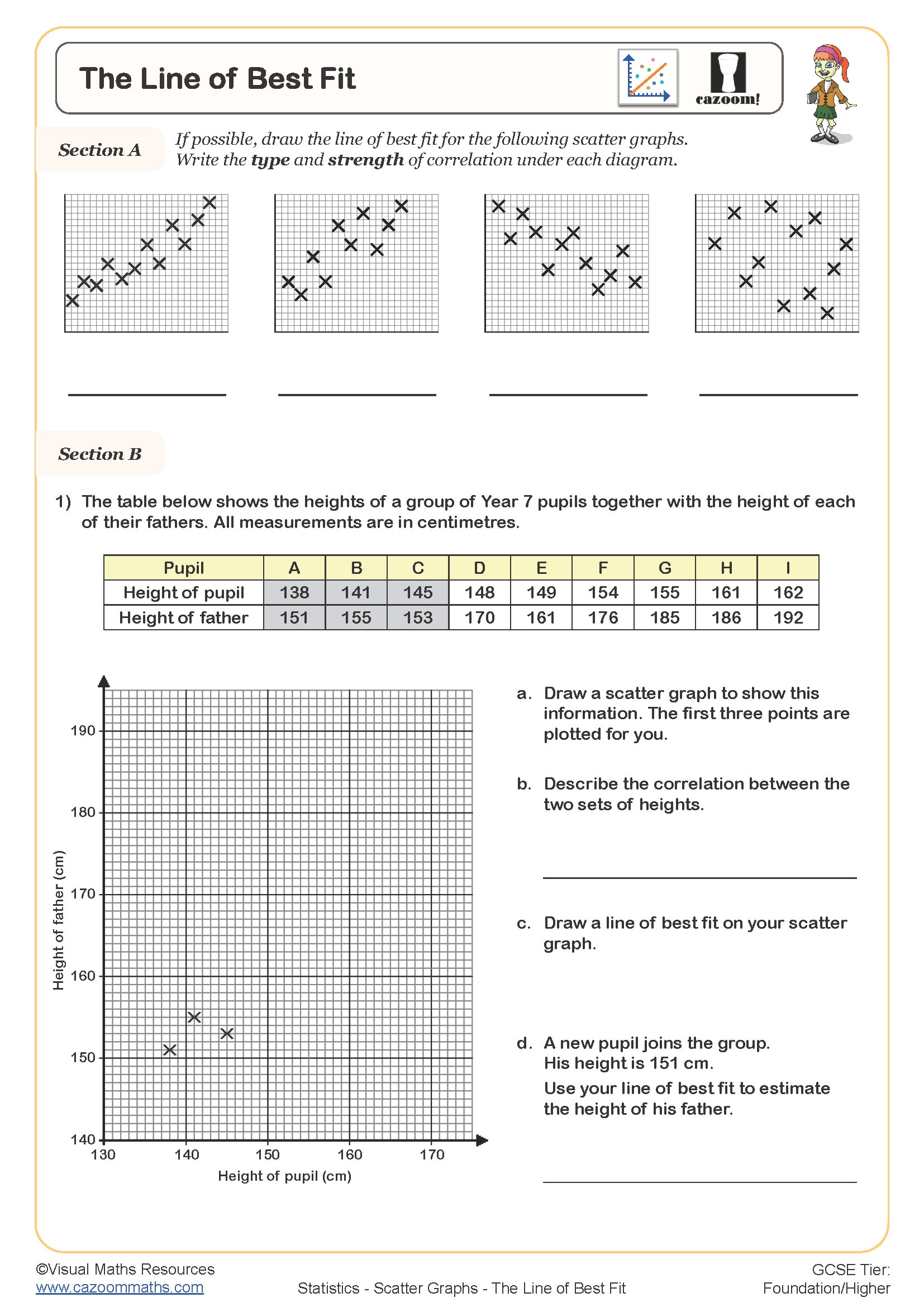
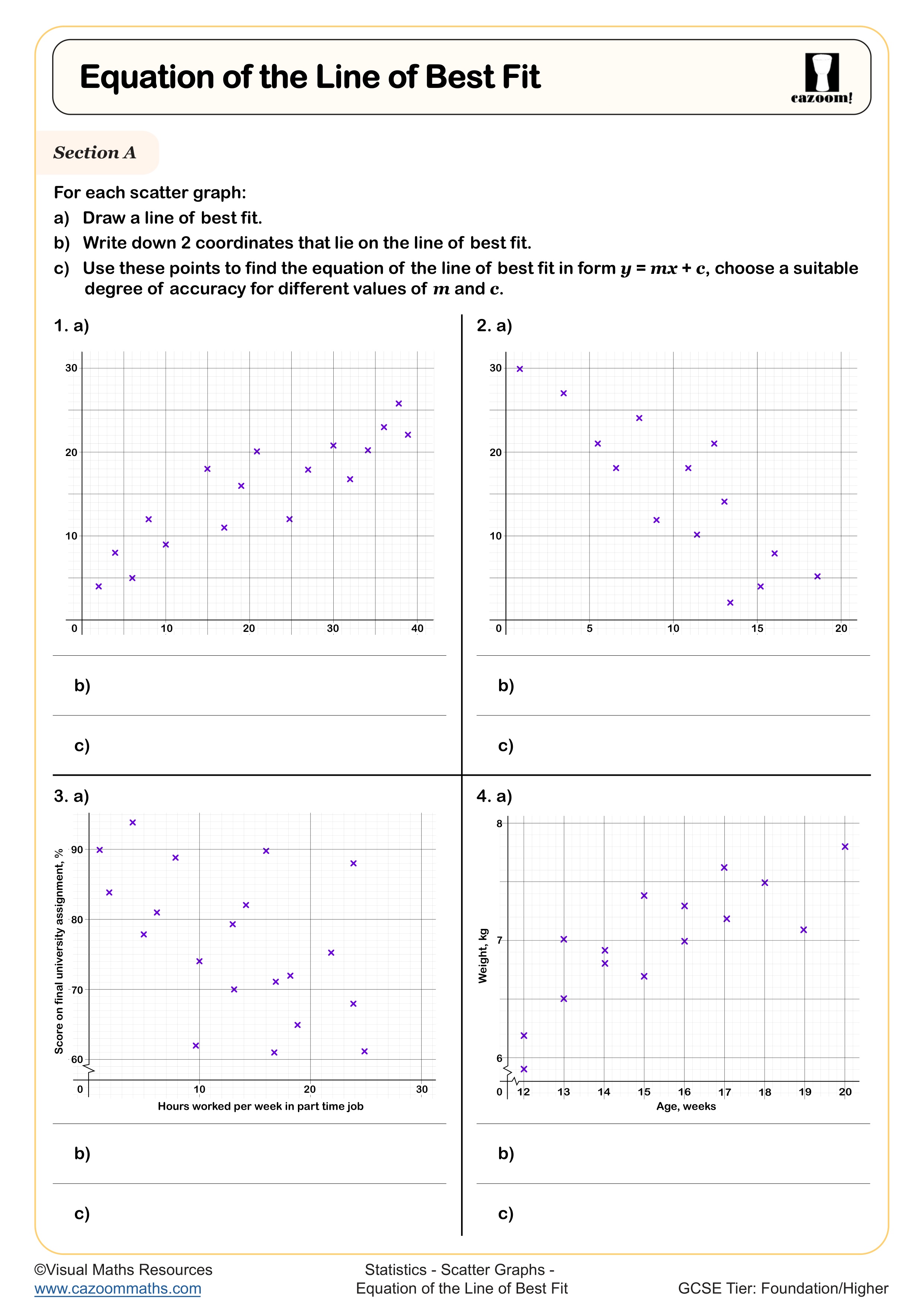
Drawing accurate lines of best fit requires students to balance data points equally on either side of the line while ensuring it passes through the mean point when possible. This skill builds naturally from scatter diagram worksheet practice that emphasises visual pattern recognition before introducing formal techniques.
Mathematics teachers consistently observe that students initially draw lines connecting the extreme points rather than representing the overall trend. Effective worksheets provide guided practice with clearly correlated data before progressing to more ambiguous scatter patterns. Students benefit from physically using rulers and being taught to ignore obvious outliers when determining line placement, skills that prove structured for GCSE examination success.
How can teachers use these scatter graphs worksheets most effectively?
Teachers achieve the best results by introducing scatter graphs through familiar contexts that engage student interest, such as sports statistics or mobile phone usage data. Starting with strong positive correlations helps students recognise patterns before exploring negative or zero correlation examples. Peer discussion during plotting activities often reveals misconceptions early.
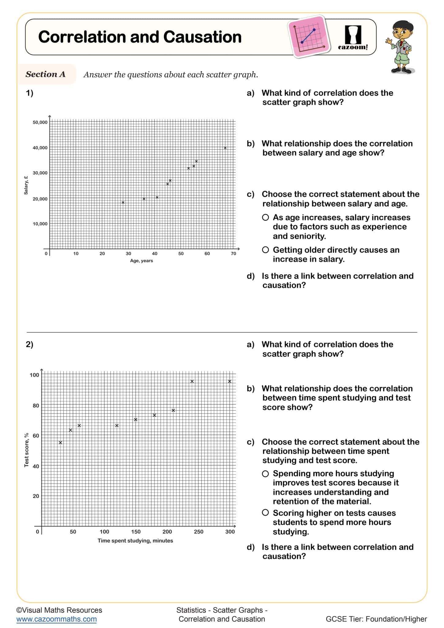
Classroom experience shows that students benefit from working in pairs during initial scatter diagram construction, with one student reading coordinates while the other plots points. This collaborative approach reduces plotting errors and encourages mathematical discussion. Teachers should emphasise that correlation doesn't imply causation through carefully chosen examples, preparing students for the critical thinking required in GCSE statistics questions and real-world data interpretation.