Year 8 Scatter Graphs Worksheets
All worksheets are created by the team of experienced teachers at Cazoom Maths.
What should students practise with scatter graph worksheets?
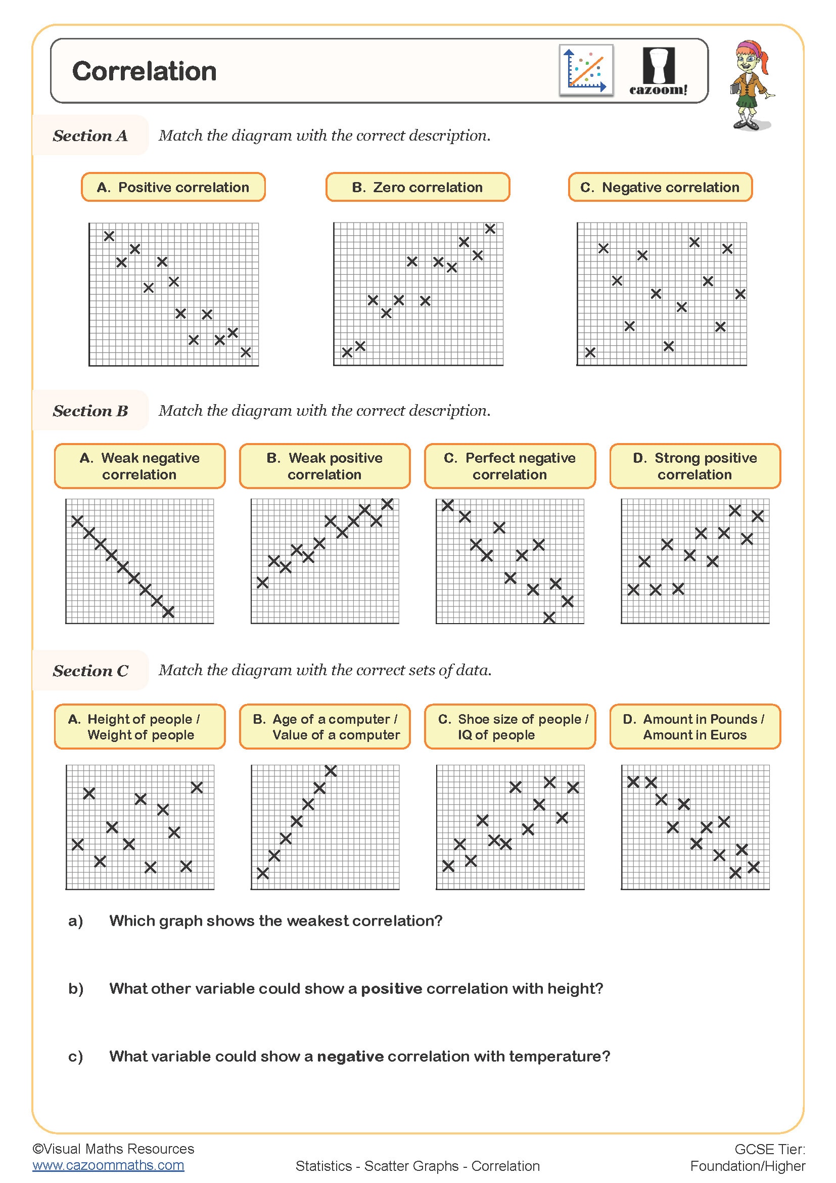
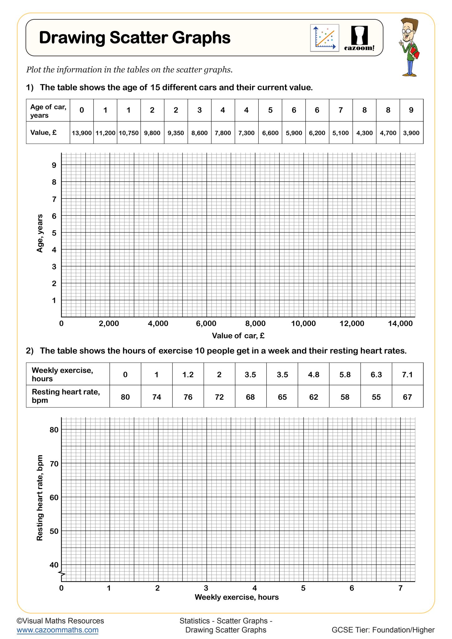
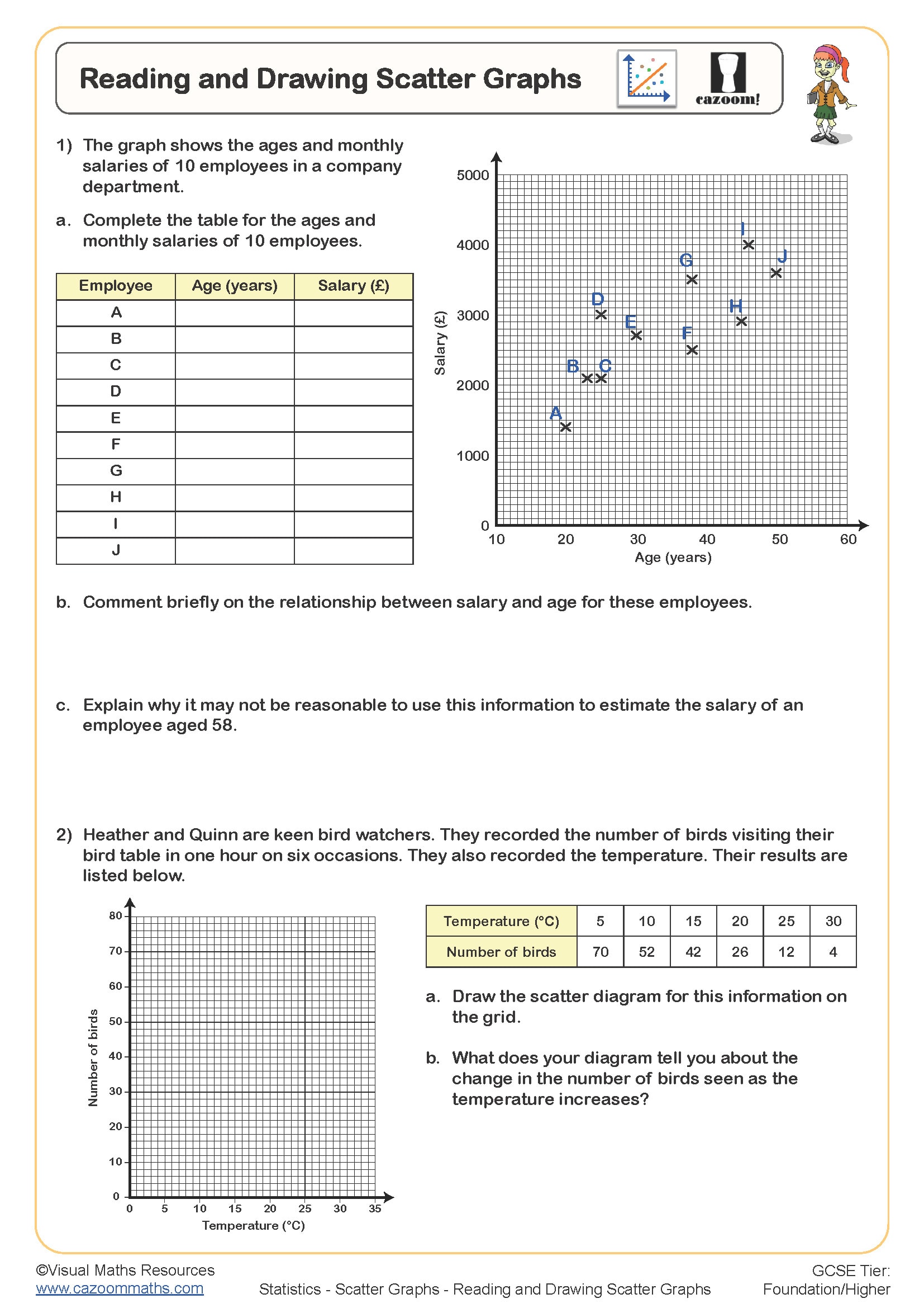
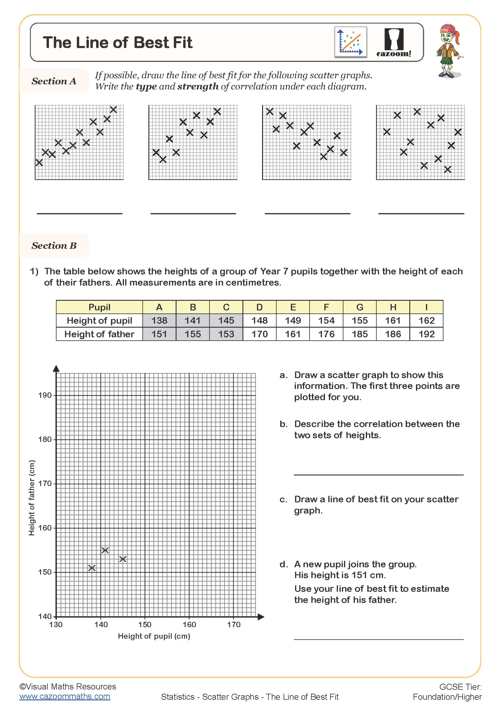
Scatter graphs worksheets should cover the fundamental skills outlined in the KS3 and KS4 statistics curriculum: plotting coordinates from data tables, choosing appropriate scales, identifying types of correlation (positive, negative, or no correlation), and drawing lines of best fit. Students need practice interpreting scatter diagrams in real-world contexts such as comparing heights and weights, or examining the relationship between study time and test scores.
Maths teachers notice that many students plot points incorrectly when data contains decimal values or when axes don't start from zero. Effective scatter diagram worksheets provide varied scales and contexts, helping students develop the flexibility needed for GCSE examination questions where data presentation can be more challenging than textbook examples.
Are scatter graphs suitable for Year 7 students or mainly Year 8?
Scatter graphs typically appear in Year 8 mathematics as part of the data handling and statistics strand, though some schools introduce basic plotting in Year 7. The National Curriculum expects students to construct and interpret scatter graphs by the end of KS3, making Year 8 the optimal time for thorough coverage including correlation analysis and lines of best fit.
Year 7 students can successfully tackle simple plotting exercises, but teachers find that correlation concepts require the mathematical maturity that develops in Year 8. Schools often revisit scatter graphs in Year 9 and Year 10, adding complexity through outliers, interpolation and extrapolation, before students encounter more sophisticated statistical analysis at GCSE level.
How do students learn to draw lines of best fit accurately?
Drawing lines of best fit requires students to identify the general trend in scattered data points and draw a straight line that passes as close as possible to most points, with roughly equal numbers above and below the line. This skill bridges the gap between basic plotting and statistical interpretation, forming a crucial component of GCSE statistics questions.
Maths teachers observe that students often draw lines connecting the first and last points, or attempt to pass through every single point, missing the concept entirely. Effective practice involves worksheets where students see multiple correct lines of best fit for the same data set, helping them understand that slight variations are acceptable provided the line represents the overall trend accurately.
How can teachers use these worksheets most effectively in lessons?
Teachers achieve better outcomes by starting with simple contexts where students can predict relationships before plotting, such as height versus shoe size or temperature versus ice cream sales. Begin each lesson with a brief discussion of what correlation students expect to see, then use worksheets progressively from basic plotting through to complex interpretation tasks.
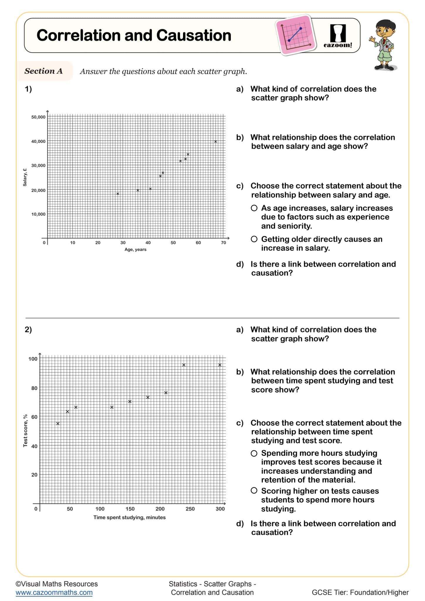
Classroom experience shows that students benefit from working in pairs during initial plotting activities, as this reduces coordinate errors and encourages discussion about scale selection. Teachers often use the answer sheets during mini-plenaries to address common misconceptions immediately, particularly around correlation strength and the difference between correlation and causation in real-world contexts.