8th Grade Scatter Graphs Worksheets
All worksheets are created by the team of experienced teachers at Cazoom Math.
What are scatter graphs and why do students learn them in 8th grade?
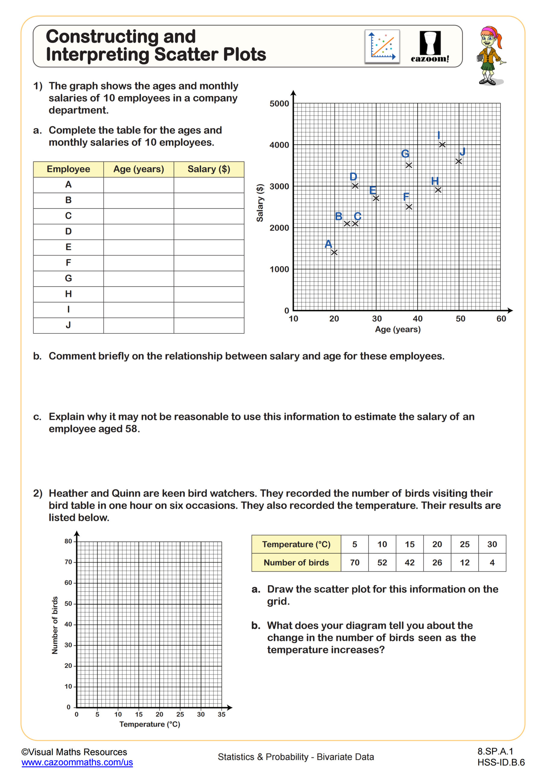
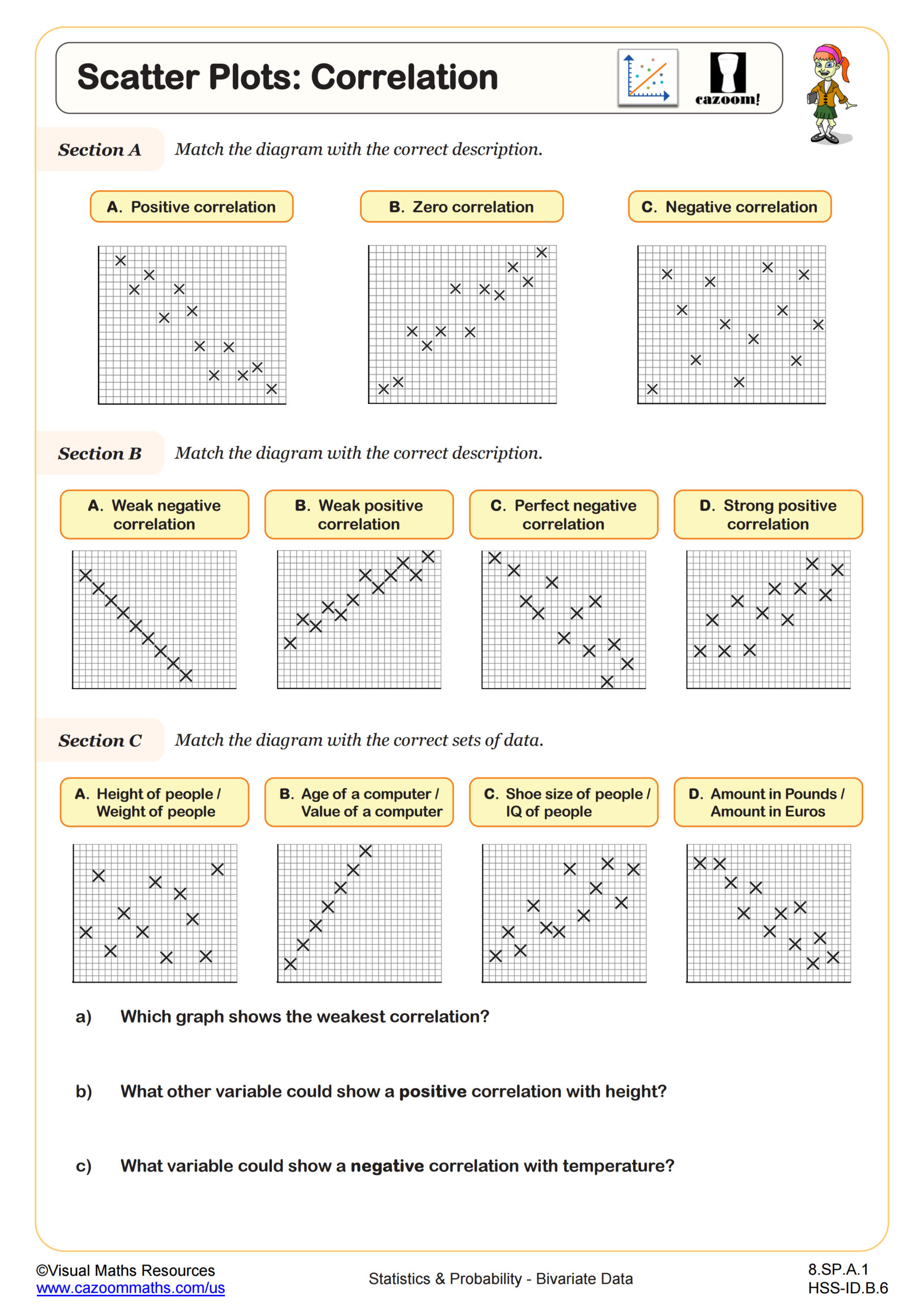
Scatter graphs, also called scatter plots, display the relationship between two quantitative variables by plotting ordered pairs on a coordinate plane. Students learn this skill in 8th grade because it marks the transition from basic graphing to analyzing real-world data relationships, a foundational concept in statistics and data literacy. The Common Core State Standards introduce bivariate data analysis in grade 8, expecting students to construct scatter plots and describe patterns like clustering, outliers, and linear associations.
A common error students make involves mixing up which variable belongs on which axis. Teachers observe students randomly assigning variables rather than recognizing that the independent variable (what you control or measure first) goes on the x-axis while the dependent variable (what responds or changes) goes on the y-axis. Reinforcing this convention early prevents confusion when students later interpret slope and intercepts in context.
Which grade levels use scatter graph worksheets?
These scatter graph worksheets target 8th grade students in middle school, where bivariate data analysis becomes a central focus of the curriculum. At this level, students move beyond single-variable statistics like mean and median to explore how two quantities relate to each other, preparing them for algebra and higher-level statistics courses.
The progression within 8th grade builds systematically: students first learn to construct accurate scatter plots from tables of data, then identify types of correlation (positive, negative, or none), and finally draw and interpret lines of best fit to make predictions. State assessments typically include multi-step scatter plot questions that require students to plot data, describe the association, and answer an interpretation question, making thorough practice across all these skills necessary for test readiness.
How do students draw and use a line of best fit?
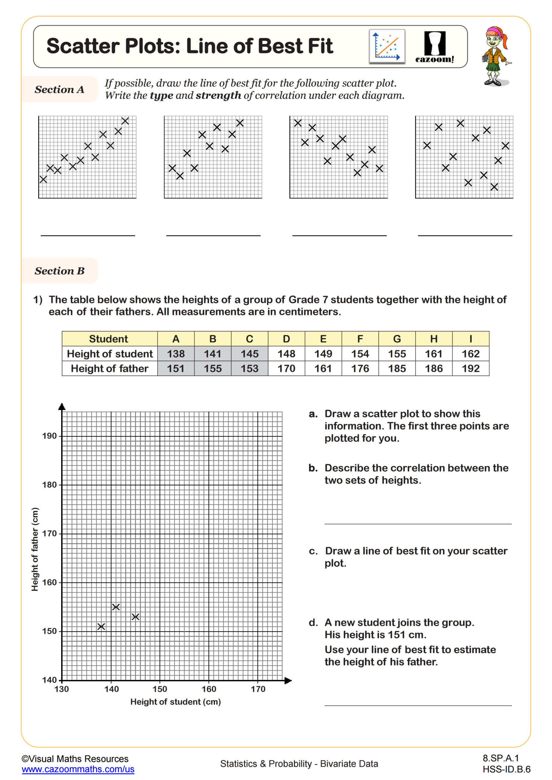
A line of best fit, or trend line, represents the general direction of data points in a scatter plot, passing through or near most points while balancing those above and below. Students learn to estimate this line by eye in 8th grade, drawing it so that roughly half the points fall on each side, then use the line to make predictions about values not in the original dataset. While technology can calculate precise regression lines, understanding how to sketch a reasonable trend line builds intuition about linear relationships and prepares students for more formal methods in high school.
Scatter plots with lines of best fit appear throughout STEM fields. Climate scientists use them to analyze temperature trends over decades, medical researchers examine relationships between dosage and patient response, and engineers study how materials behave under different stress levels. When students recognize that a steeper line of best fit indicates a stronger relationship between variables, they gain tools to interpret research findings and evaluate claims based on data evidence.
How should teachers use these scatter graph worksheets in the classroom?
The worksheets progress from foundational skills like plotting points accurately to more complex tasks like interpreting correlation strength and using lines of best fit for predictions. This scaffolding allows teachers to assign specific worksheets that match where students are in the learning progression, whether introducing the concept of bivariate data or reinforcing prediction skills before an assessment. The included answer keys let students check their scatter plot constructions independently, which builds self-correction habits particularly valuable in data analysis work.
Many teachers use these worksheets during stations or paired work, where one student plots data while another checks accuracy before both discuss the correlation pattern they observe. The worksheets also work well for intervention with students who performed poorly on data analysis questions in previous units, providing focused practice without requiring teacher-created materials. Teachers often assign one worksheet for homework after direct instruction, then use another as a warm-up review the following day to reinforce the visual patterns of positive, negative, and no correlation.