Algebra I Scatter Graphs Worksheets
All worksheets are created by the team of experienced teachers at Cazoom Math.
What Are Scatter Graphs and Why Do Students Study Them in Algebra I?
Scatter graphs, also called scatter plots, display paired data points on a coordinate plane to reveal relationships between two quantitative variables. Students study them in Algebra I because they bridge statistical reasoning with algebraic concepts like linear equations, preparing them for data analysis in advanced math courses and STEM fields. The Common Core State Standards emphasize interpreting scatter plots and using linear models to describe relationships, making this a foundation skill for both high school assessments and college readiness.
Students lose points on assessments when they forget that correlation doesn't imply causation, a critical thinking skill that scatter graph analysis develops. For example, when examining a scatter plot showing hours studied versus test scores, students must recognize the positive correlation while understanding that other factors beyond study time influence performance. Teachers consistently find that hands-on practice with real datasets helps students move beyond memorizing correlation types to genuinely understanding what the data reveals.
Which Grade Levels Cover Scatter Graphs?
These scatter graph worksheets align with Algebra I curriculum standards, typically taught during high school (grades 9-10, though some students take Algebra I in grade 8). At this level, students apply their coordinate graphing skills from earlier grades to statistical contexts, combining algebraic reasoning with data interpretation. High school mathematics introduces scatter plots as tools for analyzing bivariate data, a skill that appears on state assessments and standardized tests like the SAT.
The progression within Algebra I moves from basic correlation identification to more complex tasks like calculating lines of best fit and making predictions. Early worksheets focus on plotting points and recognizing positive, negative, or no correlation, while later materials challenge students to draw trend lines, write equations for those lines, and use them to interpolate or extrapolate values. Teachers observe that students who master correlation recognition first find constructing accurate lines of best fit significantly more manageable than those who rush through the foundational concepts.
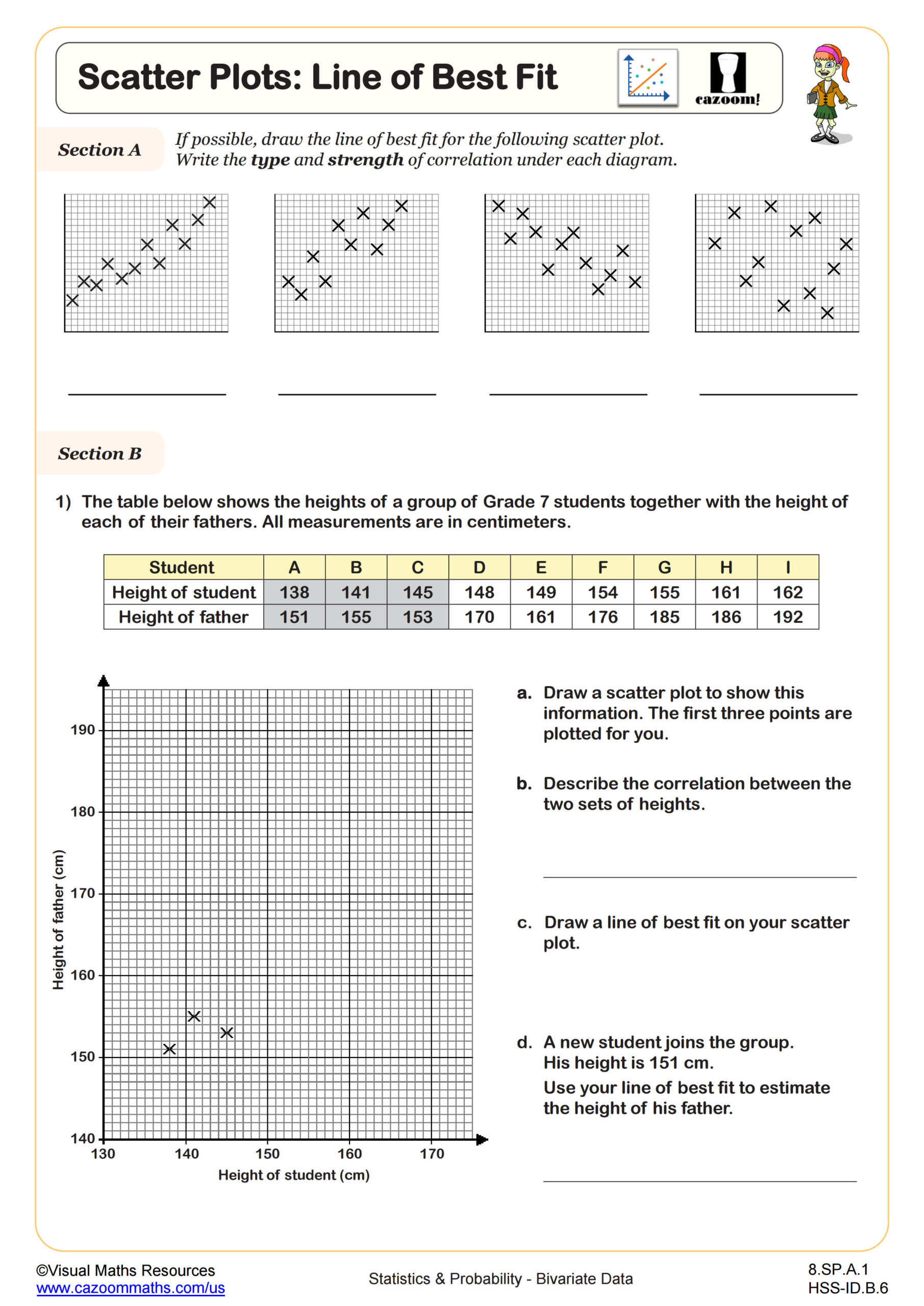
How Do Students Determine the Line of Best Fit?
The line of best fit, or trend line, represents the linear relationship that best approximates the data points in a scatter plot. In Algebra I, students typically draw this line by hand, ensuring it passes through or near as many points as possible while balancing points above and below the line. More advanced students learn to calculate the equation using two representative points or, in later courses, regression formulas. The goal is creating a model that captures the overall trend despite individual data variation.
This skill connects directly to fields like economics, where analysts use trend lines to forecast sales growth, and environmental science, where researchers predict climate patterns based on historical data. For instance, meteorologists use scatter plots and best-fit lines to analyze the relationship between carbon dioxide levels and global temperature changes over decades. Students recognize the power of mathematical modeling when they see how a simple line equation can predict future values, transforming abstract algebra into a practical problem-solving tool used across scientific disciplines.
How Can Teachers Use These Scatter Graph Worksheets Most Effectively?
These worksheets provide structured practice that builds from foundational correlation recognition through advanced line-of-best-fit applications. The variety of subtopics allows teachers to assign targeted practice based on where students struggle—whether that's distinguishing correlation types, accurately plotting points, or writing equations for trend lines. The included answer keys enable students to self-check during independent practice, making these worksheets valuable for differentiated instruction when some students need remediation while others are ready for extension activities.
Many teachers use scatter graph worksheets for paired work, where one student plots data while their partner identifies correlation and draws the trend line, then they compare their analyses. This collaborative approach surfaces misconceptions quickly and builds discussion skills around mathematical reasoning. The worksheets also serve effectively as homework following direct instruction, as formative assessments before unit tests, or as intervention materials for students who need additional exposure to bivariate data analysis before state assessments.