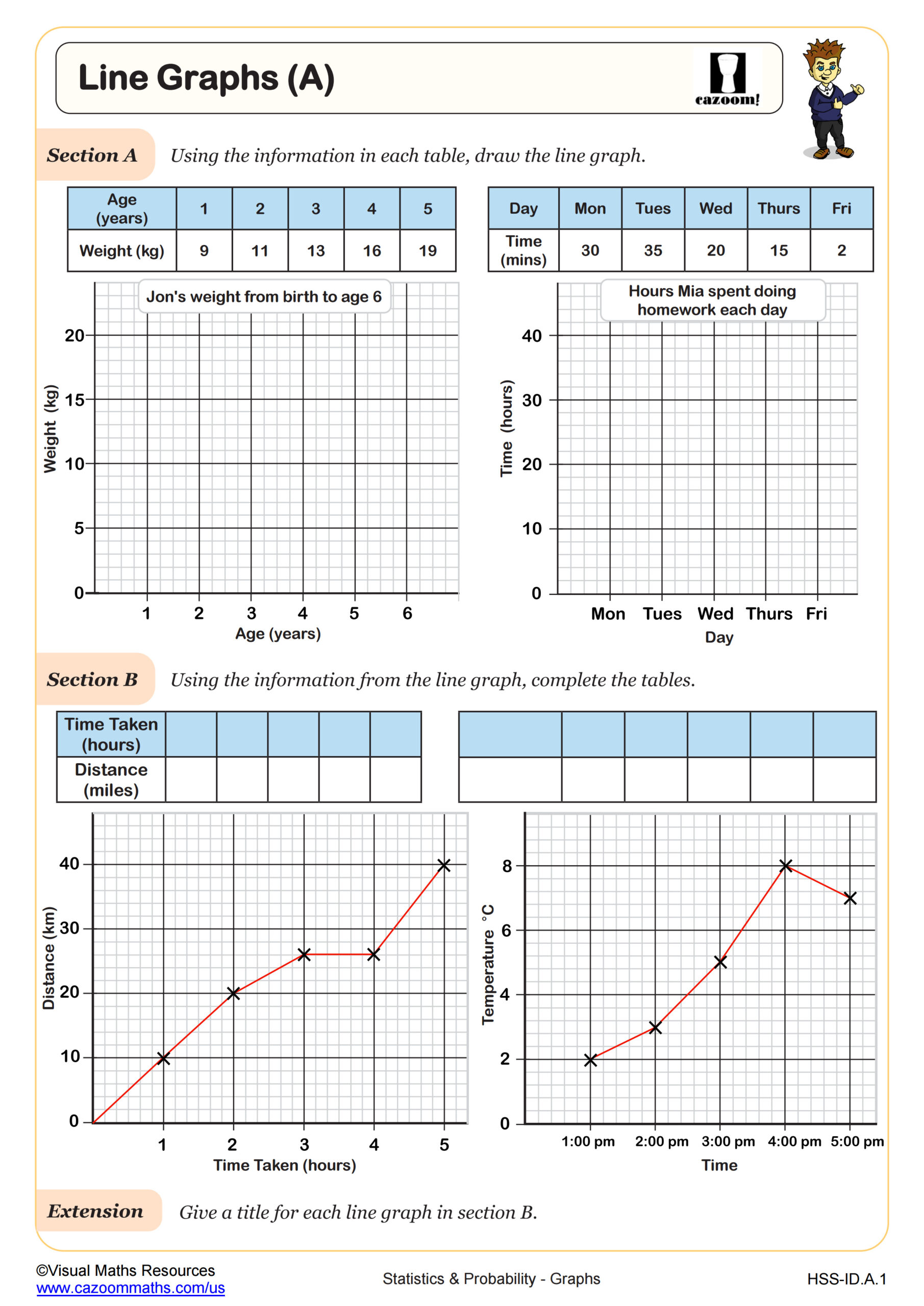
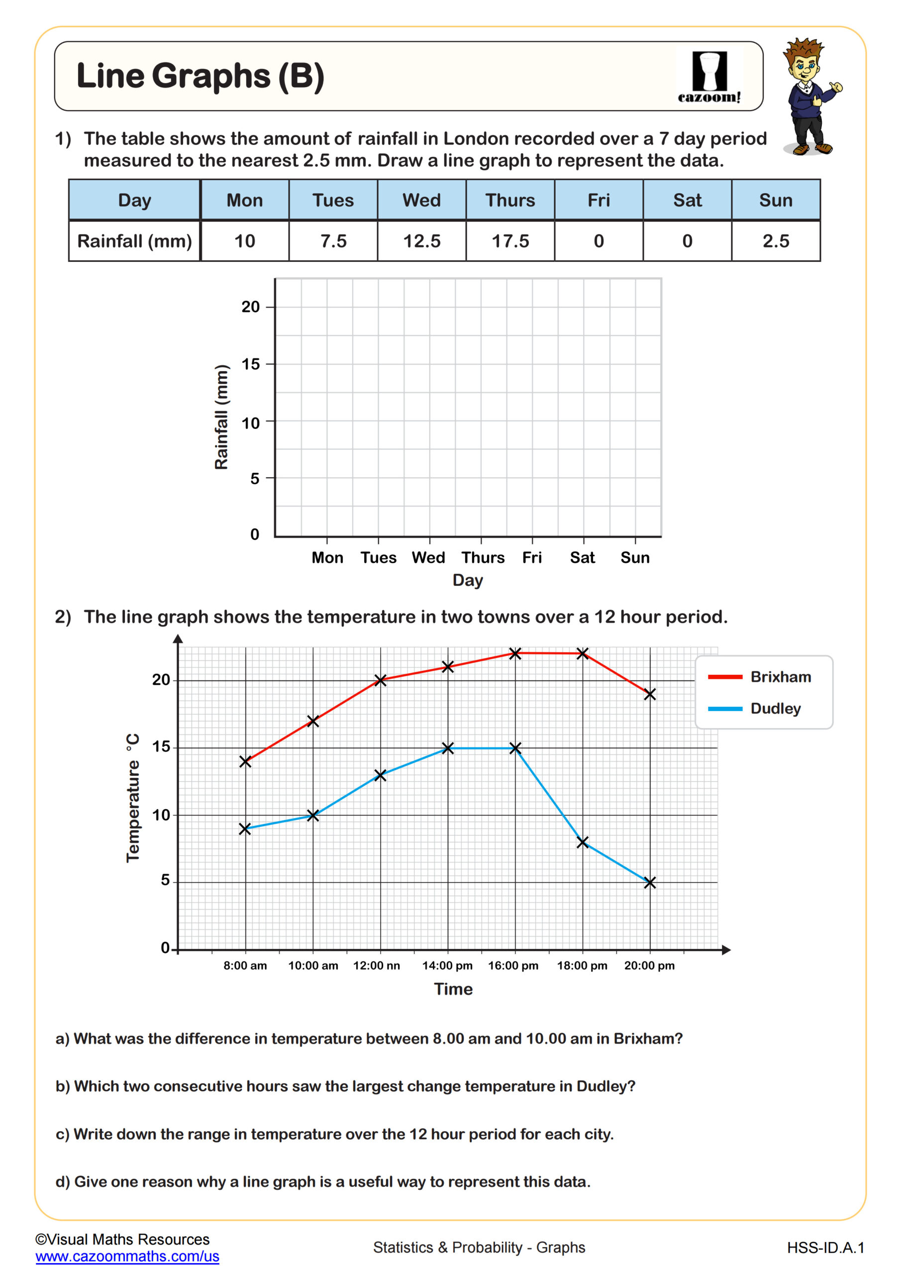
Geometry Pie Charts and Bar Charts Worksheets
All worksheets are created by the team of experienced teachers at Cazoom Math.
What Do High School Geometry Students Learn About Pie Charts and Bar Charts?
In Geometry, pie charts and bar charts serve as applications of measurement, proportional reasoning, and visual data analysis. Students interpret existing charts to extract information, calculate missing values, and create accurate visual representations from datasets. The focus extends to calculating central angles for pie chart sectors using proportions and percentages, converting between different data representations, and analyzing which chart type best displays specific datasets.
A common mistake occurs when students calculate pie chart angles without converting percentages to the full 360-degree circle. For instance, students might see that 25% of data should occupy 25 degrees rather than recognizing it represents one-quarter of 360 degrees, or 90 degrees. This error reveals gaps in proportional reasoning that teachers can address through direct instruction on the relationship between percentages, fractions, and angular measure.
How Are Data Visualization Skills Tested on the SAT and ACT?
The SAT and ACT both include multiple questions requiring students to interpret bar charts, pie charts, and other data displays across the Math sections. Test questions typically ask students to extract specific values, compare quantities across categories, calculate percentages from visual data, or identify trends and patterns. Students must read axis labels carefully, interpret legends accurately, and perform multi-step calculations based on chart information, often within time constraints that reward quick visual analysis.
Students lose points when they misread scales on bar charts, particularly when axes don't start at zero or use intervals other than ones or tens. Another frequent error involves misinterpreting pie chart sectors by estimating visually rather than using provided percentages or calculating from given data. College-bound students benefit from timed practice with charts embedded in word problems, as standardized tests rarely present data visualization as an isolated skill but rather combine it with algebraic reasoning and real-world contexts.
How Do Students Calculate Central Angles for Pie Chart Sectors?
Calculating central angles connects data analysis to geometric concepts students study throughout the Geometry course. To determine a sector's central angle, students convert the category's proportion or percentage into degrees by recognizing that the entire pie chart represents 360 degrees. The process involves setting up a proportion or multiplying the decimal equivalent of the percentage by 360. For example, if 35% of students prefer soccer, the sector angle equals 0.35 × 360 = 126 degrees. This reinforces understanding of central angles, which students encounter again when studying circles, arcs, and sectors.
This skill appears frequently in STEM fields where professionals visualize survey results, market share data, budget allocations, and research findings. Engineers use pie charts to display material composition in designs, epidemiologists track disease distribution across populations, and business analysts present sales data to stakeholders. The ability to both read existing visualizations and create accurate representations from raw data prepares students for data-driven decision making across college majors and career paths, particularly in fields requiring statistical literacy and clear communication of quantitative information.
How Can Teachers Use These Worksheets in Geometry Classes?
These worksheets provide structured practice that bridges data analysis and geometric reasoning within the Geometry curriculum. Each worksheet includes problems with complete answer keys, allowing teachers to assign independent practice, homework, or assessment preparation with confidence. The progression from reading existing charts to creating new visualizations helps students build from interpretation to application, reinforcing both computational skills and conceptual understanding of how data relationships translate to visual representations.
Many teachers use these worksheets during units on circles and angle measurement to provide real-world applications of central angles and proportional relationships. They work well as warm-up activities before state assessments, targeted intervention for students struggling with data interpretation questions, or extension work for students who finish other assignments early. The worksheets also support paired work where one student interprets a chart while their partner verifies calculations, promoting mathematical discourse and peer learning that strengthens both students' understanding of data visualization principles.