High School Pie Charts and Bar Charts Worksheets
All worksheets are created by the team of experienced teachers at Cazoom Math.
Why Do High School Students Study Pie Charts and Bar Charts?
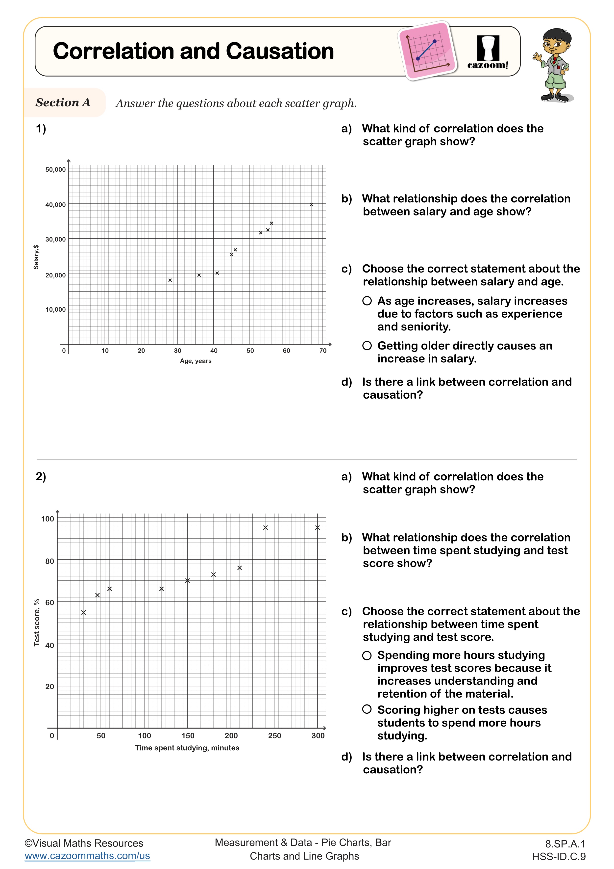
Data visualization appears throughout high school math courses, from analyzing statistical distributions in Algebra I to interpreting experimental results in precalculus. Students need to extract information from graphs quickly and accurately for standardized tests, science lab reports, and college entrance exams. The Common Core State Standards emphasize interpreting categorical and quantitative data across multiple representations.
Students lose points on assessments when they misread scales, confuse percentages with actual values on pie charts, or fail to recognize when data categories overlap. Teachers often observe that students who practice with varied graph types develop stronger critical thinking skills—they begin questioning whether a graph accurately represents the underlying data rather than accepting visual information at face value.
What Grade Levels Use These Pie Chart and Bar Chart Worksheets?
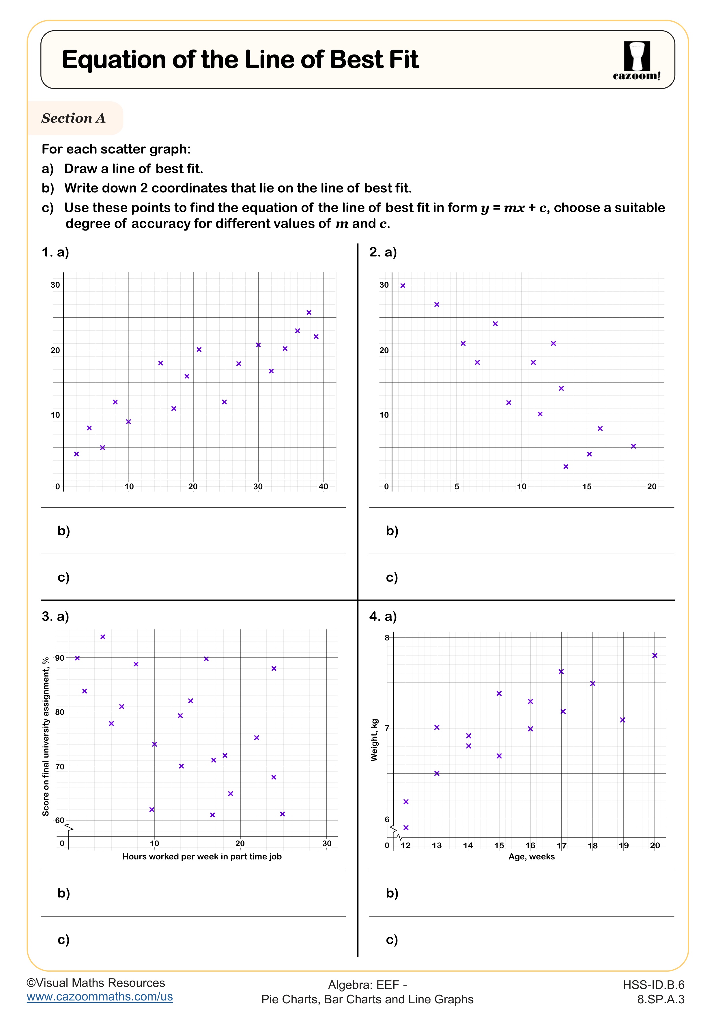
This collection covers high school courses including Algebra I, Algebra II, Geometry, Precalculus, and the Integrated Math pathway (IM 1, IM 2, IM 3). While data visualization begins in elementary school, high school students work with more complex datasets, multiple variables, and nuanced interpretations that require algebraic reasoning and statistical literacy.
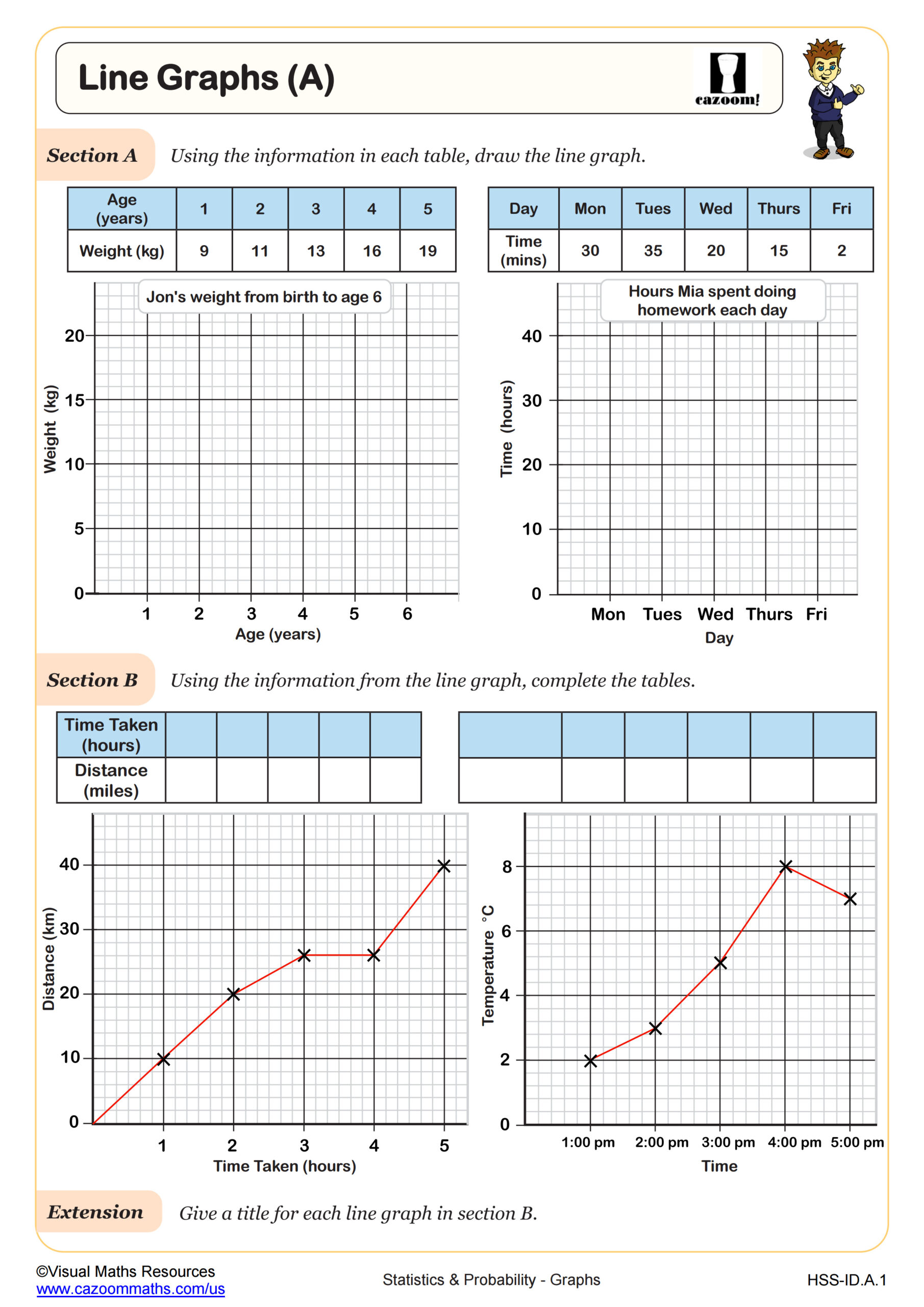
The progression across courses becomes more sophisticated: Algebra I students interpret straightforward bar graphs and create basic two-way tables, while Precalculus students analyze compound bar graphs with multiple data sets and determine which visualization best communicates specific insights. Geometry courses incorporate data visualization when students explore geometric probability and measurement applications.
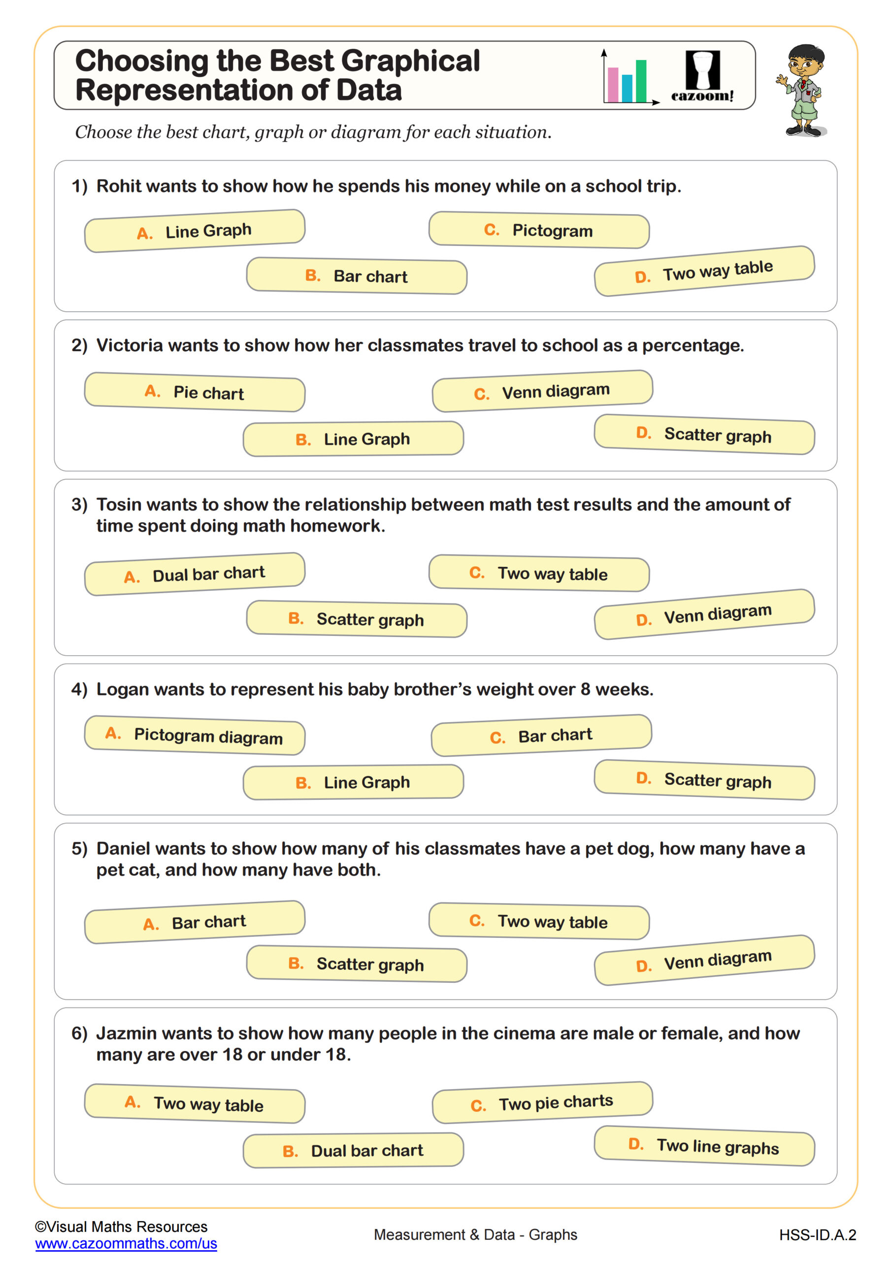
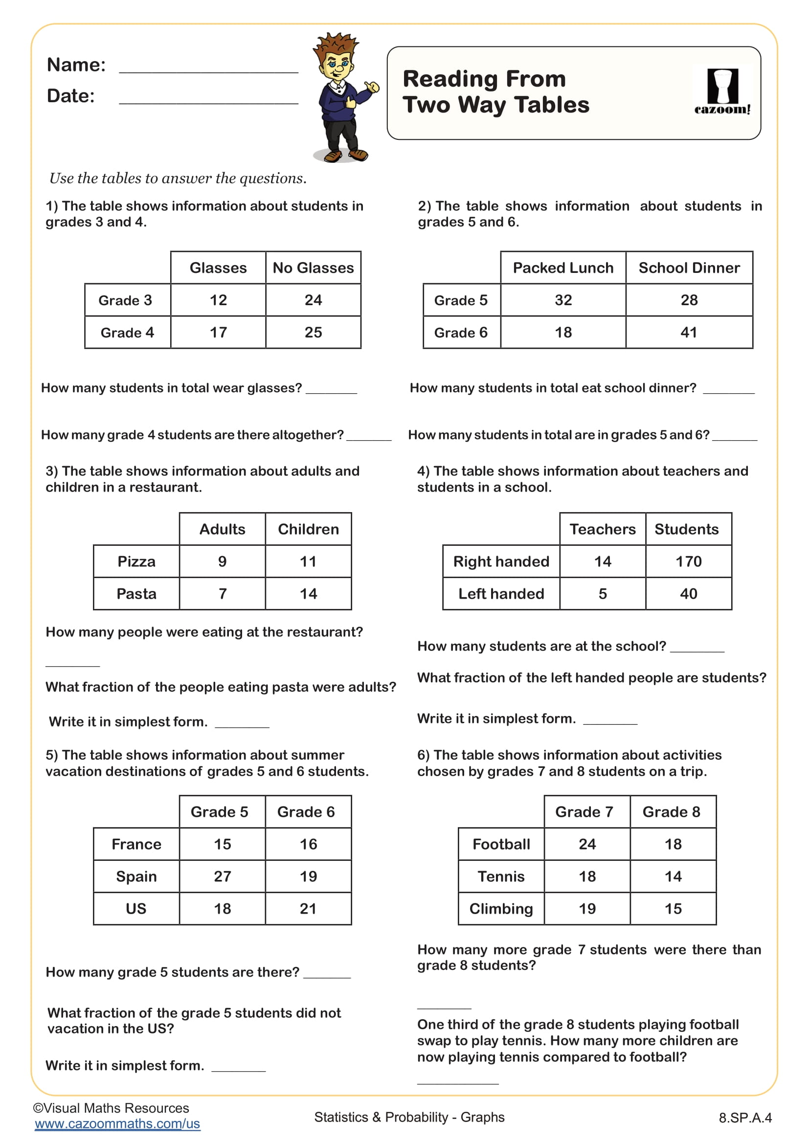
What Are Two-Way Tables and How Do Students Use Them?
Two-way tables organize data with two categorical variables, displaying frequencies or percentages in rows and columns. Students learn to read these tables, calculate marginal and conditional probabilities, and convert the information into bar graphs or other visual formats. This skill bridges data interpretation and probability, particularly when analyzing survey results or experimental outcomes.
Two-way tables appear extensively in STEM fields: medical researchers use them to compare treatment effectiveness across patient groups, engineers analyze product defect rates by manufacturing location, and social scientists examine demographic patterns. Students who master two-way tables gain tools for evaluating claims in news articles, scientific studies, and business reports—skills that extend far beyond the math classroom into informed citizenship and career readiness.
How Can Teachers Use These Worksheets in the Classroom?
The worksheets build from foundational graph-reading skills to more complex tasks like selecting appropriate representations and creating visualizations from raw data. Answer keys allow students to self-check during independent practice or enable teachers to quickly review homework and identify patterns in student errors. The variety of subtopics means teachers can target specific skills where individual students need reinforcement.
Many teachers use these worksheets for differentiated instruction—students who grasp concepts quickly work on choosing graphical representations while others focus on accurate graph reading. The materials work well for bell ringers reviewing previous concepts, homework extending classroom lessons, or intervention sessions addressing gaps before unit assessments. Paired work encourages students to discuss why certain graph types communicate data more effectively than others, deepening conceptual understanding beyond procedural skills.