High School Scatter Graphs Worksheets
All worksheets are created by the team of experienced teachers at Cazoom Math.
What are scatter graphs and why do students study them?
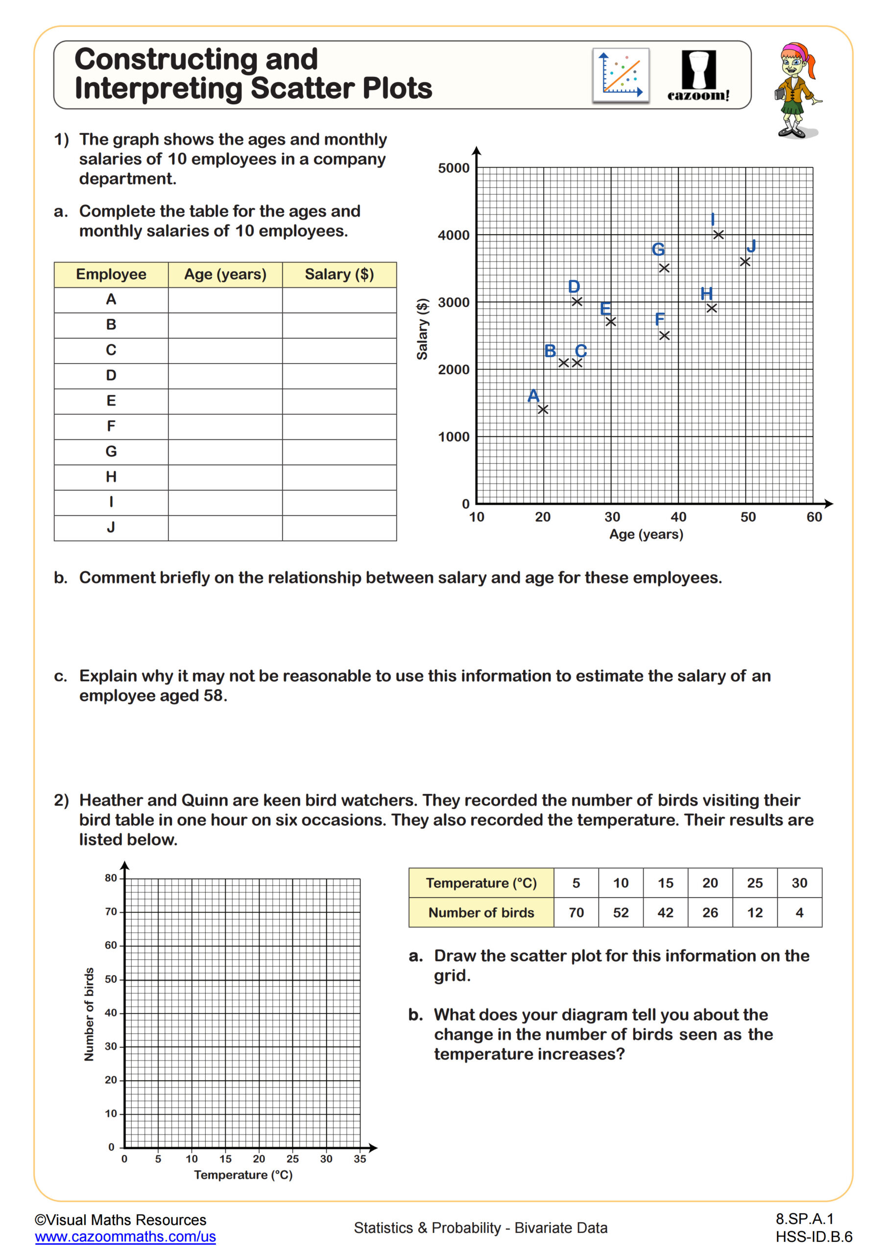
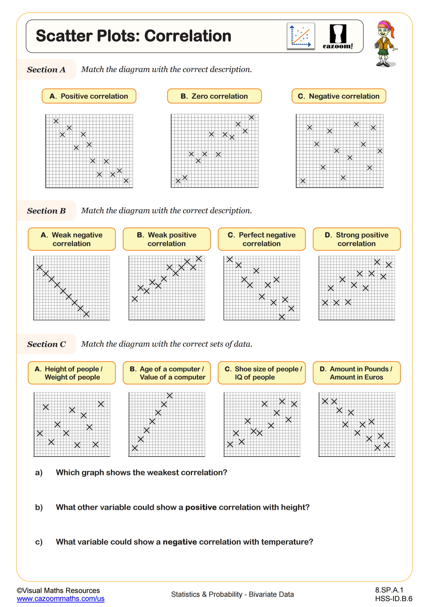
Scatter graphs, also called scatter plots or scatterplots, display paired data points on a coordinate plane to reveal relationships between two quantitative variables. Students study them because they're foundational for statistics, data science, and scientific analysis, appearing in state assessments and connecting algebra concepts to real-world problem solving. Scatter plots help students move beyond calculating answers to analyzing patterns and making predictions based on evidence.
A common misconception is that any pattern proves one variable causes the other. Students lose points on assessments when they confuse correlation with causation, writing that increased ice cream sales cause drowning incidents rather than recognizing a lurking variable like summer weather. Worksheets that require written explanations alongside graphing help students develop this analytical reasoning.
Which grade levels learn about scatter graphs?
These scatter graph worksheets align with Algebra I, Algebra II, Geometry, and Precalculus courses, as well as Integrated Math 1, 2, and 3 sequences used in many states. All fall within the high school stage, though introduction to scatter plots may occur in advanced 8th grade classes. The topic connects directly to Common Core standards for interpreting categorical and quantitative data and modeling relationships between variables.
The progression builds sophistication across courses. Algebra I students construct basic scatter plots and identify positive, negative, or no correlation. By Algebra II and Precalculus, students calculate correlation coefficients, distinguish between linear and non-linear associations, and use residuals to evaluate model fit. Integrated Math sequences distribute these skills across IM 1 through IM 3, reinforcing concepts alongside other algebra and statistics standards.
How do students create and use a line of best fit?
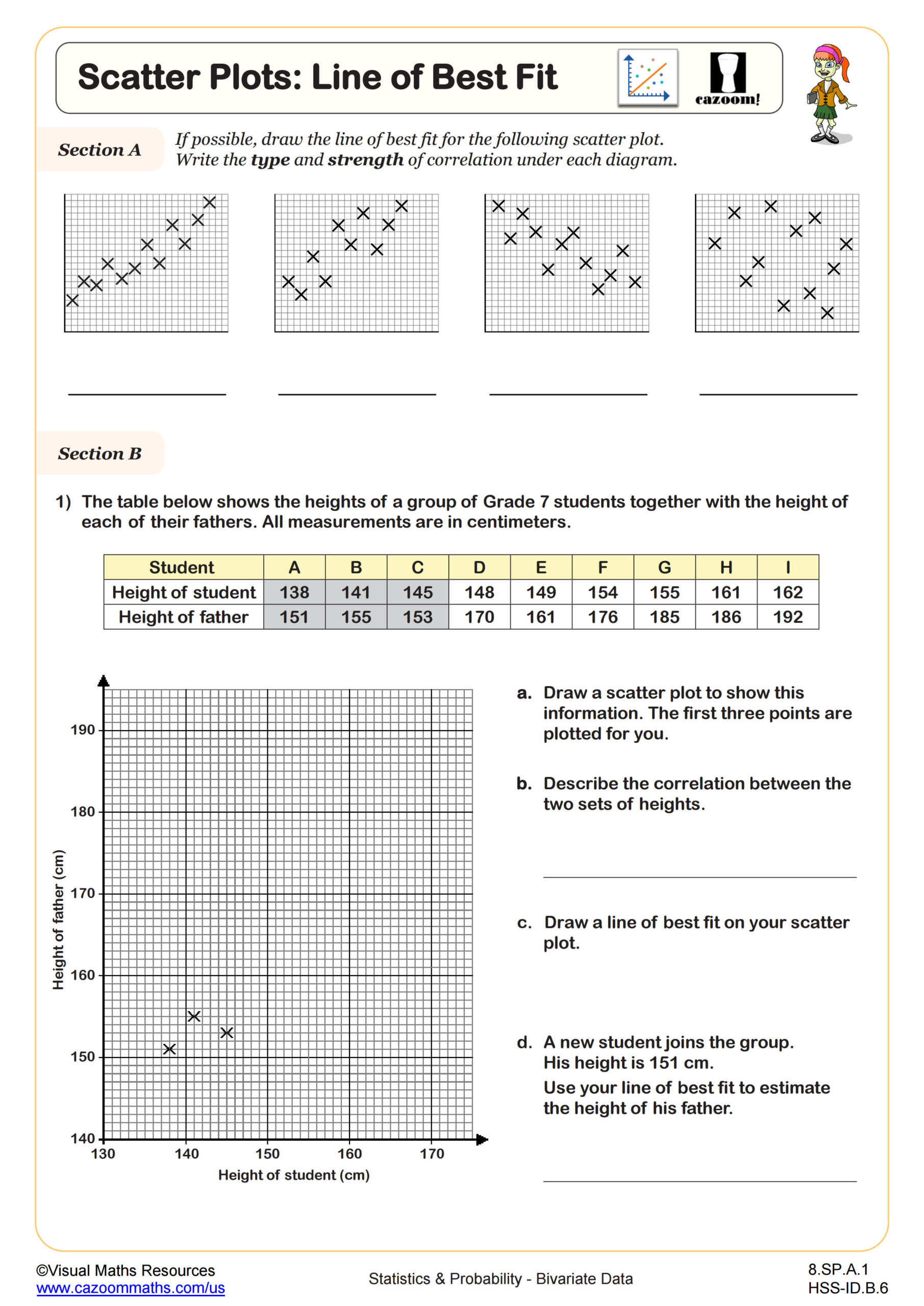
The line of best fit, or trend line, is a straight line drawn through scattered data points to model their overall pattern. Students create it by identifying the direction of correlation, then sketching or calculating a line that minimizes the distance from all points. In Algebra I, many students sketch it by eye, while Algebra II introduces least-squares regression for precise calculation. Teachers notice breakthrough moments when students realize the line doesn't need to pass through any actual data points.
Lines of best fit drive predictions across STEM fields. Meteorologists use scatter plots of temperature versus humidity to forecast heat index values. Medical researchers analyze scatter graphs of drug dosage versus patient response to determine safe treatment levels. Engineers plot stress versus strain in materials testing to predict failure points. Understanding trend lines helps students recognize how professionals transform scattered observations into actionable predictions.
How can teachers use scatter graph worksheets effectively in class?
These worksheets scaffold learning by presenting problems in order of increasing complexity, starting with identifying correlation types before advancing to constructing plots and calculating trend lines. Many worksheets include partially completed graphs or worked examples that model the reasoning process, helping students understand not just what to do but why each step matters. The answer keys show complete solutions, allowing students to check their work during independent practice or homework.
Teachers find these worksheets valuable for differentiated instruction in mixed-ability classrooms. Struggling students benefit from reviewing basic correlation types while advanced students tackle residual analysis or non-linear patterns. The worksheets work well for paired activities where students compare their trend lines and discuss differences, developing mathematical communication skills. They're also effective for review sessions before unit assessments or standardized tests that include statistics questions.


