Integrated Math 1 Pie Charts and Bar Charts Worksheets
All worksheets are created by the team of experienced teachers at Cazoom Math.
What Do Pie Charts and Bar Charts Cover in Integrated Math 1?
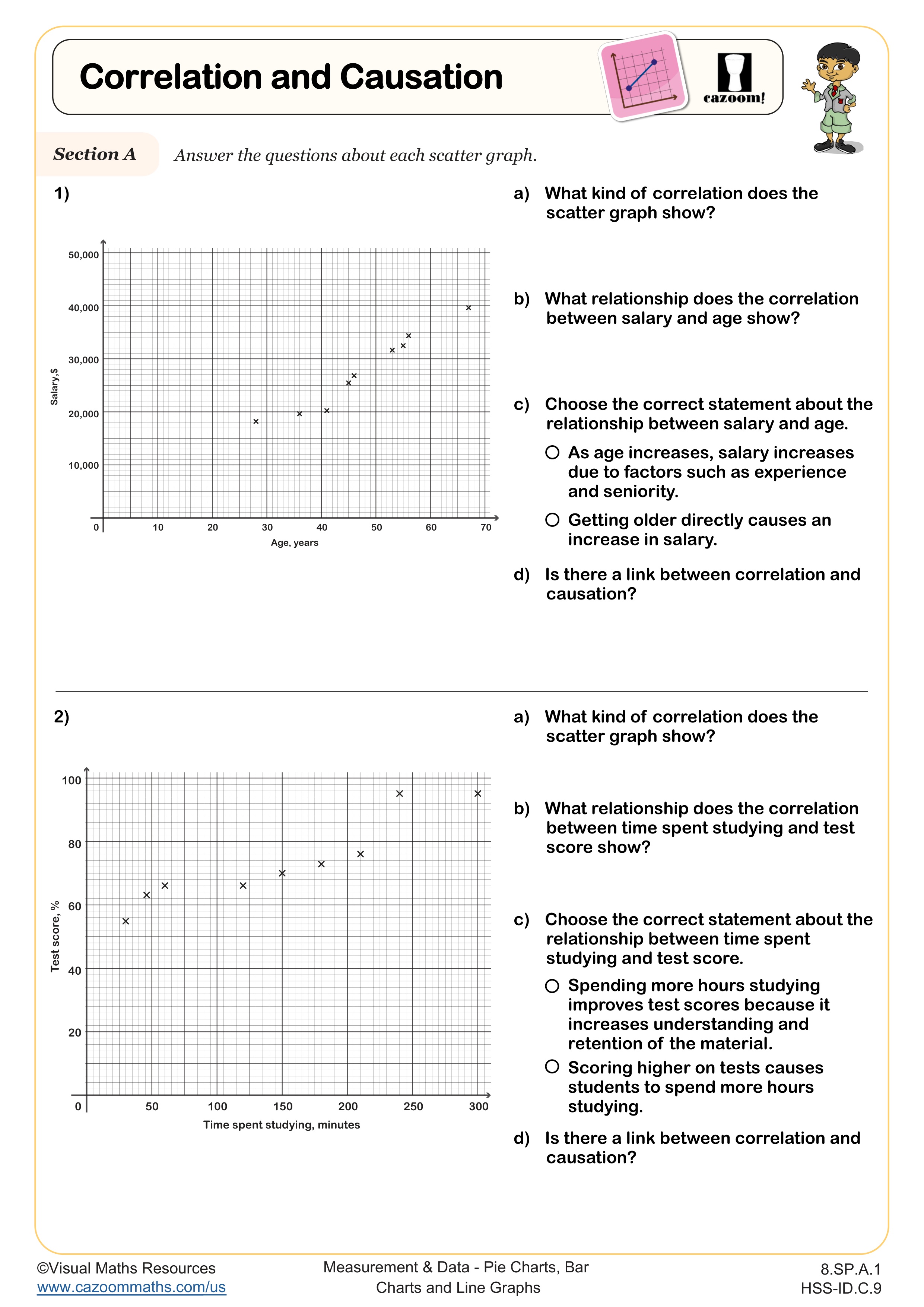
In Integrated Math 1, pie charts and bar charts instruction extends beyond basic graph reading to include analyzing two-way tables, distinguishing between correlation and causation, and making data-driven conclusions. Students learn to extract information from visual displays, calculate percentages from pie charts, compare frequencies in bar charts, and recognize when two variables show association without proving a cause-and-effect relationship. This aligns with Common Core standards for interpreting categorical data and understanding statistical reasoning.
Teachers frequently notice that students misinterpret pie chart sections by reading visual size rather than checking numerical labels, especially when sectors appear similar. A common error occurs when students see two variables change together and immediately claim causation, overlooking confounding variables or coincidental patterns. Emphasizing the phrase "correlation does not imply causation" alongside concrete examples helps students develop the critical thinking skills needed for data analysis.
How Do Pie Charts and Bar Charts Appear on Standardized Tests?
Standardized tests like the SAT, ACT, and state assessments regularly include questions requiring students to interpret pie charts and bar charts, often within real-world contexts such as survey results, population demographics, or scientific data sets. Students must extract specific values, calculate percentages or ratios, compare categories, and draw valid conclusions from visual data. Questions may present two-way tables that students must convert mentally into visual representations, or they may show graphs with missing labels that require proportional reasoning to complete.
Students lose points when they misread scales on bar charts, particularly when intervals aren't uniform or when the vertical axis doesn't start at zero. Another frequent error involves selecting answer choices that confuse correlation with causation, especially in word problems presenting two variables that change together. Test questions deliberately include these distractors, making it crucial that students practice identifying what the data actually shows versus what it might suggest.
How Do Students Analyze Two-Way Tables With Pie Charts and Bar Charts?
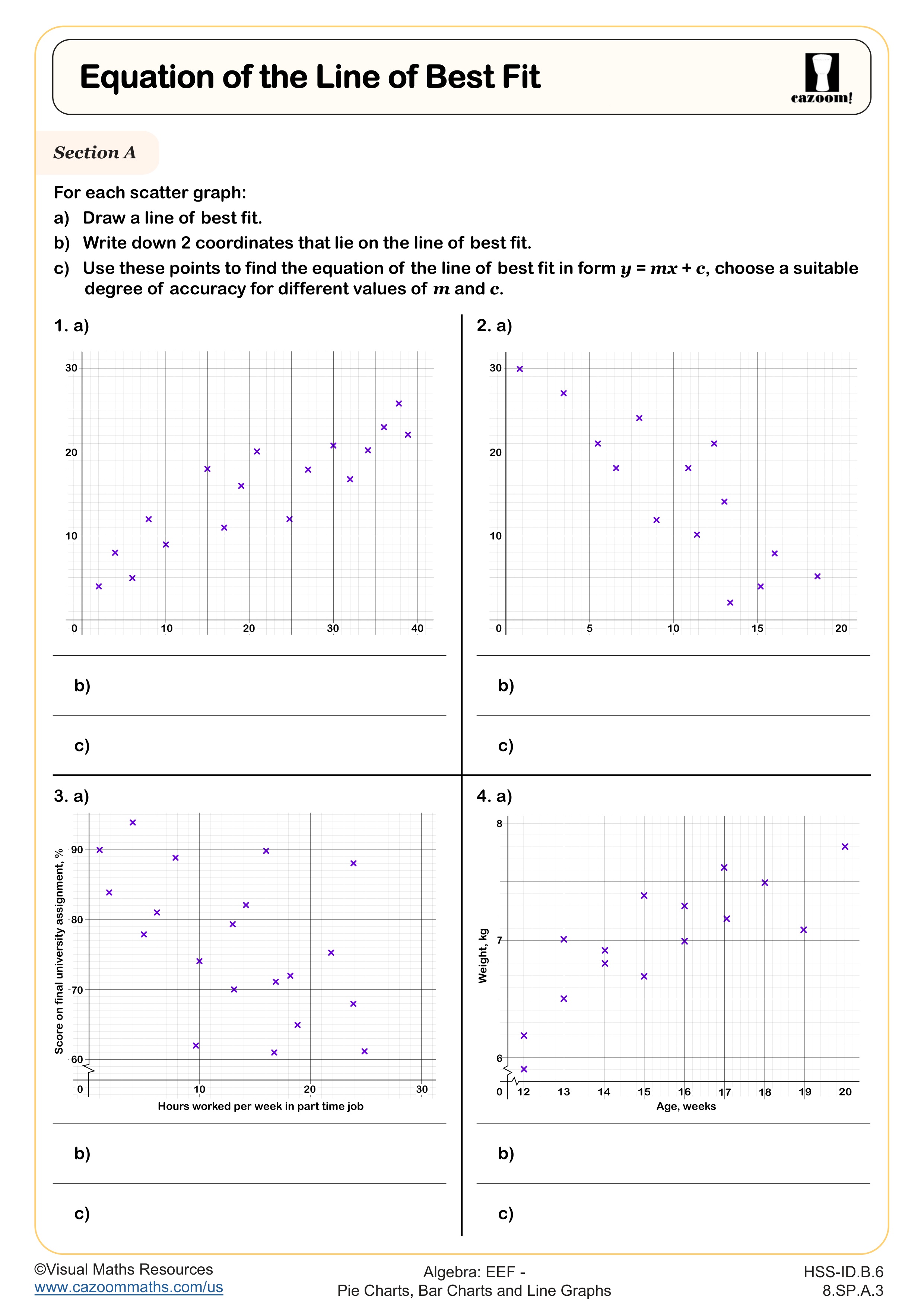
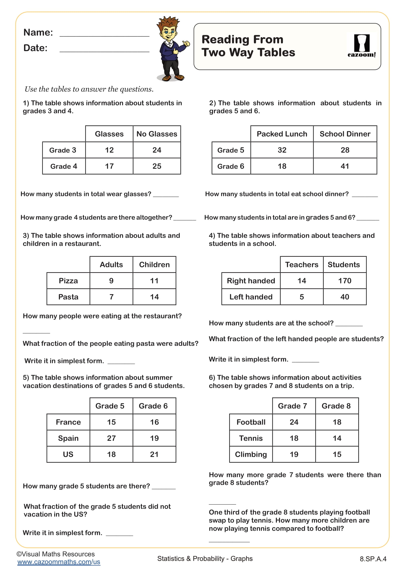
Two-way tables organize categorical data by displaying frequencies or percentages across two variables simultaneously, such as survey responses broken down by grade level or product preferences sorted by age group. Students learn to read row and column totals, calculate conditional probabilities, and identify associations between variables. Converting information from two-way tables into bar charts or pie charts requires students to select appropriate categories and recognize which visualization best displays the relationships in the data.
This skill connects directly to data science and research methodology, fields where professionals must present findings clearly to varied audiences. In STEM careers, scientists use two-way tables to analyze experimental results across different conditions, while business analysts compare consumer behavior across demographics. College statistics courses build extensively on these foundations, expecting students to arrive with fluency in reading and creating data visualizations that communicate patterns and support evidence-based arguments.
How Can Teachers Use These Worksheets in Integrated Math 1 Classrooms?
These worksheets provide targeted practice with two-way tables, correlation versus causation, and chart interpretation, offering students multiple opportunities to build confidence with data visualization concepts. The structured format allows teachers to identify specific gaps in understanding, whether students struggle with percentage calculations, proportional reasoning, or logical analysis of relationships between variables. Answer keys enable quick feedback during class, making these resources effective for formative assessment before unit tests or standardized assessments.
Many teachers use these worksheets during test review sessions, as data interpretation questions consistently appear on state assessments and college entrance exams. The materials work well for paired activities where students compare their reasoning about correlation and causation, fostering mathematical discourse about what evidence supports different conclusions. Teachers also find these worksheets valuable for intervention groups, allowing students who missed initial instruction to practice independently while receiving targeted support on specific misunderstandings about chart interpretation or two-way table analysis.