Cumulative Frequency and Box Plots Worksheets
All worksheets are created by the team of experienced teachers at Cazoom Math.
What makes effective box plot worksheets for classroom use?
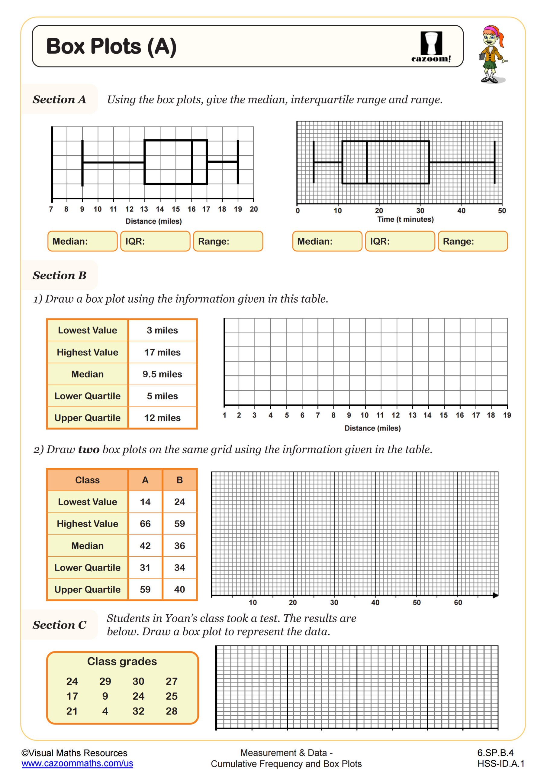
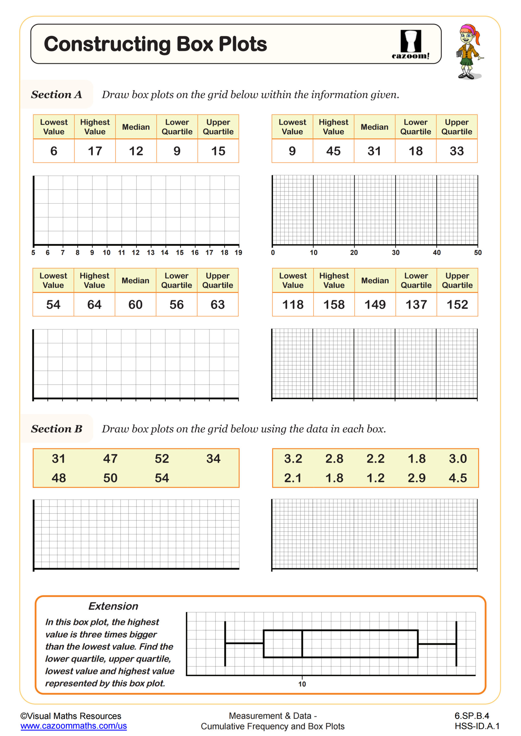
Quality box plot worksheets should connect cumulative frequency graphs directly to box plot construction, as this relationship appears frequently in Common Core State Standards for grades 6-12. Students need practice extracting quartile information from cumulative frequency data and translating it into accurate five-number summaries.
Teachers report that students often misread the cumulative frequency axis when determining median positions, especially with larger data sets. Effective worksheets include step-by-step guidance for finding quartiles from cumulative frequency curves, with clear examples showing how to handle datasets where quartile positions fall between plotted points.
Which grade levels benefit most from cumulative frequency and box plot practice?
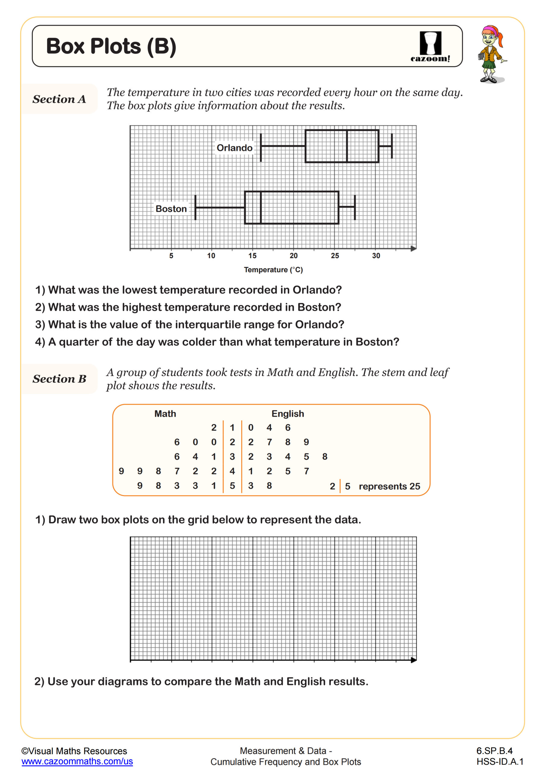
Middle school students in grades 6-8 typically encounter basic box plots as part of data representation standards, while high school students in Algebra I and Statistics courses work with more complex cumulative frequency relationships. The progression moves from simple five-number summaries to analyzing distribution shapes and comparing multiple datasets.
High school teachers observe that students who mastered basic box plot construction in middle school adapt more quickly to cumulative frequency applications. Advanced students often use these skills in AP Statistics and data science contexts, where understanding the relationship between different graphical representations becomes focused for statistical inference.
How do students construct a box plot from cumulative frequency graph data?
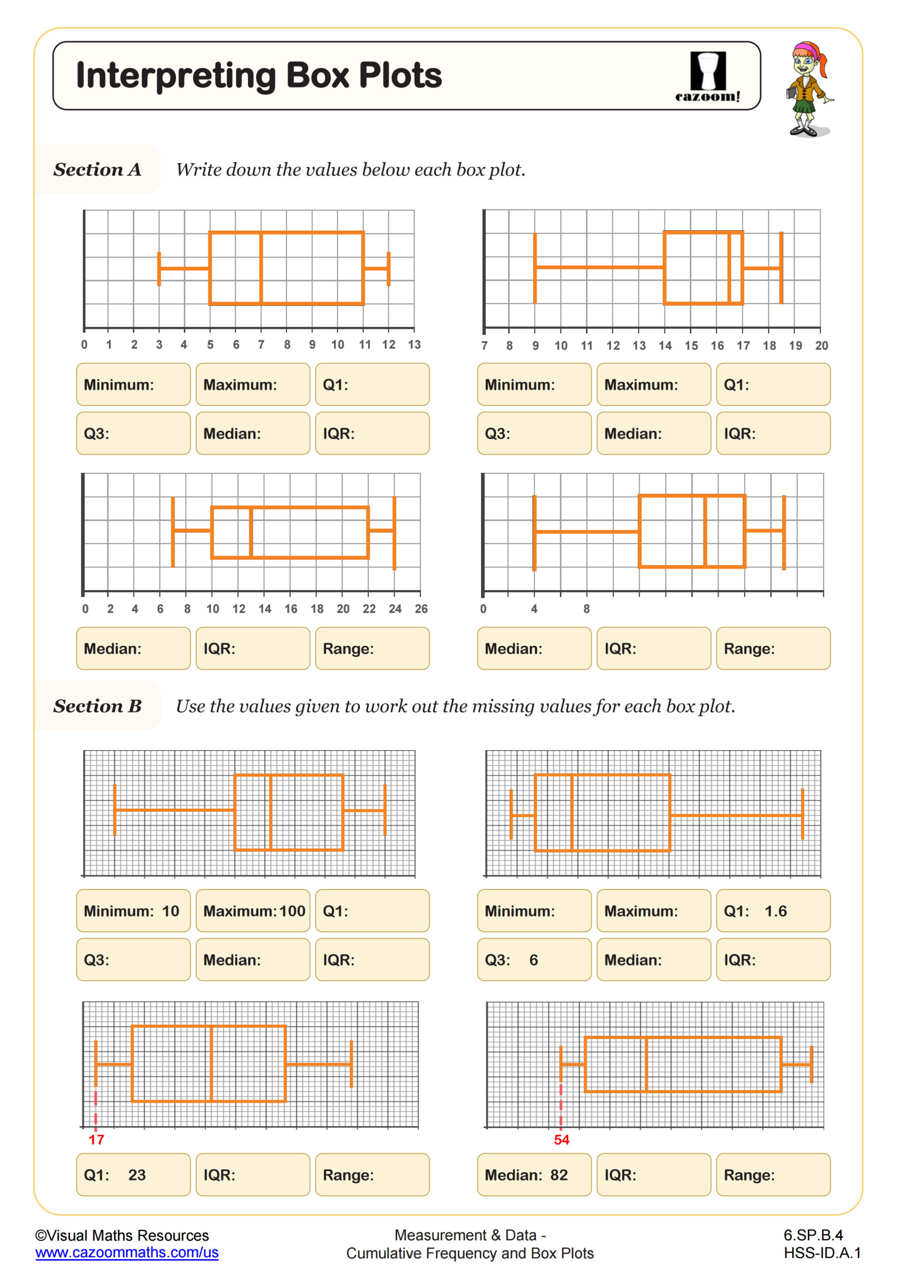
Students must first identify the total frequency from the cumulative frequency graph, then calculate quartile positions using the formulas for Q1 (25%), Q2 (50%), and Q3 (75%) of the dataset. They read corresponding data values from the horizontal axis where these percentile lines intersect the cumulative frequency curve.
A common error occurs when students confuse the cumulative frequency values with the actual data values when plotting their box plots. Teachers find that explicit instruction on reading the horizontal axis for data values, while using the vertical axis only for position calculations, prevents this misconception and leads to more accurate box plot construction.
What classroom strategies work best when teaching these worksheet concepts?
Teachers report success when students work through cumulative frequency worksheet problems before attempting box plot construction, as this builds the foundational skill of reading cumulative data. Pairing students to check each other's quartile calculations often catches errors before they transfer to incorrect box plots.
Many teachers use real-world datasets from sports statistics or climate data when introducing these concepts, as students can verify their box plots make sense in context. The answer keys become particularly valuable for independent practice, allowing students to self-correct and understand where their quartile identification or box plot scaling went wrong.