Histograms and Frequency Polygon Worksheets in PDF
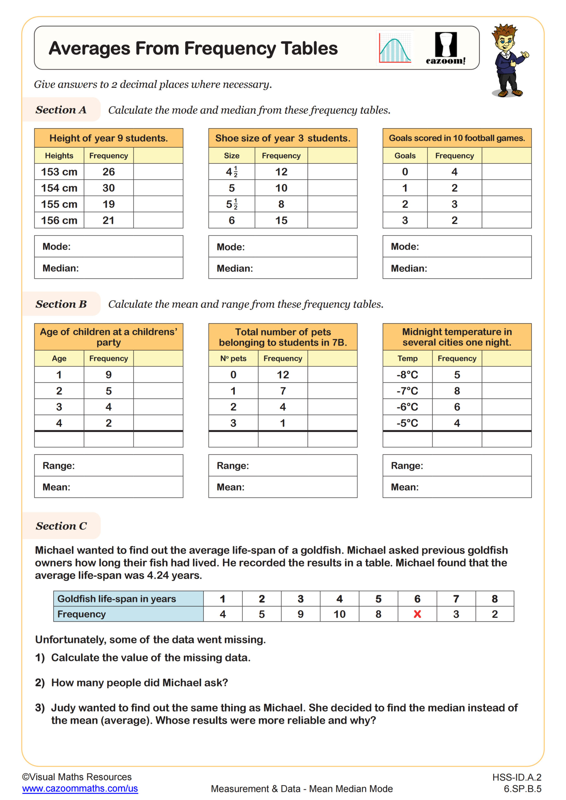
Averages from Frequency Tables
Grades: 6th Grade, Algebra I
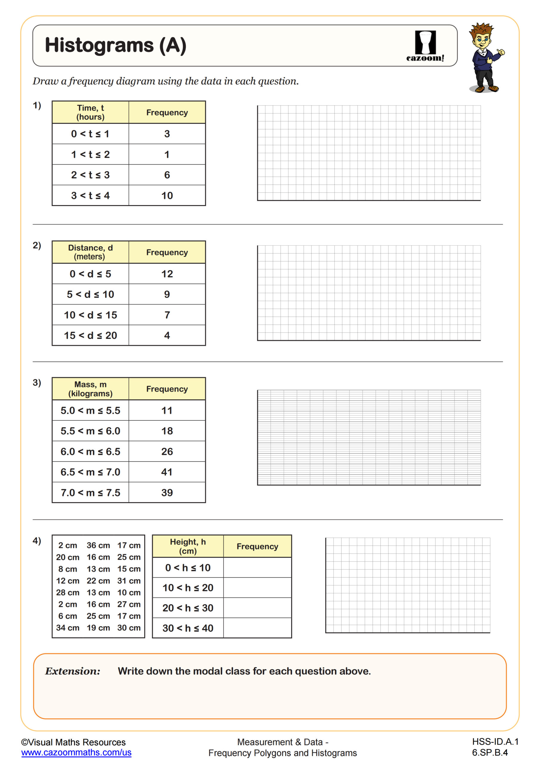
Histograms (A)
Grades: 6th Grade, Algebra I
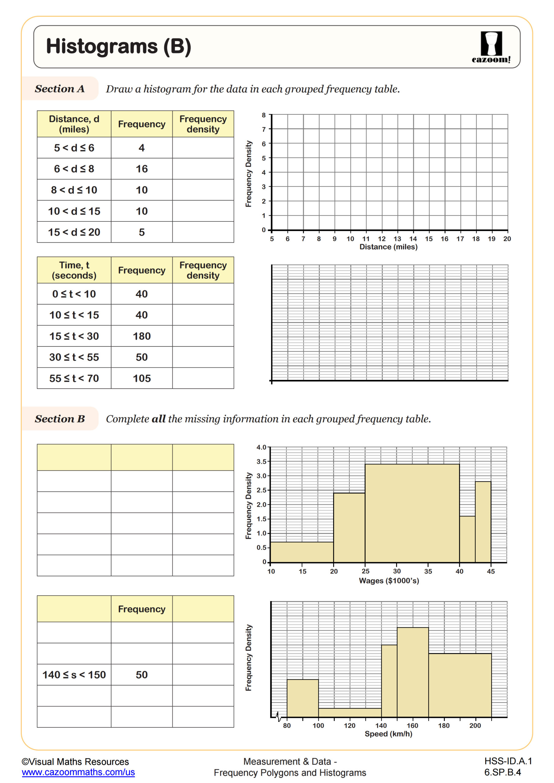
Histograms (B)
Grades: 6th Grade, Algebra I
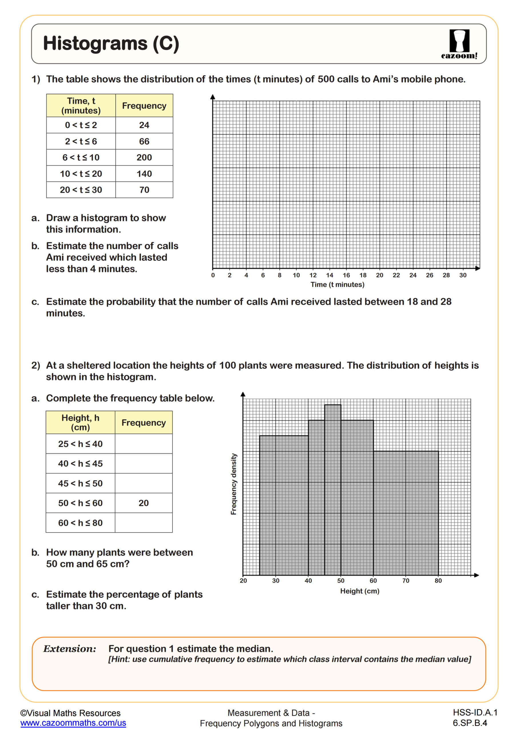
Histograms (C)
Grades: 6th Grade, Algebra I
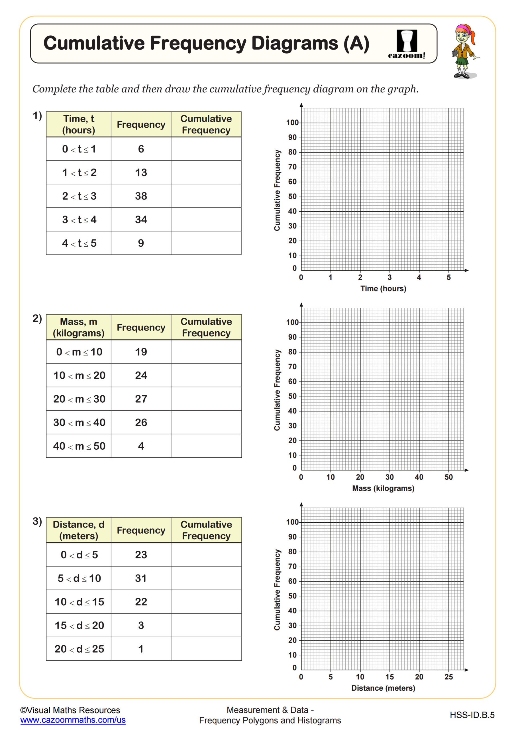
Cumulative Frequency Diagrams (A)
Grades: Algebra I
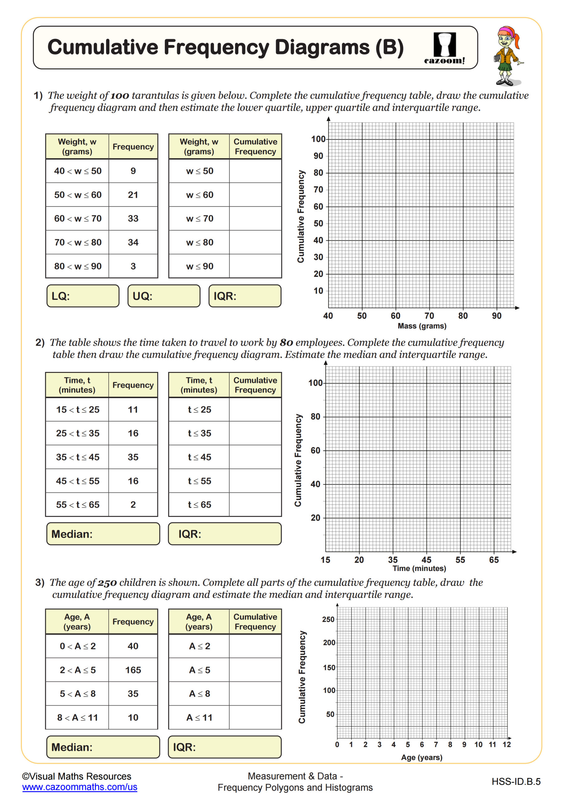
Cumulative Frequency Diagrams (B)
Grades: Algebra I
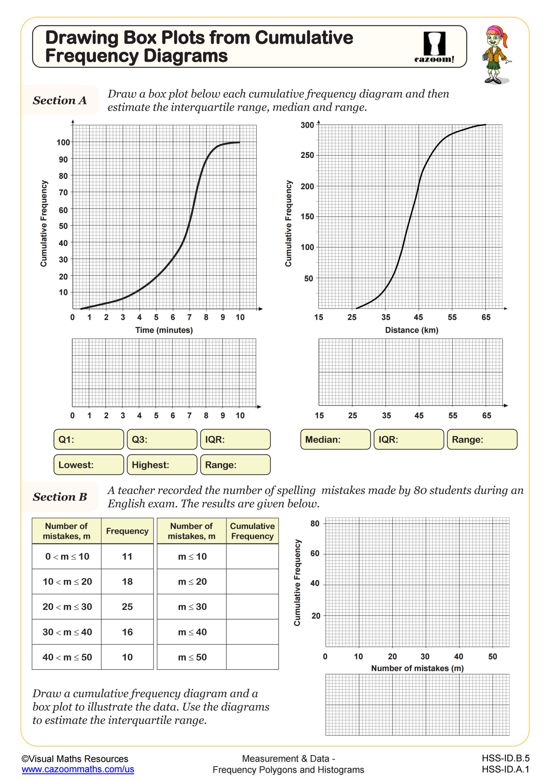
Drawing Box Plots from Cumulative Frequency Diagrams
Grades: Algebra I
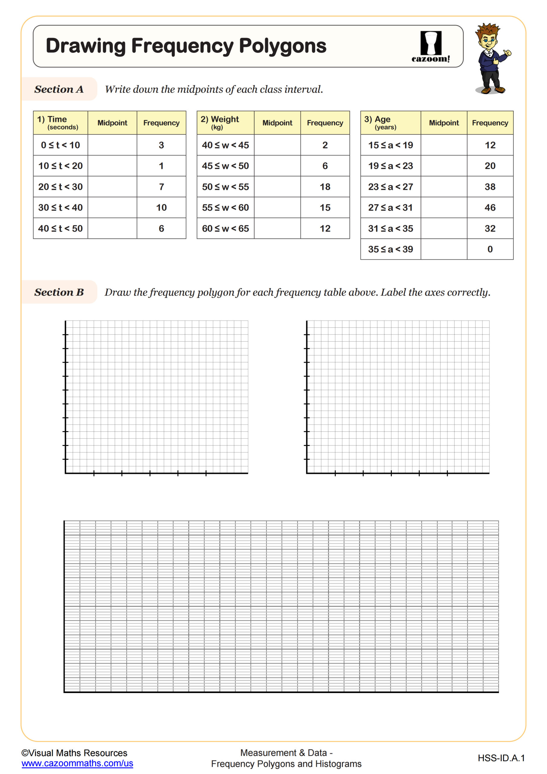
Drawing Frequency Polygons
Grades: Algebra I
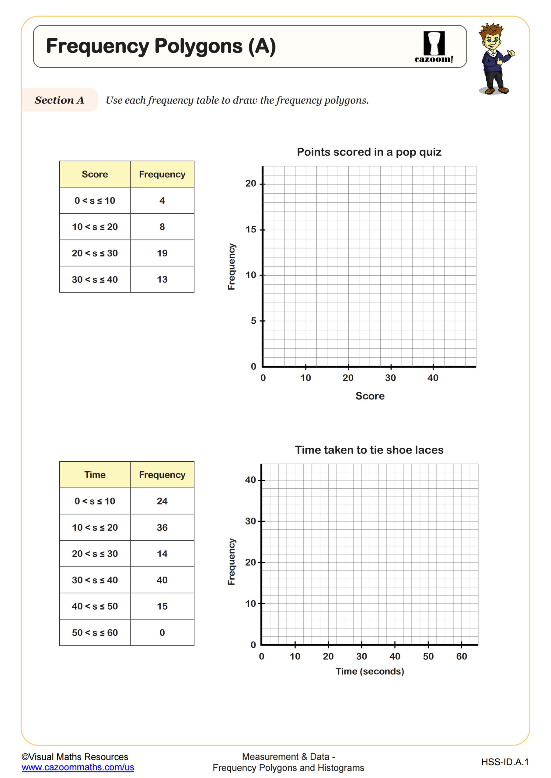
Frequency Polygons (A)
Grades: Algebra I
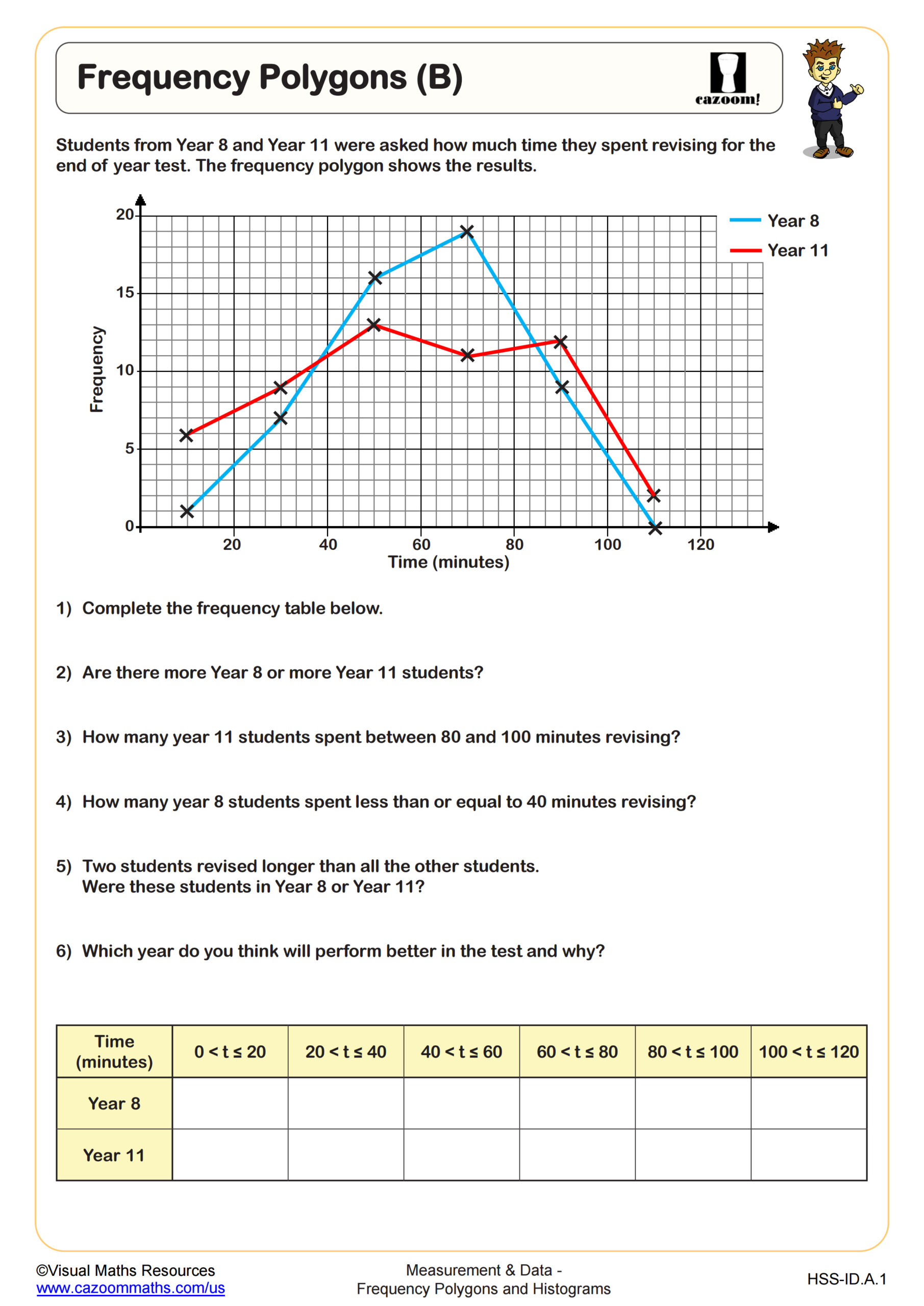
Frequency Polygons (B)
Grades: Algebra I
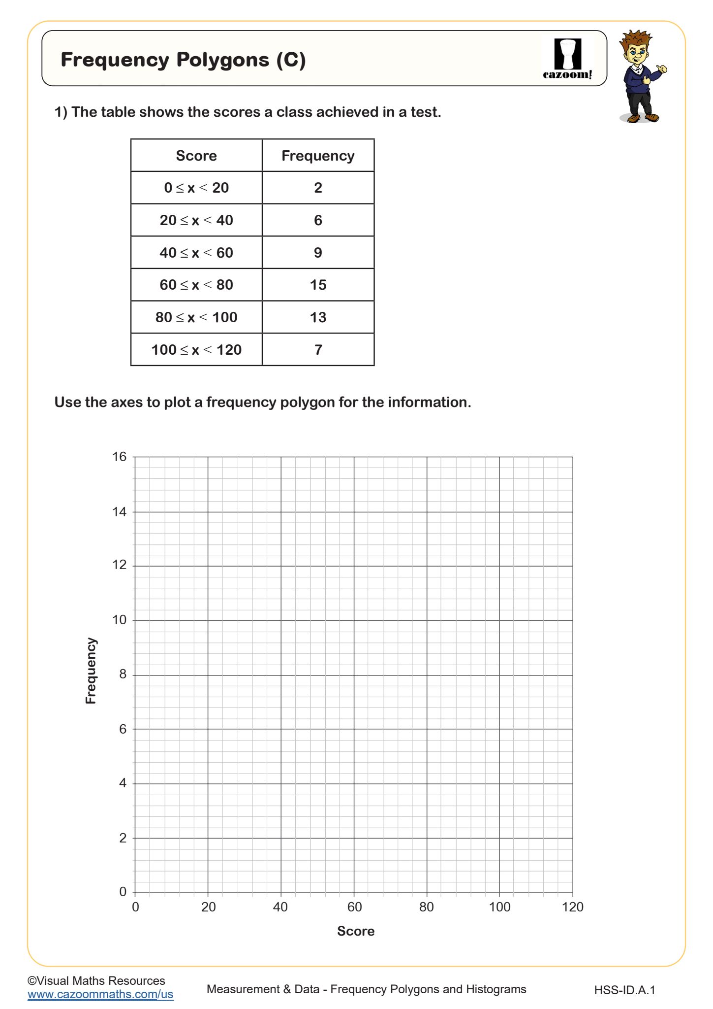
Frequency Polygons (C)
Grades: Algebra I, IM 1
All worksheets are created by the team of experienced teachers at Cazoom Math.
Where can Teachers find histogram and frequency polygon questions with answers pdf for classroom use?
Teachers can access downloadable PDF worksheets that combine histogram construction with frequency polygon practice, featuring complete answer keys for efficient grading and student self-assessment. These materials align with Common Core standards for statistics and probability, covering topics from basic frequency table creation through advanced comparative analysis of different graphical representations.
Many teachers notice that students initially confuse histogram bars with frequency polygon points, leading to hybrid graphs that combine both incorrectly. The answer keys help identify these mixing errors early, allowing teachers to address misconceptions before they become entrenched habits that affect more complex statistical analysis in advanced courses.
What grade levels benefit most from histogram worksheet high school materials?
High school students in grades 9-12 encounter histograms and frequency polygons most extensively, particularly in Algebra 2, Statistics, and AP courses where data analysis becomes central to problem-solving. Middle school students in grades 6-8 begin with basic frequency table construction, building foundational skills that support more sophisticated graphical interpretation later.
Teachers report that 9th graders often struggle with bin width selection when creating histograms from raw data, while 11th and 12th grade students in statistics courses need practice comparing multiple data sets using frequency polygons. The progression from simple bar graphs to complex statistical representations requires scaffolded practice that builds confidence with each graphical method before combining techniques.
What are the main disadvantages of frequency polygon pdf materials that teachers should consider?
Static PDF worksheets cannot provide the interactive feedback that digital graphing tools offer, limiting students' ability to experiment with different bin sizes or observe real-time changes in graph shape. Teachers must supplement printed materials with hands-on activities using graphing calculators or computer software to help students understand how data distribution affects graph appearance.
Many educators observe that students working exclusively with PDF worksheets may memorize construction steps without developing conceptual understanding of when to choose histograms versus frequency polygons for different data types. The fixed nature of printed exercises can also limit exposure to the messier, real-world data sets that students encounter in science labs and social studies research projects.
How should teachers use frequency table and histogram worksheet materials most effectively in lessons?
Successful implementation begins with guided practice where teachers demonstrate histogram construction step-by-step before students tackle frequency polygon creation independently. Teachers should emphasize the connection between frequency tables as organizational tools and the resulting graphical representations, helping students understand that both histogram and frequency polygon formats display the same underlying data relationships.
Classroom observations suggest that students benefit most when worksheet practice follows hands-on data collection activities, such as measuring classmates' heights or recording quiz scores. This real-world context helps students appreciate why statisticians choose different graphical formats for different purposes, moving beyond mechanical construction toward meaningful data interpretation that supports STEM learning across multiple subjects.